Jun2010 |
Gehoor geven (aan) |
text |
writer, reviewer |
(sound) art |
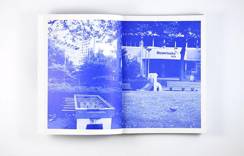
Justin Bennett |
mapping |
Stroom and Gemeentemuseum Den Haag |
Dutch and English |
7 |
7 |
7 |
2009 Ouborg Prijs winner Justin Bennett, a sound/installation artist, experimental composer and musician, produced a book on his work, with texts by Rahma Khazam and Freek Lomme, the complete text of the video "City of Progress", and many images. In dutch and english.
Design Book by Atelier Carvalho Bernau
Commissioned by Stroom Den Haag and Gemeentemuseum Den Haag, 2010.
Download

Nov2005 |
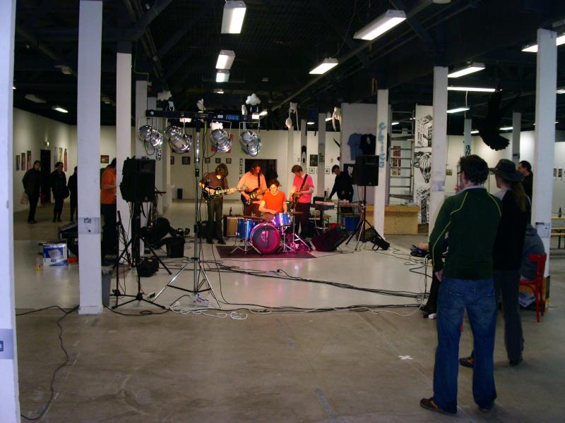
Crackle-canvas #1 |
exhibition |
curator, producer |
(sound) art, performance |
Crackle canvas |
experience |
TAC |
English |
6 |
9 |
7 |
Crackle-canvas #1 by TOKTEK. Performance and installation.


Apr2006 |
Independent Arts festival |
Independent Arts Festival |
Facilitator, co-curator, producer |
(street) art |
A sum of energy |
pushing a different |
TAC |
Dutch and English |
6,5 |
8 |
7 |
18th "INDEPENDENT ARTS"- FESTIVAL - the final chapter
> 22-23 April 2006 > Vierkante Zaal / Sint-Niklaas, Belgium
> 28-29-30 April 2006 > TAC (Temporary Art Centre) / Eindhoven, the Netherlands
Curator: Sztuka Fabryka / Extra program Eindhoven by Freek Lomme
Organisation: Hotel Volzet / Edition Eindhoven in co-operation with TAC
Co-organisers: Cultural Centre Sint-Niklaas / OJC Kompas vzw / Cultuurraad Sint-Niklaas
Partners: Academy of fine Arts / Municipality Sint-Niklaas
STREET ART
> ::Hixtril:: (BE) / Sjors Trimbach (NL) / Pure Evil (UK) / Eugene & Louise (BE) / Noaz (E) / Josh MacPhee - justseeds.org (U.S.A.) / Vinnie Ray (U.S.A.) / M-City (PL) / Weestar (CN)
FINE ART
> unknown artist formally known as gassy recipe (BE) / Jimmy Fly & Dzia-Dzia (BE) / James Marr (E) / Matt Joyce (UK) / Ruben De Loof (B) / Chu Keng Fu (TW) / Joris Van Vossel (BE) / Bram Verstraeten (BE) / Christian Lindemann (DE) / Eline Van Eerdenbrugh (BE) / Sabina Romanin (IT) / Sammy Vandenberghe (BE) / I Like Drawing (UK) / Lorenzo Petrantoni (IT) / Available Art (PL) / Dzia-Dzia (BE) / Stijn Claikens (BE) / DsuDorion (BE) / Chica (BE)
MAIL-ART
> Guido Vermeulen (BE) / Marilyn Dammann (U.S.A.) / Rémy Penard (FR) / buZ blurr (U.S.A.) / Angela Netmail (DE) / John Held Jr. & Mike Dickau (U.S.A.) / Haje Homström (FI) / Ragged Edge Press (U.S.A.) / Pawel Petasz (PL) / Sztuka Fabryka (BE) / H.R. Fricker (CH) / The Sticker Dude (U.S.A.) /
> Mail-Art meeting: Rémy Penard (FR) / Karl-Friedrich Hacker (DE) / Peter Netmail (DE) / Dobrica Kamperelic (YU) / Reid Wood (U.S.A.) / Lynn Palmiter Jr. & Elizabeth Zois (U.S.A.) / Franziska Block (DE) / Stijn Hüwels (BE) / ...
SMALL PRESS
> Karl-Friedrich Hacker (DE) / Danny Hellman (U.S.A.) / Dzia-Dzia (BE) / Jenny Gonzalez (U.S.A.) / Garage Magazine (IT) / Polvo (U.S.A.) / Brad Simon (U.S.A.) / Kaasschaaf Uitgeverij (NL) / Bries (BE)
PERFORMANCE
> Karl-Friedrich Hacker (DE) / Peter Netmail (DE) / Ultima Occasio (YU) / Nele Antonovic, Gabriel Savic Ra and Lidija Anotonovic (YU) / Wannes Goetschalckx (BE) / Patrick Anderson-Mc.Quoid (IE) & Marina Miletic (BE)
VIDEO
> Documentary screening on Saturday "POPaganda" by Pedro Carvajal (U.S.A.) / Front (BE) / Taxonomy (IT) / Lane Last (U.S.A.) / Silvio De Gracia (AR) / Sinus Gunes & Nilde Safak (TR) / SU-EN (SE) / Zoran Dragelj (CA) / Jan Leenders (BE) / Myriam Thyes (DE) / Clemente Padin (UY) / Stijn Roelofs presents Justin Kees & Mike Clark (NL) / Studio Van Laar (NL) / Pure Evil (UK)
HOME TAPE
> Fear Falls Burning (vidnaObmana) (BE) / Kapotski (BE) / Formatt (BE) / Five Leaves Left (BE) / Anatole Stretch vs Nakamura (BE) / Jozefaleksandropedro (BE)
Extra program Eindhoven:
Streetart by Erosie, Space3, Eric de Haas
Performances by The Hitmachine and Meeuw


Feb2012 |
The revelation of the concealed |
EXHIBITION and PUBLICATION |
CURATOR, PRODUCER and WRITER |
Activism, art and poetics |
Hidden data and visual poetry |
poetic |
sself-commissioned |
English |
8 |
8 |
8 |
Politics (in)form: Freedom of Information Act results
Freedom has its limitations. While a visual culture of revealing liberties is in the forefront, concealed images barely draw any public interest: simply because their subject is hidden and their existence is non-existent in the public eye. But who is concerned with the ‘redaction’ of concealed documents and why is this so important?
Solo show and publication by Renée Ridgway
Since 1980 anyone in the Netherlands can request disclosure of information and documents controlled by the government institutions with the WOB (The Freedom of Information Act, (FOIA). The WOB makes public access possible to government records, archives and documents, in the form of paper records; not all files are digitalized yet.
Artist Renée Ridgway searched the archives of Buro Jansen & Janssen, an investigation agency that critically follows the police, judiciary and intelligence services and uses the WOB as one of its research tools. Taking a critical stance on governmental policies and actions, Ridgway selected various files to be turned into readymades of political aesthetics. These A4s are palimpsest, remnant texts merging into newly created and visually poetic images.
This project pragmatically explores the actual conduct of these redacted documents. In diverse reflections, Freek Lomme, Renée Ridgway and Simon Ferdinando trace the capacity and relevance of this artistic turnover whilst Rick van Amersfoort of Buro Jansen & Janssen positions the practical implications of the WOB.
To uncover the politics involved in communication requires a game of hide and seek. The revelation of concealed data might very well both acknowledge and extend our understanding of rights and wrongs, leading us to an image of the political. As a counterpart to this power, this display allows a possibility to not only reveal the concealed but to reaccess its implications.
Curator / managing director: Freek Lomme
Editors: Freek Lomme and Renée Ridgway
Texts by: Simon Ferdinando, Freek Lomme, Buro Jansen & Janssen, Renée Ridgway
Graphic design publication: Eric de Haas
Made possible thanks to: Mondriaan Stichting, Municipality of Eindhoven, Buro Jansen & Janssen
Download
Freek’s text for the publication

Photography by Renée Ridgway
Photography by Renée Ridgway

Photography by Renée Ridgway

Photography by Fieke van Berkom
Jan2012 |
Public Performance |
Review |
critic |
Architecture, performance, photography |
performing public space |
analysis and mapping |
Frame magazine |
English |
7,5 |
7.5 |
8 |
Review of the book Public Space: Cultural/Political Theory: Street Photography by architect and educator George Baird in Frame 84.
In a fascinating way, the book catalyses thinking on, experience of and an activation both through as within public space; a rather bottom up and very much playfull scene in a way i like it!
DOWNLOAD
Text as published in Frame here

Dec2008 |
LOST BETWEEN EXTENSIVITY/INTENSIVITY EXHANGE |
Exhibition and PUBLICATION |
CURATOR and WRITER |
ART |
SOLO + PUBLICATION WARREN NEIDICH |
Quest |
Warren Neidich and Freek Lomme |
ENG/DUTCH |
7,5 |
8,5 |
8 |
To visualize a brainstorm through diagrams is a proven strategy to generate innovative thinking. It is able to catalyze the production of new knowledge systems, previously unavailable to thought. Like the well-known French philosopher Gilles Deleuze states in his book, Francis Bacon, the logic of Sensation, "The diagram is indeed a chaos, a catastrophe but it is also a germ of order or rhythm. It is a violent chaos in relation to the figurative givens, but it is a germ of rhythm in relation to the new order of the painting. As Bacon says, it “unlocks areas of sensation.” Then what of the Mindmap. Does it unlock new forms and conditions for thought and the imagination? Is the mind map a kind of auto representation of the thought itself an instantiation of thoughts made into "thingness"? Thoughts interfacing with each other along distributed epistemic networks are for Neidich poetic couplings between brain, mind, and world.
Within the gallery space of ’production label’ Onomatopee, Warren Neidich will give rise to the landscape of a brainstorm. He will produce a totally projected assemblage of a drawing history the end point which manifested itself as a stage set in his studio at the IASPIS residency program creating a contained dynamic zone in between the visual and analytic whatever that style of analysis might be, where he made the performance "Some cursory comments on the nature of my wall drawing", 2008.
Onomatopee published a book covering the entire trajectory of his drawing project. Beginning with his early descriptive drawings of his Cultured Brain Model made from 1999-2002, moving on to the incorporation of the illustrations of his Becoming Earthling Project, 2004-2006 and finishing with his model of how the power art can sculpt Neural Network architectures as a form of resistance, Resistance is Futile, Resistance is Fertile, 2005 -2007. Neidich: his endeavor wherein he investigates the extent of ’Neuropower’.
Essays by Lia Gangitano, Director of Participant Inc. and Curatorial Advisor PS 1-MOMA and Sven-Olaf Wallenstein, philosopher and editor of the arts journal Site will join a transcript of a recorded IASPIS performance of Warren Neidich, foreword by Freek Lomme, curator and writer, NL.
An aftermath essay by Warren can be downloaded here
Curator / managing director:Freek Lomme
Graphic design:Remco van Bladel
Assistants:Nina de Wit, Anke Hamers, Christine Elson.
Photography exhibition:Ingmar Swalue
Supported by:Delft School of Design, Pokon fund


May2007 |
The Architect and The Housewife |
text |
writer, reviewer |
art |
Frances Stark |
on the go, mapping |
8Weekly, Van Abbemuseum, Cultugest |
DuTCH, English and Portuguese |
6,5 |
8 |
7 |
Feb2011 |
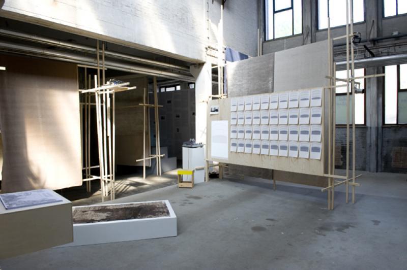
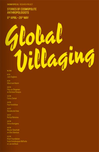
Global Villaging |
Exhibition, PUBLICATION and text |
CURATOR, editor, WRITER and PRODUCER |
art |
Glocalism and artistic reports |
wonderer |
self-commissioned |
English and Dutch |
7,5 |
8 |
8 |
Stories of Cosmopolite Anthropologists
Come and experience personal exchange in a globalizing world: a post-exotic transcultural play of positions! Various Dutch and Flemish artists tempt us to experience a present-day cultural economy through experimental visual and literary narratives, acquired during exchanges with locals from China to Bahrain, from the Argentinean pampas to Ethiopia!
With: Allard van Hoorn, Fanny Zaman, Filip van Dingenen & Barbara Pereyra, Khatt Foundation: Huda Smitshuijzen AbiFarès & Jan de Bruin, Jack Segbars,Paul Hendrikse, Richtje Reinsma, Rieneke de Vries,Simon Kentgens, Wouter Osterholt & Elke Uitentuis.
The transcultural dynamic of Global Villaging redefines several cultural anchors. First, the dominance of the Western concept of culture has expired. We are dealing with a culture in crisis. On the one hand, it is conservatively looking for support in the recently acquired anchors of human rights and the welfare results of the capitalist liberal democracy. On the other hand, it experiences the results of a faltering nutrition of these comfort zones. The reality of the Global Village completely ignores the ethical standard which supported the way in which we practiced our culture.
Thus, also the Western, modernist concept of culture has collapsed as cultural standard. The beauty and composition applied by an avant-garde are no longer the supporting forces for cultural change. On the new transcultural stage, art has to assert its actual influence in the social-economic sphere. This cultural production manifests itself transnationally, between people, and nourishes new social-economic configurations.
Transcultural dynamic is non-hierarchic and fragmented. It moves among the masses. It goes against the dominant opinions which consider global cultural development to be a universal process of assimilation and hybridization. It is rather rooted in media specificity and the interlocutor.
But then is it possible to discover a logic in its communication structure? How is the Global Villager shaping his identity, as an individual and as intercultural actor? A number of themes present themselves: economic, religious, politico-military, and social. Like Global Villagers, the artists in this exhibition move within this dynamic.
Curator/editor: Freek Lomme
Exhibition design: TTTVO in collaboration with Anthony Kleinepier
Publication design: Eric de Haas and Ana Baliza
Production: Freek Lomme and Ellen Zoete
Exhibition Photography: Fieke van Berkom
Sponsors: Leeuwerik (wood) and Leo Schellens (textile)
Funded by: Mondriaan Stichting and Municipality of Eindhoven
DOWNLOAD
the publication and all texts (English section at the end) here
The publication used to be available through Onomatopee, but after splitting with Onomatopee, Onomatopee did not want them anymore and whatever is left is rather lost unfortunate. But you can get the publication through me if you want.

entrance exhibition Photography by Fieke van Berkom
left: Wouter Osterholt & Elke Uitentuis right: Allard van Hoorn Photography by Fieke van Berkom

Jack Segbars Photography by Fieke van Berkom

Khatt Foundation: Huda Smitshuijzen AbiFarès & Jan de Bruin Photography by Fieke van Berkom
Graphic Design by Eric de Haas i.c.w. Ana Baliza
Apr2008 |
Multitasking |
text |
Writer, reviewer |
art |
forms of multitasking via activating practices |
mapping and wondering |
De Kantlijn |
Dutch |
7 |
7 |
6,5 |
About forms of Multitasking, via activating practices given by the exhibition Multitasking in the Stedelijk Museum s’Hertogenbosch (SM’s).
De tentoonstelling werd georganiseerd in samenwerking met de Neue Gesellschaft für Bildende Kunst (NGBK) Berlijn en reisde na Berlijn en ‘s-Hertogenbosch door naar de Overbeck-Gesellschaft in Lübeck (D) en La Filature in Mulhouse (F).
Deelnemende kunstenaars waren Cory Arcangel, Nathalie Bruys, Peter Fischli/David Weiss, Irène Hug, IEPE, Suchan Kinoshita, Bernadette Klausberger/Jana Krause/Hannah Stracke, Constantin Luser, Warren Neidich, Yves Netzhammer, Stefan Panhans, Adrian Piper, Bill Shackelford, Lars Siltberg, Lars Tunbjörk, Marius Watz/Christine Wolfe.
DOWNLOAD
text in Dutch, as published in De Kantlijn
Mar2008 |
Surreal |
exhibition, book and text |
Guest curator, writer |
art |
surreal settings |
playfull |
bART |
Dutch |
6,5 |
7,5 |
7 |
Organised by bART
Graphic design by Attak
locatie
Parkeergarage Paleiskwartier Verdieping-2 ’sHertogenbosch
Informatie
Surreal gaat over de suggestie van een nieuw of ander leven, anders dan die wij in ons dagelijks leven ervaren. Een andere werkelijkheid die verder lijkt te reiken dan onze waarneming, een wereld waar het herkenbare een nieuwe identiteit krijgt, waar alles mogelijk lijkt. Dit alles in een ondergrondse parkeergarage waar een onzichtbaar labyrint zich optrok in het duister.
Deelnemende kunstenaars
Tjeerd Vrielink, Marianne Lammersen, Esther Jacobsen, Siebe de Boer, Cassander Eeftering Schattenkerk, Francois Salden, Reinier Kranendonk, Violet Cleo van Tienhoven, Sanne van Gent, Tim Rutten, Helgi Kristensson, Daniela Bershan, Ieke Trinks en Vincent Dams
DOWNLOAD
Text catalogue in Dutch

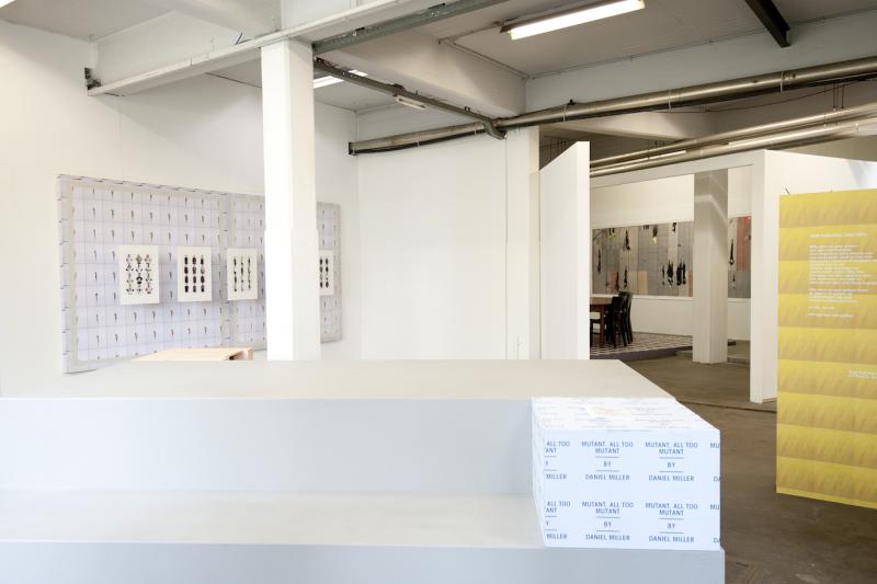
Sep2012 |
Who told you so?! |
Exhibitions, publications, texts |
Curator, editor, producer |
Art |
Social ambivalence and visual ambiguity |
mapping, playing |
Onomatopee |
English |
8 |
8,5 |
8 |
Stories of collectivity vs. individual narrations
Who told you so?! is the 2012 Research project year-program featuring four group shows, delivering four chapters of social ambivalence though ambiguous images that take us to another level of understanding.
The truth vs. government, organisation, scene and family: about the secularisation of stories of social cohesion through individually processed hybrid flows of information.
Living through ambivalence and searching for cohesion: this is where we pair up the increasingly hybrid character of the points of reference by which we narrate our personal identities, together with our need for stories that allow us to engage in social cohesion (government, organisation, scene and family) and proceed to confront these traditional social structures.
This project assembles voices that establish focussed spheres of ambiguity, playling our mood boards, on the level of government, social organisation, scene and family. On these stages, we are challenged by texts and images to approach the narrations of our identity and stories of our cohesion. In four group shows that function as chapters Onomatopee attempts to take an in-depth look into the story and the narration: our individual play with sources of information and the desire for social cohesion.
Curator/editor: Freek Lomme
Exhibition design: Dave Keune
Graphic design: In Edition
Made possible thanks to: Municipality of Eindhoven and Mondriaan Fund
PUBLICATION
If uncertainty is the greatest common denominator, ambiguity is a means to unite the parts….
The concentrated gestures and scenarios in this book offer surprising and revealing perspectives of the conditionality of individual freedom within the social relations in which we find cohesion.
Forty artists, ten writers and four poets use their astute authors’ skills to offer a thought-provoking ambiguity. This book will offer conformists an insight into the restrictions of freedom they are responsible for, will inspire freethinkers who feel they lack something and try to find a position, and it will provide recognition to those who feel oppressed.
isbn: 978-94-91677-04-5
softcover with inserts and extra’s!
Size: 6,49 x 9,05 inches / 165 x 230 mm
Book has 336 pages, the reader with Patricia reed’s text has 64 pages, the one of Daniel Miller has 54 pages.
Over 600 images in color and over 200 in B/W
Graphic design:
In Edition
Curator/editor:
Freek Lomme
DOWNLOAD
Introduction text written by Freek
EXHIBITIONS
WHO TOLD YOU SO?! #1 Truth vs. Government
“What we need is Star Peace and not Star Wars” – Mikhail Gorbachev
On show until May 27th
thursday - Sunday 13:00-17:00
with: Aleksandra Domanovic (SI / DE), Foundland (NL), Gokce Suvari (TR), Group R.E.P. (revolutionary experimental space) (UA), Lieven De Boeck (BE), Mauro Vallejo (ES), Monika Löve (EE / UK), Slavs and Tatars(INT)
+ project specific texts by Dr. Jonathan Short and Matteo Lucchetti
+ project specific poem by Joost Baars
This first chapter of our year-long Who told you so?!program focuses on the story of Truth vs. Government. The stories that construct our national identities become arguable as they are overrun by an extreme flow of global data exchanges via Internet, social media, travel and migration. Humanity has become global as the stories we deal with on a daily basis arise from everywhere across the globe. We generate our own narration through these in an eclectic manner, intuitively. Identities are configured from the bottom-up, throughout the lively narrations of the multitude. Meanwhile national and supranational governments attempt to offer identities in which we can find cohesion, just as the “European” storyline is trying to postulate something of a Jewish/Christian/humanist body.
This first chapter takes on the visual and textual narrations that are able to question the official story and help us to produce our individual narrations. They provoke us to doubt the context in which the story of the government presents itself, and allow for speculation and new relationships through which we are able to playfully recount the configuration of the narrative. It stimulates us to go beyond our own pleasantly eclectic narratives as well as the constant stream of “official” stories.
Downloads:
Persbericht in Dutch
Press release in English
WHO TOLD YOU SO?! #2 Truth vs. Organisation
“The trust of the innocent is the liar’s most useful tool” - Stephen King
Opening Friday 8 June, 20:00
On show 9 June - 15 July
This second chapter of Who told you so‽! focuses on the story of Truth vs. Organisation. Stimulated by and parallel to the rise of mass media such as newspapers, radio and television in the early 20th century, people started organising themselves socially, beyond the boundaries of villages and countries. In the Netherlands this resulted in a compartmentalised society, administered top-down by the leaders of the different compartments and regulated by the union representatives, broadcasters the church and so on.
With: Azra Aksamija (INT), Elena Bajo (INT), Hank Willis Thomas (US), Heath Bunting (UK), Jacqueline Schoemaker (NL), Job Janssen (NL), Tracy Mackenna & Edwin Janssen (INT), Paul Segers (NL), and Anikó Loránt and Kaszás Tamás (HU).
+ project specific poem by Serge van Duijnhoven
+ project specific texts by Markus Miessen, Alfredo Cramerotti and Wim Langenhoff
+ project specific publications by Jacqueline Schoemaker (graphic design by Arthur Roeloffzen) and Elena Bajo (graphic design by Novak)
Regardless of the religious secularisation that took place, these models of organisation were able to maintain a base – and therefor power – by slightly adapting the range of their production. As social organisations, they found a new economic basis to empower this, by altering their products from class and religion based into a market based story, which emerged in a left and right political spectrum. At this time, due to the fading of European and globally cultural and economic borders and the emergence of new economies and media, these systems begin to erode internally. The new calls for organisation are conservative or progressive. This overlooks the economic management of the “left” and “right” culture, which should be shaped through public and private investment. There is no body that can provide a basis for the new administration.
What is remarkable is the growing gap between younger generations who are open to the necessary risks of our globalised world, and the older generations who are afraid to lose their accomplishments, as can be identified in the divide between the young and the older segments of labour unions; for example in Spain, where the youth has no future, or in the Netherlands, where a grey wave of elderly people is likely to become a heavy financial burden.
Within this context, the increased presence of purely commercial broadcasting stations – that are dominated by the state in Italy, but unprecedented in the Netherlands until the early 90’s – created a diffuse and distrustful landscape for social recognition and identification, thus giving power to a growing mistrust These commercial platforms do not hold any social representation; they are a body without spirit. Meanwhile, new media add another layer of confusion, allowing everyone to get their voice heard and use their own sources: from the populist and anti Eastern-European Freedom Party blogs, to blogs by Occupy groups. And what did Occupy represent anyway? Is it the post-political mass of undecided voters? Is that the definition of the multitude...?
WHO TOLD YOU SO?! #3 Truth vs. Scène
“Accent your positive and delete your negative” – Donna Karan
Opening: Friday 7 September, 20:00
8 September – 28 October
Special opening hours during Dutch Design Week 2012 (20-28 October)
With:
Boudewijn Bollmann (NL), Daan Samson(NL), Exactitudes: Ari Versluis & Ellie Uyttenbroek (NL), Gillian Wearing (UK), Julian D’Angiolill (ARG), Katrin korfmann (NL), Ken Lum(CAN), Marjolijn Dijkman (NL), Matthijs Bosman (NL),Mireia c. Saladrigues (ES), Serge Onnen (NL) Šejla Kamerić (BA).
+ project specific poem by Krijn Peter Hesselink
+ project specific text by René Gabriëls and by Daniel Miller
This third chapter of the year-long Who told you so?!program focuses on the story of Truth vs. Scène. The fruits of our “social life” are disguised: not as social but as narrow-minded. With the advent of the experience economy and the increased complexity of our specialized society, we have found cohesion with our “friends:” friendly blogs and nice mood boards that match our supposed ideological identity. We are able to live the lives we want to live, as long as we do not harm others. We can hide online or behave ourselves offline, as long as our roads are paved. Again, it is the economy that pushes us out of these comfort zones, when the results and production of our labour, leisure and luxury are revealed as a fragile façade. What is our identity, on which basis is it constructed and how can we sustain our dignity beyond the normal routes?
Precisely within the framework of the Dutch Design Week, a week full of tempting things we always like to rave about, this project questions the course, structure and results of this scène.
WHO TOLD YOU SO?! #4 Truth vs. Family
“What must it be like for a little boy to read that daddy never loved mummy?” – Princes Diana
Opening November 9th, 20:00
Running from November 10 - ?
open thursday-sunday 13:00-17:00
With:
Ani Eloyan (NL), Erwin van Doorn & Inge Nabuurs (NL), Erika Rothenberg(US), Gunes Terkol (TR), Jans Muskee (NL), Keren Cytter (IL), Melanie Bonajo (NL), Nadine Byrne (SE), Pedro Bakker (NL), Ronald Ophuis (NL),Sebastian Friedman (ARG).
+ Project specific poem by Anne van Amstel
+ Project specific texts by philospher Leon Heuts and curator Annie Fletcher
This fourth and last chapter of our year-long Who told you so?! program focuses on the story of Truth vs. Family. We are familiar with our families but do we know them personally, do we know them deeply? We are close, but do we come close to the sources of our neighbours’ deep wishes and needs? Can we rely on “the most natural social context” and where does the emancipation stand that takes place indoor, with the revival of the traditional housewife, twittering children and fathers imaginatively undermining the traditional family throughout their private pages. What is actually written in the emancipated “official” story, in which we all keep ourselves together?
Can we emancipate as a family, now that communicative means threaten to take down this traditional structure? Now that the ever-emerging new media, through which the “new” manifests itself in family life, have countered the voice of the father? What do we know about our family members? Which resources of needs, desires and inspirations are really at stake? How do we build the closest social desires of nurture and love, confidence and trust? Where are we when it truly comes down to ourselves?
Now that the winter months and Christmas are coming, we must come together in mutual respect and take into account the incredible nature of the source of our daughters and mothers, brothers and fathers, uncles and aunts, grandmothers and grandfathers. Precisely now that the winter months and Christmas are coming, we must come together in mutual respect and take into account the unimaginable nature of our mothers and daughters, brothers and fathers, uncles and aunts, grandmothers and grandfathers.

#1 overview exhibit Photography: Fieke van Berkom

#2 Work by Elena Bajo (left), Anikó Loránt and Kaszás Tamás (glimpse right). Photography by Fieke van Berkom

#2 Work by Hank Willis Thomas in preperation Photography by Freek and his phone...
#3. Photography by Studio Clack.

#4 left to right: Pedro Bakker, Sebastian Friedman, Ani Eloyan and Jans Muskee. Photography by Studio Clack.
May2008 |
Bevindingen door kijkgedrag |
Text |
writer, reviewer |
Art |
Karin van Pinxteren |
mapping |
De Kantlijn |
Dutch |
7 |
6,5 |
7 |
On Karin van Pinxteren, in the aftermath of het publication titled Kurt’s Zimmer
Download
Dutch text as published in De Kantlijn
Aug2006 |
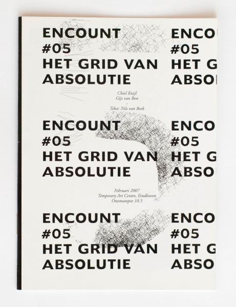
Encount |
Exhibitions and publications |
CurATOR, editor and PRODUCER |
art |
art in pairs |
mapping, catalyzing |
Self-commissioned |
Dutch and English |
7 |
7 |
7 |
Encount consisted in a serie of five exhibitions in which two artists with a similarity in theme, aesthetic style or approach presented their work in the same room. Encount required public reaction, stimulated by a selected author. The Encount series started through real subjects and ended in abstraction.
Project + publication in series of five:
Each exhibition is documented in a small publication.
Encount concisted in a serie of five exhibitions in which two artists with a similarity in theme, aesthetic style or approach presented work in the same room. Encount required public reaction, stimulated by a selected author. The Encount series started on real subjects and ended in abstraction.
Encount # 1: Public in media
Artists: Ferdinand Maks & Gerco Lindeboom/
Danny Jeroense
Writer:Michiel van Opstal
Encount # 2: Public view
Artists: Paulien Oltheten &
Michiel van der Zanden
Writer:Stijn van de Vyver
Encount # 3: Aesthetic politics
Artists: Maurice van Daalen & Pierke Hulshof
Writer:Freek Lomme
Encount # 4: Applied abstraction
Artists:Jeroen van Bergen & Gijs Pape
Writer:Huib Haye van der Werf
Encount # 5: grid of absolution
Artists:Chiel Kuijl & Gijs van Bon
Writer:Nils van Beek
Curator/project manager/editor: Freek Lomme
Project Assistance & photography: Tessa Peeters
Graphic design:Remco van Bladel
Made possible thanks to:Municipality of Eindhoven, NBKS/ Province of Brabant
PUBLICATIONS
5 booklets, to be ordered seporateley
stabled
12 pages per booklet
Full color
Printed at Rob Stolk
The publications used to be available through Onomatopee, but after splitting with Onomatopee, Onomatopee did not want them anymore and whatever is left is rather lost unfortunate. But you can get the publication through me if you want.


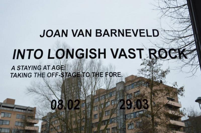
Feb2014 |
into longing, vast rock |
Exhibition, publication, text |
curator, editor, producer |
art |
The visual redistribution of rock-guts |
poetic |
Self-commissioned with Joan van Barneveld |
English |
8 |
8 |
8 |
A staying at age: taking the off-stage to the fore.
Sehnsucht, part and parcel of alternative pop culture, experienced by many teenagers during the time their bodies are wriggling under their skins, but usually left behind when coming of age, is Joan’s expressive theme.
Through collaboration, Onomatopee and Joan will develop new work and reflect on its territory. This becomes visible in a solo exhibition in the format of a studio space setting at Onomatopee, which will tour via Los Angeles gallery Paul Loya. At Onomatopee, events like talks and music sessions will rock the foundations and stimulate outcomes. A publication will be launched at the end of the working period, condensing it and taking it beyond the confines of the residency.
Joan van Barneveld plays the deep desires and visual processes of pop culture. His earlier work energises the visual poetics of grunge culture, the 90s revitalisation of punk’s counterculture, into the present. In paintings made up in black, he projects iconic images of this culture, both on stage and elsewhere. In these, people remain absent, but the feedback of the intensity of this cultural movement is ’condensed’ behind a veil of black layers. By using this technique, the longing is placed behind an optical membrane, which does not suppress it as much as situates its introverted grandeur behind the curtain constituted by this dark skin.
In recent developments within his work, the energy shifts to a deeper, romantic longing for an essential horizon, narrated in a visually wider manner. He continues to work with blacks and depicts cultural spaces without humans, to process pictures from the public or private sphere releasing a similar charge as when they are ‘condensed’ by shading. Thus, the development of his oeuvre is also a figured and narrated coming of age, evolving the intensity of the original grunge energy he used. The work becomes more layered: as a spectator you can explore narrative links within series, diptychs or triptychs. This enables the evolvement of a temporal transfer of the intensity in his work over a longer period of time, becoming more layered and more powerful in the adult world where positions are more and more fixed and iconic totems possess less strength: the flatness of pop becomes a wide desolate opening into the rock which underlies it.
Fuck pop, go poetry.
For further information download the handout,
also available in riso-print,
here
Curator / editor: Freek Lomme
Graphic design by Brusatto
Text by Freek Lomme, Rene Gabriels and Jan Tumlir
Made possible thanks to the generous support of the municipality of Eindhoven and the Mondriaan Fund

work in progress

work in progress
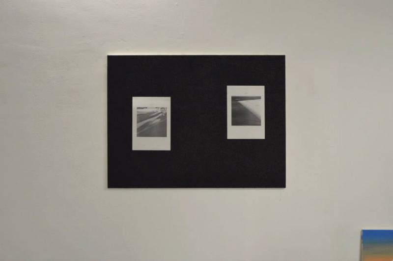
work in progress

Exhibition


May2014 |
Datenwelt und Alltagsroutine / The data world and daily theatre |
text |
critic |
art |
Exploring a living history of orderliness between nature and culture through the work of Esther Stocker |
mapping |
Kunstraum Dornbirn |
English and German |
7,5 |
8 |
8 |
Die Dinge beginnen oft mit einer Renaissance... erkunden das Moderne… treten in eine immaterielle Leere ein … und leben schließlich in der Matrix … tatsächlich: wir sind hybrid und daher pluralistisch.
- Die Erkundung der lebendigen Geschichte der Ordnung zwischen Natur und Zivilisation durch das Werk von Esther Stocker
Things often start with a Renaissance… and explore the modern… enter an immaterial void… end up living in the matrix… indeed: we are hybrid and therefore pluralistic.
- exploring a living history of orderliness between nature and culture through the work of Esther Stocker.
Die Künstlerin Esther Stocker überrascht die Besucher des Kunstraum Dornbirn mit riesigen, teils hängenden, teils liegenden Papierknäuel- Gebilden. Der Titel »Zweifel an der Geraden« ist dabei durchaus wörtlich zu nehmen. Mit ihrer eindrucksvollen Rauminstallation verwandelt sie die ehemalige Montagehalle in ein Experimentierfeld sinnlicher Wahrnehmung, indem sie gewohnte Ordnungen bewusst verändert, stört und hinterfragt.
Die Reduktion auf schwarz-weiße Rasterungen ist charakteristisch für Esther Stocker und findet sich sowohl in ihren malerischen als auch installativen Werken. Die Raster sind dabei Ausgangspunkt und sich selbst genügendes Element ihrer Bild- und Wahrnehmungswelten. Das Projekt im Kunstraum Dornbirn stellt die Weiterentwicklung ihrer neuesten Werkserie dar.
Esther Stocker wurde 1974 in Schlanders / Italien geboren. Sie studierte an der Akademie der Bildenden Künste in Wien, der Accademia di Belle Arti di Brera in Mailand und am Art Center College of Design in Passadena. Sie lebt und arbeitet in Wien.
DESIGNER
saegenvier, Dornbirn
PUBLISHER
Kunstraum Dornbirn, Thomas Häusle
TEXT
Freek Lomme
Download Deutsch
Download English
INTERVIEW
Thomas Häusle with Esther Stocker
German/English
56 pages
Numerous ills. in color and b/w
ISBN 978-3-86984-099-4
Order the book here
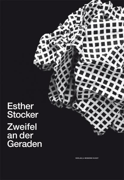
© Verlag für moderne Kunst
Sep2016 |
Artist-Run Europe - Practice/Projects/Spaces |
text |
writer |
art |
Dutch independent art spaces |
descriptive |
Pallas Projects |
English |
8 |
? |
? |
Freek contributed a text on Dutch independent art spaces
Download text HERE
or
Buy book HERE
Part how-to manual, part history, and part socio-political critique, Artist-Run Europe looks at the conditions, organisational models, and role of artist-led practice within contemporary art and society. The aim is to show how artist-run practice manifests itself, how artist-run spaces are a distinctive and central part of visual art culture, and how they present a complex, heterogeneous, and necessary set of alternatives to the art institution, museum and commercial gallery.
Edited by Gavin Murphy & Mark Cullen (Pallas Projects Dublin)
Designed by WorkGroup, Dublin
Contributors: Jason E. Bowman, AA Bronson, Noelle Collins, Valerie Connor, Mark Cullen, Céline Kopp & Alun Williams, Joanna Laws, Freek Lomme, Megs Morley, Gavin Murphy, Gavin Wade and Katherine Waugh.
In a self-reflexive, critically questioning process, contributions discuss and analyse areas such as: What position do artist-run spaces occupy within the field of contemporary art today? Should they stand in opposition to or in parallel to other art-world structures? How is value ascribed to these often transitory practices, and is this value recognised within the field? How are these spaces organised? Can artist-run spaces develop and be sustained without the need to institutionalise? What do artist-run spaces add to the ecology of the civil society? What can we say about future (or hoped for) trajectories?
Such a publication is timely and unique, with case studies of spaces and projects: Triangle France, Transmission Gallery, Pallas Projects/Studios, Eastside Projects, Catalyst Arts, Pink Cube, Secession, Dienstgebaeude, Supermarket, 126 Artist-led Gallery, and The Artist-led Archive; and an expansive and detailed index of artist-run spaces in Europe. It will seek to develop and encourage discourse on the subject within the wider field of contemporary practice, be a source for academics and students, and act as a practical tool for those running or wishing to set up artist-run spaces.

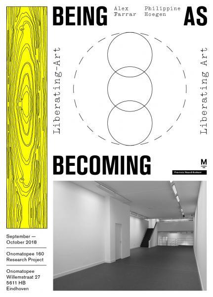
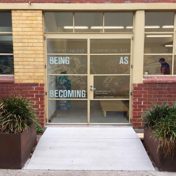
Apr2018 |
being as becoming - liberating-art and/or liberating art |
exhibition and publication |
curator, editor |
art |
qualities of artistic production in our life |
critical practice |
self-commissioned |
English |
pending |
pending |
pending |
# 1 / 2 – Bus Projects Melbourne April 11 – May 5
Opening Wednesday April 11, 6-8 PM
Featuring artists Sanne Vaassen and Tim Breukers
The artists will be available for conversations every Wednesday from 6 PM.
# 2 / 2 – Onomatopee Eindhoven September 7 – October 7
Featuring artists Philippine Hoegen and Alex Farrar
The artists are available for conversations every Friday at 6 PM.
being as becoming: liberating-art and/or liberating art is a collaboration between public gallery and publisher Onomatopee (NL) and artist-run space Bus Projects (AU). The project integrates notions of ‘the contemporary’ and aims to assert the added qualities of artistic production in our life. Does art liberate and/or should it be liberated?
In life, we operate with responsibility in our surroundings. As we progress from the here and now of our contemporaneity, we encounter various conditions by chance, conversations, technical opportunities and more. Artistic practice takes off from this practice based responsibility and releases different ensembles of conditions along the organising principles of various creative practitioners, which by offering new expressions bring awareness within the on-going newness of contemporary life and culture.
Fore-fronting this direct contact with our surroundings from within the artistic practice, this project will contest the moral legitimacy of the ethics of modernism in arts and culture, will economically contest the under the invisible hand of monetized artistic circulation, will contest the traditional autonomous viewpoint of artistic practice, and will discuss the liberal agenda of cultural civilization at large.
Devised by Onomatopee’s founding director Freek Lomme in association with Bus Projects director, Channon Goodwin, this endeavour vibrantly incites the independent art spaces and their inhabitants along the living qualities of the practice itself. Pushed by the premises of a thought-experiment, the project will promote dynamics over fixedness, and generate responsible and progressive imagination along various conditions involved, leading up to a more conclusive bundling in the eventual publication.
Both exhibitions will feature open-studio or residency-like situations, which will be documented in a logbook/diary of causes and consequences written by local critics who follow the artistic process and will be visually recorded and shown by means of a stop-motion camera. At Bus Projects Dutch artists Sanne Vaassen and Tim Breukers will inhabit the space and engage conditions on site. Breukers embraces chance and opportunity in an outgoing, all-embracing manner that challenges ideas on the causality of wonder and opportunity, while Sanne Vaassen gives prominence to the motion of the unremarked, engaging with the fundamental, implicit existence of the natural elements that surround us. The artist will install themselves during the opening of the exhibition and de-install / pack during the finisage, stressing the ongoing dynamics of production and life throughout the show. During both exhibitions visitors can engage in an ongoing on-site correspondence with critics/lecturers Sebastian Olma (writing from NL) and Johanna Drucker (writing from the US). Graphic design for the project will be delivered by Pierre Martin (FR); exhibition design by Dave Keune (NL).
– Premises –
- if we understand everyone as an amateur in the dynamic face of progressive and experimental contemporaneity;
- If we understand contingency of opportunity a factor of artistic production;
- if we understand art as a dynamic service, rather than a static object only to be judged through a density of texts;
- if we understand the artistic rendition as a key to understanding art as a push for life;
- if we position the poetic momentum as a dynamic factor in engaging our subjective momentum;
- if we understand this dynamic as an open source of possibilities, rather than a paternalistic causal narrative;
>then how should the viewer engage, how should the art world deliver and how should artists position themselves in this arena?
Credits:
Curator, editor and producer: Freek Lomme
Co-curator at Bus Projects / advisor: Channon Goodwin
Graphic design: Pierre Martin
Exhibition design: Dave Keune
Artists: Sanne Vaassen, Tim Breukers and more to follow
Confirmed contributing critics and writers: Sebasian Olma, Johanna Drucker
Made possible thanks to the Mondriaan Fund, the province of Noord-Brabant


Sep2005 |
Beeldende blikken frissen mensgeschapen ruimte op |
review |
critic |
art and architecture |
artistic value in architectural space |
describing |
Tubelight |
Dutch |
6 |
6 |
6 |
On the artistic, achtectonic interventions in the exhibit SPACE – NOW AND THEN by Fundament Foundation
DOWNLOADLINK
Text here
Jun2008 |
Matter Materialising |
Interview |
writer, reviewer |
art and craft |
Navid Nuur |
friends’ in quest |
Stroom Den Haag |
Dutch and English |
7 |
7 |
7,5 |
Download:
Apr2015 |
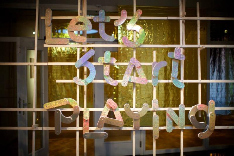
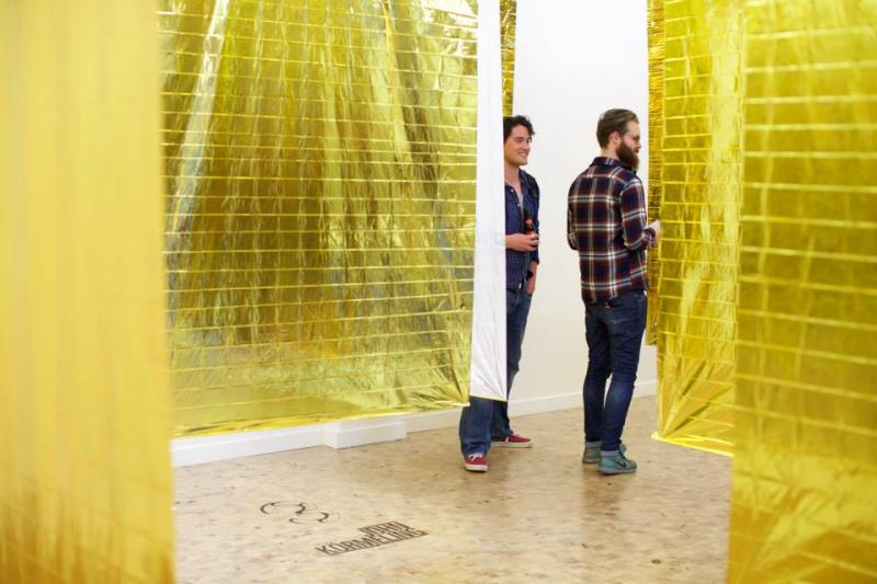
Let’s start playing the game! |
Exhibition and publication |
curator, editor |
art and design |
on cooperation, free will, free space and the mechanics of our sociability. |
playfull |
De Brakke Grond |
Dutch and English |
8 |
9 |
8 |
on cooperation, free will, free space and the mechanics of our sociability.
Participating artists/designers:
Heyheydehaas (NL), Julien Carretero (FR/BE), Thomas Lommee (BE), Uglycute (S), Mireia c. Saladrigues (SP), John Körmeling (NL), Ryan Gander (UK), Aurélien Froment (FR).
Contributing authors: Petra Van Brabandt, Paul De Bruyne, Florian Schneider, Rene ten Bos and interviews with Slava Kozlov by Harvey Herman and Arnon Grunberg by Laurence Scherz.
The publication used to be available through Onomatopee, but after splitting with Onomatopee, Onomatopee did not want them anymore and whatever is left is rather lost unfortunate. But you can get the publication through me if you want.
A project by De Brakke Grond Amsterdam.
Life is a game – but who are the other players? Usually, we play with our own kind of people, people from our own ‘tribe’. Within our own group, we are familiar with the ambitions, with those factors that contribute to success, and with the winners. Things don’t get really exciting until we move into a different field of play, expand our territory onto other gaming boards, admit new players or different elements.
In the exhibition Let’s Start Playing the Game, both artists and audiences will re-invent the form and rules of this party game. If really we want to stimulate innovation and open dialogue, it’s no use just playing the game by the rules. A certain degree of anarchy and flexibility in relation to the rules is necessary to stimulate creativity and co-creation.
Heyheydehaas, Julien Carretero, Thomas Lommee and Uglycute have designed four new games for this exhibition on the basis of their expertise in the creation of relevant, stimulating situations in which production, dialogue and wonder can come together. The games are like satellites in this universe, the entrance to and routes through which have been created by designer Anthony Kleinepier.
In addition, existing works with a playful component will be shown by artists Mireia c. Saladrigues, John Körmeling, Ryan Gander and Aurelien Froment. Each taking its own course and creating its own perspective – but all offering possibilities to follow different paths.
Visitors will be challenged to take part in the games, both to learn and to enjoy: to play with ambitions, social needs and identity on the basis of forms of production and interaction. Welcome to this world, in which every game can be passed through resolutely, and with other players, familiar and unfamiliar. This playful experience is a real challenge. / Let’s start playing the game!
Credits:
Curated by Freek Lomme in collaboration with Veerle Devreese for the Flemish art centre ‘De Brakke Grond’ Amsterdam, The Netherlands, hosted by Onomatopee.
Spatial design exhibition: Anthony Kleinepier
Graphic design: Strange Attractors
Made possible thanks to the generous support of Stichting DOEN and the Flemish government


Mar2018 |
the Ghost of Weaving |
exhibition and publication |
curator / editor / writer / art-director |
Art and design |
patterns |
exploring |
self-commissioned |
English |
7,5 |
8,5 |
8 |
- considering life’s productive patterns through the work of handcraft masters operating at the edge of abstraction
Opening April 15 2017, 15:00
Book Launched March 9, 2018
Featuring Elisa van Joolen, Esther Stocker, Freek Lomme, Hansje van Halem/Tracy Widdess, Har Sanders, Koen Taselaar, Maria Hedlund, Sigrid Calon, Timon van der Hijden
ISBN: 978-94-91677-73-1
Hardcover, 150 mm x 220 mm standing / 6 x 8,5 inches
32 pages / 16 viewing pages leporello alike thing with images of the works and the show
plus two smaller 32- page self-cover booklets featuring two texts plus some images, all glued inside.
The publication used to be available through Onomatopee, but after splitting with Onomatopee, Onomatopee did not want them anymore and whatever is left is rather lost unfortunate. But you can get the publication through me if you want.
The textures of our culture are reflected within the patterns we produce. Sometimes the surface that hosts the pattern is more slippery than imagined, or the pattern appears to have been too unstable in the first place. As the ruler is held exclusively in the hands of man, why then is the pattern so tempting and why do we give into it time and time again? Extra more, as productive mastery is channelled through ever more abstract processes, digital tools and semi-finished particles, don’t we lose touch with the fundamentals of the pattern produced?
This project concerns the visual poetry that is released within the woven patterns’ ambivalence between fixation by rule and the dynamics of life; on the fracture of materialistic realism and the limits of the power we hold in our hands.
With this endeavour, we take a step back into the mastery of patterns in craft. We will balance this by looking back into the history of ideas involving patterns as visual motives to culture, and dive into our experience of patterns.
The exhibition surveys the visual poetry of various handcraft masters dealing with the imaginative fabric of patterns and surface. The show will furthermore offer speculation upon the phenomenon of the visual pattern as an identifier, along the thoughts of Onomatopee’s Freek Lomme.
Inspired by the works of various artists who have fascinated him for years now, he wants to re-imagine our capacity to understand the dichotomous life between the pattern as an immanent yet hidden cultural motive, and the pattern as texture; which through transcendence, we can actually reach out for. We only hope he’s chasing something he can hold on to within this spectral subject.
This project concerns the visual poetry that is released within the woven patterns’ ambivalence between fixation by rule and the dynamics of life; on the fracture of materialistic realism and the limits of the power we hold in our hands.
With this endeavour, we take a step back into the mastery of patterns in craft. We will balance this by looking back into the history of ideas involving patterns as visual motives to culture, and dive into our experiences of them.
Curator and editor: Freek Lomme
Graphic design publication: Benjamin Critton
Assistant curator: Josh Plough
Made possible thanks to the generous support of all participating artists, the Mondriaan Fund, the province of Noord-Brabant and dr. julius | ap gallery Berlin.


temporary overview of the show


May2017 |
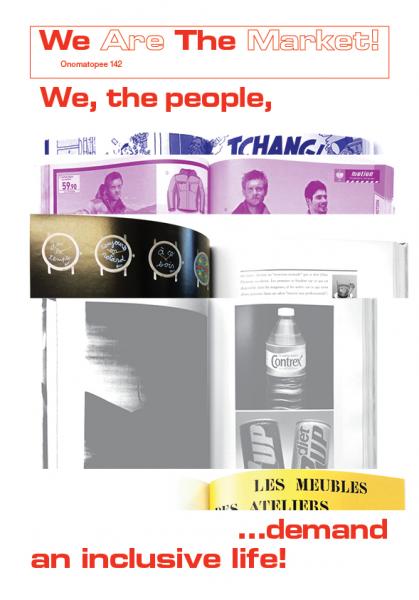
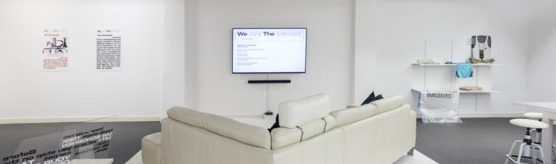
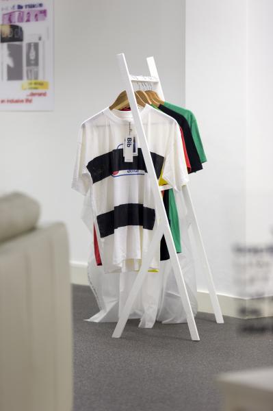
WE ARE THE MARKET! |
commissions, exhibition and publications |
CURATOR / EDITOR / WRITER / ART-DIRECTOR |
ART AND DESIGN and more |
activating the capitalist commons |
subversive |
self-commisssioned |
English |
8 |
9 |
8,5 |
‘WE WANT INCLUSIVITY, AND WE ARE HERE TO TAKE IT!’
May 2017 - january 2018
The publication used to be available through Onomatopee, but after splitting with Onomatopee, Onomatopee did not want them anymore and whatever is left is rather lost unfortunate. But you can get the publication through me if you want.
Onomatopee, organisor of this project, has a space for free imagination in the heart of Eindhoven. Here they provide their services free of charge - partially paid for by the spokesperson of the people’s sovereignty - yet hidden behind all the commercial force.
As an alternative, focused on public service of the interestless imagination as exclusive to the arts, Onomatopee goes onto the street in action against mollycoddling and in defence of an inclusive world: in ultimate stimulation of possibility. They make everybody question their role in our collective responsibility regarding public culture. Now the focus is on target audiences, life in bubbles alienates us and public space is becoming increasingly exclusive.
The centre of the city is the place for meeting and consumption. That is where everyone goes, that’s where our culture is consumed and lived. However, the offering there is limited, and not a lot is allowed. It’s not everybody’s space, but the space of the majority. Even for that majority, there is no free choice, so it is also place to the silent majority. Meanwhile, every human being wants an inclusive culture, with free offering and free access. Our culture turns out not to be free, but forced.
With this project we ask what could be on offer, and what perhaps ought to be. Many free-thinkers such as designers, philosophers, journalists, artists and others take space to explore this. In short: WE ARE THE MARKET! calls out to freedom in the capitalist commons, within the cultural production of the highstreet.
Our culture is our responsibility: we demand inclusivity!
READ THE MISSION STATEMENT FULL OF CONFUSION CONTEXTUALISED HERE.
First achievements have happened and are on show, more are to follow.
Featuring: Harmen de Hoop, Snodevormgevers, David Blamey, Nolwenn Salaun, Jennifer Moon & Laub, Su Tomesen, Martin Krenn, MG&M Collective (Mosab Anzo, Gil & Moti), the Mona Lisa’s, Grupo Etcétera, The Temple of Tease, Vanessa Brazeau, Toine Klaassen, Jasper Griepink, Apparatus 22, Everyday criticality, Cindy Moorman and others.
The theory-sparked bartenders, offering enlightening conversations over heavy drinks, include Robert-Jan Gruijthuijzen, Michel van Dartel, Lietje Bauwens & Wouter De Raeve, Rogier Brom, Berit Fischer, Dirk Vis, Petra Van Brabandt and others yet to be announced!
Curator / editor: Freek Lomme
Assistent curator / editor: Josh Plough
project assistants: Lucy Rose Nixon and Mook Attanath
Graphic design: Bart de Baets
Made possible thanks to the generous support of the Province of Brabant, the Mondriaan Fund and the Creative Industries Fund NL.

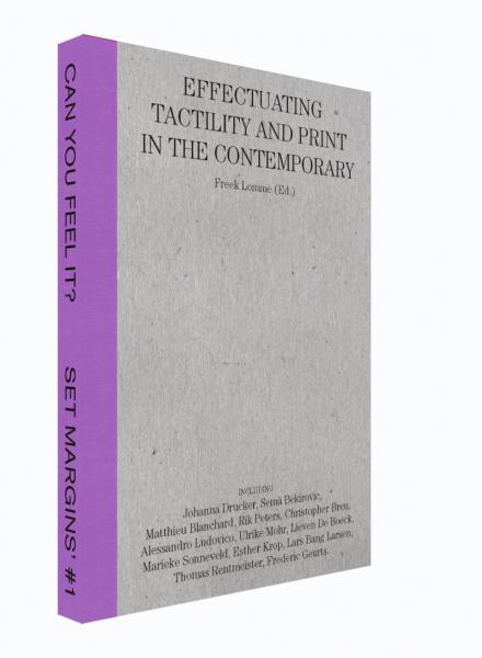
Jun2015 |
Can you feel it? |
exhibition and publication |
curator and editor |
art and design, graphic in particular |
tactility |
A field mapping into the perimeters |
Z33 and Frans Masereel Centre |
English and Dutch |
8 |
8 |
8 |
EXHIBITION
Can you feel it?
Tactility and/in print
@ Z33, house for contemporary art
June-October 2015
PUBLICATION
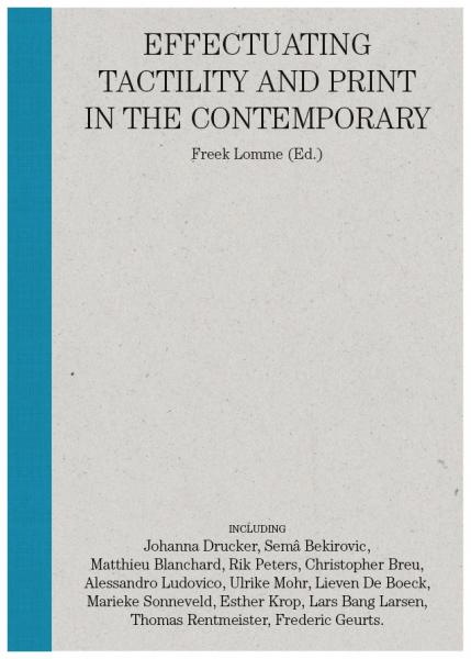
Can you feel it?
Effectuating tactility and print in the contemporary
ISBN 978-90-832706-0-9
softcover, 192 pages
A6 size (Postcard): 148 x 105 mm / 6 x 4 inch standing
14 pages full color
32 pages duotone
English
SHORT INTRO
What exactly is the tactile, in a world in which a rising technocracy exploits the designed environment we feel? Who authorises and who writes, what tradition do we stand in and how can we touch base?
Presenting artists in the practice of making and thinkers in the development of thought here and now, we connect to tactile characteristics, guided by a specific focus on graphic, printed matter.
LONGER INTRO
We touch the world, we sense its objects, but these sensations disappear all too quickly, leaving us with fleeting impressions. Our sense of touch is characteristic and yet we know very little about it.
Today, tactility asks for attention. In the high-tech and knowledge-driven society we live in, the tactile is being increasingly recognised as a quality and processed accordingly. Now, even more than in the pre-digital era, tactility is something we can become conscious of, if only because the variety of tactile materials has continued to increase. By being more aware of our tactility, we can learn to better define it and discover its richness.
Tactility is a physical sensation and at the same time it is a mental experience; it is ambiguous in nature. In addition, the tactile object can both be hand-crafted from basic materials or produced using sophisticated technological and/or biochemical processes. In its growing complexity, tactility becomes ever more hybrid: layered in material, making the flowing sense of the tactile world increasingly ambiguous.
What do we actually feel when we touch things? What feels like a natural material, no longer needs to be natural at all. We become increasingly alienated from the uncomplicated tactility that existed before the advance of hybrid objects, unless we consciously reach for its changing appearance. Is it old-fashioned to hold on to familiar things? Should we just grasp things, should we actually feel them, or should we contemplate them and look for words to describe them? Is tactility a trick of the mind or is it a sensual quality that we can seize upon? What does beauty feel like and when does beauty feel ‘right’? Can we express this in language or trace it out on paper?
During a residency at the graphic workshop of the Frans Masereel Centrum, six artists were challenged to produce a graphic sample or the essence of the tactility featuring in their oeuvre. This has resulted in a variety of works that reveal the diversity and range of tactility through the artists’ distinctive handwriting or language. Tactility also touches thinkers and writers. In the light of their contemplations, tactility proves to be perceptible on the surface of the skin while remaining intangible underneath. The exact qualities of touch are harder to read than the context in which it is acting. The desire to make contact is strong and appeals to our sensitivity; in a changing material environment this is cause for considerable strain. That is exactly why cultural production in our present time is so exciting. These extraordinary gestures towards the tactile world are being presented in an emotive and anecdotic manner. They provide access to a spectrum where you can join them in tracing tactility’s ambiguous position.
FURTHER INFO
Read the curator talk with Nadia Rivera in The Word Magazine
CREDITS:
Curator and editor: Freek Lomme
Artists and authors: Lars Bang Larsen (DK), Sema Bekirovic (NL), Matthieu Blanchard (FR), Christopher Breu (US), Lieven De Boeck (BE), Johanna Drucker (US), Frederic Geurts (BE), Alessandro Ludovico (IT), Esther Krop / De Monsterkamer (NL), Ulrike Mohr (DE), Thomas Rentmeister (DE), Rik Peters (NL), Marieke Sonneveld (NL)
The exhibition is a coproduction of Z33 and the Frans Masereel Centrum, the publication is produced by Freek Lomme.
Graphic design / key visual: Pierre Martin Vielcazat - Stalles (FR)
Set Magins’ # 1 _ Can you feel it?

Ulrike Mohr (front), Lieven De Boeck (back)
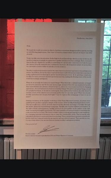
a welcoming letter by the curator

Work by Sema Berikovic. Photography by K. Vranken.
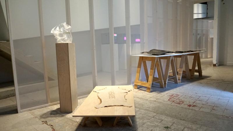
Lieven De Boek (left), Ulrike Mohr (Right) and Sema Berikovic (through wall)

Ulrike Mohr

Thomas Rentmeister

Matthieu Blanchard

Work by Frederic Geurts. photography by K. Vranken
Oct2009 |
Laughing Prohibited! / Verboden te Lachen! |
Blockbuster exhibition, publciation |
CURATOR, editor, WRITER and PRODUCER |
art and design, visual communication |
Humor in design |
fun and tempting |
Freek Lomme and Dave Keune |
English and Dutch |
6 |
9,5 |
8 |
On the comic and the prophecy.
Laughing prohibited! engages with humour as a technical tool for creatives. Humour consists in many tones of voice and many shapes to visualise. Laughing prohibited! asks the visitor to take a further look into the matter: what does the work put forth? Laughing prohibited! debates the quality of the artistic freedom of expression, against the background of the Danish caricatures.
With: Anthony Kleinepier, Atelier Van Lieshout, Bas van Beek, Erwin Wurm (AT), Daniel Eatock (UK), Jorre van Ast, Heim Steimbach (US), Helmut Smits, Marti Guixe(ES), Oooms, Atelier Ted Noten, Lara de Greef.
Laughing Prohibited! enhances an exchange of experiences and knowledge about humour. When do we laugh, why do we laugh and when should we laugh?Laughing Prohibited! shows us techniques, strategies and issues of conception and representation. This relates immediately to the classic issues of design processes: the form and context of production.
We live our daily lives without questioning too much, otherwise we would ’not be able to function’ as we are used to say. This notion, ’not being able to function’, tells us a lot. We look at ourselves within the framework of a machine, operating within certain constraints. These constrains are norms and values, conventions in the form of social codes and control. All of these constrains are mere estimates: we are unsure of their actual extent. Therefore, we are also unsure of the legitimacy of these constraints. Nevertheless we hold on to a social body founded on these presuppositions. We ourselves regulate and maintain this order; and call it self-regulation.
As soon as someone breaks this chain of presupposed rules, we ourselves break: we feel the need to laugh, to determine the break as humorous. Through this mechanism, artists have been able to address many issues without taking any immediate responsibility. Thus, counter-perspectives could be voiced, and structures and individuals could be questioned. This exhibition aims to take responsibility and defend our liberties.
But currently, this domain is not so safe anymore. The war against terror effectively silences the court jester, accusing him a demagoguery of the fictitious. We can recognize these accusations in the debates on the Danish Mohammed cartoons, the counter-cartoons by the Arab European League, jestingly denying the Holocaust. Seriousness is taking over, suppressing humor as a tool to propose different perspectives. Seriousness silences the debate. What is the current status of (artistic) freedom of speech? To what extent can artistic imagination, throught the use of ‘humour’, catalyze our relations for the better?
he works on display in Laughing Prohibited! claim that the world is not enough! If we resign ourselves to what we are seeing, we will not understand it. There is more to relate to than desire. The current socio-economic and socio-political context is demanding more of us. We need to face our material and social environment, because we are part of it. A multitude of perspectives is shows itself, perspectives that change the relation between us and the world around us. All of these perspectives break the chain of conventions that regulate our liberties. In Laughing Prohibited!, these perspectives release visual and discursive data that exceed the regular conventions of social, moral, visual or cultural frameworks and restrictions. They reframe the status quo. It is up to you to take account of them and to frame yourself!
In design, humour is increasingly often used as a tool: intentionally or purposely, witty or stale. Verboden te lachen! (Laughing prohibited! ) shows different expressions of humour in design: the bitter laugh and the wry laugh, progressive and conservative. Onomatopee aims to make you aware of your laughter: why do you laugh, when do you laugh along with others, and what is it precisely that you laugh about
Curators:Freek Lomme and Dave Keune
Managing director:Freek Lomme
Assistant:Rob Ritzen
Exhibition design:Dave Keune
Graphic design:Novak ontwerp
Supported by:SNS Reaalfund, Prins Bernhard Culturefund, Pokon fund, Stichting Stokroos
Partners:
Van Abbemuseum, Eindhoven
Centraal Museum, Utrecht
Stedelijk Museum SM’s, ’s Hertogenbosch
PUBLICATION
LAUGHING PROHIBITED! / VERBODEN TE LACHEN!
Softcover
48 pages
Monochrome
15 x 20 CM
Printed at:
The publication used to be available through Onomatopee, but after splitting with Onomatopee, Onomatopee did not want them anymore and whatever is left is rather lost unfortunate. But you can get the publication through me if you want.


Aug2005 |
Ballet van Liefde |
review |
writer, critic |
art and poetry |
love and it’s visual and written poetry |
mapping |
Tubelight |
Dutch |
6,5 |
7,5 |
7 |
On the poetics of the exhibit OVER LIEFDE / ON LOVE, August 2005, Museum het Domein
featuring: Heddy Honigmann, Susan Cianciolo, Thomas Campbell, Wim Delvoye, Tracey Emin, Jesper Just, Adam Leech, Jacqueline Machado de Souza, Martine Stig
DOWNLOAD
article here
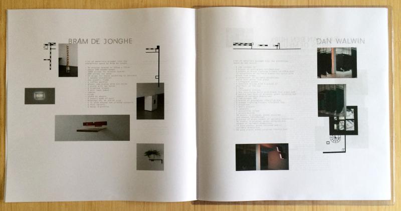
Jun2016 |
the unmediated mediation / de onbemiddelde bemiddeling |
spoken word LP |
author and editor |
art and poetry |
artistic curating and critisism |
experimental |
P/////AKT |
Dutch and English |
7,5 |
8,5 |
8 |
Ruminations about the locality of art production / Mijmeringen rond de lokaliteit van kunstproductie
Invited as moderator within the 2015 year program at P/////AKT, platform for contemporary arts Amsterdam, curator, writer and poet Freek Lomme reflected upon the way the various exhibitions came about, as unmediated mediation typical to the production and presentation of artist-run projects.
The 2015 series of six exhibitions featured Bram de Jonghe, Dan Walwin, Bas Van Den Hurk & Hans Demeulenaere, Claudia Pagès & Ulijona Odišarija, Roderick Hietbrink and Kasper Bosmans. The LP carries experimental spoken word of writings reviewing each exhibition. The accompanying booklet survey’s images of the various exhibition and lists of all materials brought in to produce each exhibition.
The publication used to be available through Onomatopee, but after splitting with Onomatopee, Onomatopee did not want them anymore and whatever is left is rather lost unfortunate. But you can get the publication through me if you want.
We can doubt to what extend the world is full of ideas and / or experiences but cannot ignore the facts of stuff. We should possibly support the determination of our reality by relying on the stuff, rather then anything trivial floating outside of it. If indeed so, then this project may just deliver be a justified approach as speech act. Possibly even, as form of art reviewing, it offers more justifiable words for the actual exhibitions on site.
When stuff is aligned with purpose, care, and/or sensitivity, as when artists make exhibitions through engaging whatever specific on a material basis leaving us artworks and exhibitions, there might just be a bigger reality inherent to the that stuff, within the total setting of this stuff. That reality just might not need any further thought and might not need any mediation as it starts and ends being stuff.
In short notes (call it poems) Freek wrote down what he saw, without writing down thoughts about wider context, abstract analysis, historical connections or personal experiences: just to write about the stuff. In being descriptive, as if to leave out all human projections and to come to some sort of reality without reflection, projection or imagination, he tried to reach for an objective truth-finding...and find out if words without anthropocentric burden can indeed connect with the world outside of us and make sense fundamentally.
It is by the diction and rhythm applied in the spoken out loud reading of the texts, as pressed onto vinyl, as well as through tension projected onto this result by you my dear listener/reader, while you’re connecting to the rhythm and such, that our human sensitivity interferes again.
Simply to appreciate life, in order to reach out to an understanding via experience, Freek values conceptual wonder. Not allowing for much unmediated production, he normally works as director at project space and publisher Onomatopee, which he founded. But then he also writes poetry, experiment beyond the constraints of the sense-making ratio, into a flow of sensory. It is in appreciation of the temporal and ephemeral nature of the shows that he wanted to release the results as spoken word, on vinyl that doesn’t easily migrate to viral.
This material is written over the course of 2015 in the train from Amsterdam to Eindhoven and behind Freek’s desk, read and recorded in a hut in Topanga California, February 2016.
Commissioner: P/////AKT Amsterdam
Graphic design: Harvey Herman
Audio processing:Tom Verbruggen (TokTek)
Translations: Nanne op t’ Ende
Special thanks to: the P///// AKT people: Nienke Vijlbrief and Rob van de Werdt for given liberty, Gieneke Pieterse for keeping it all together, Valeria Marchesini for production, to all artist for allowing me to engage this way, Tom Verbruggen for audio processing, Harvey Herman for stimulation, illustrating and production and a big kiss in writing to Nanne op t’ Ende for his amazing translating.
Made possible thanks to the generous support of all contributors, the Mondriaan Foundation, the municipality of Amsterdam and the Amsterdam Fund for the Arts (AFK).


Dec2010 |
’Waarneming’ |
Text |
Writer |
Art and pseudo-philosophy |
perception |
quest and mapping |
DeFka |
Dutch |
7 |
8 |
7,5 |
Over de toegepaste verbeeldingsrijkdom van een vaag begrip en de resulterende kwaliteiten in ’opfuck’ strategieën.
Een essay geschreven voor het DeFka project Zienderogen, een tentoonstelling die zich concentreert op kunst en waarneming, op kennis en de esthetische attitude. Het gaat om een fundamentele verdieping van het DeFKa jaarthema Old School/New School tegen de achtergrond van de jubileumexpositie ‘Against Pragmatics’ die in november 2009 werd gehouden en die zich toespitste op de relatie kunst en kennis. Kunst en kennis die ook in 2010 en 2011 bij DeFKa centraal zullen staan.
De nadruk ligt bij Zienderogen op kijkgedrag, waarneming, visueel experiment en kunst, kennis en oordeelsvorming. Het is daarmee een tentoonstelling die ingaat op vragen als: Hoe gaan wij om met de werkelijkheid, met kunst (ook film, theater), wat nemen wij eigenlijk waar als we waarnemen en in hoeverre klopt deze waarneming met de werkelijkheid?
Op de tentoonstelling is werk te zien van Erica van Loon, Arthur Stokvis, Barthold Boksem en Jan Scheerhoorn. Daarnaast verschijnt de bundel ‘Zien der Ogen’ met theoretische, essayistische artikelen van onder meer Lucas den Boer, Arjen Klomp, Maria Noel Dourron, Deborah Hauptmann en Freek Lomme. Aanvullend worden er films vertoond van o.m. Erik Tode en Koos Buist.
DOWNLOAD
Tekst in NL
Sep2010 |
Slotjes van Sint-Oedenrode |
Texts and Hiking map |
PR man, publication coordinator |
Art and public space |
the lively myths of Sint-Oedenrode |
wonderous |
SKOR and Kunststichting Sint Oedenrode |
Dutch |
6,5 |
7,5 |
7 |
Het kunstproject ‘Slotjes van Sint-Oedenrode, 7 waarvan 3’, dat in 2007 van start ging op initiatief van de kunststichting Sint Oedenrode en SKOR, laat een wonderelijke wereld zijn aan de hand van een nieuw aangelegd wandelpad, ontworpen door Paul Roncken en twee bruggen ontworpen door Floris Alkema. Deze slingeren zich door het dorp en over de Dommel, langs betekenisvolle plekken in het dorp. Het pad voert tevens langs diverse kunstwerken: Frank Havermans situeert een verstillend Observatorium en zowel kunstenaars Honoré d’O als Christiaan Zwanniken een uitgesproken, mythisch orakel. In 2007 werden twee eerder delen van ‘Slotjes van Sint-Oedenrode, 7 waarvan 3’ gepresenteerd: de Geluidswandeling van Cilia Erens en het hedendaagse relikwie door Dinie Besems. Al deze werken kun je ervaren en genieten, zoeken en koesteren te Sint-Oedenrode.
I.s.m. grafisch vormgevers Space3, Marleen Hartjes en algeheel projectcoordinator Peter van den Berk hebben we een wandelkaart gemaakt, waarmee bezoekers alle kunstwerken kunnen treffen.
DOWNLOAD
Wandelkaart
Paul Roncken’s wandelpad. Foto: Paul Roncken

Dinie Besems

Frank Havermans
Nov2010 |
Between Forms of Representation and Interpretation |
Exhibitions, publication, texts |
CuRATOR, editor, WRITER and PRODUCER |
Art and technology |
The poetics of Andres Ramirez Gaviria’s information distribution |
poetic and analytical |
self-commisssioned |
English |
7,5 |
8 |
8 |
How is information distributed and produced by the fracture between the cultural and the technological sphere?
Andrés Ramírez Gaviria focuses on the translation between cultural and technological processes. His work calls into question the presumed determinacy of culture and technology and instead suggests multiple readings.
Andrés Ramírez Gaviria focuses on the translation between cultural and technological processes. His work calls into question the presumed determinacy of culture and technology and instead suggests multiple readings. By forgoing the claim to immutability, the work opens up an alternative space, where information becomes malleable material, reshaping its form and content each time again in reference to its contextual relationships.
The conventional, modern approach to the design of technology and art is often understood as a rational drive toward reduction and efficiency. In this case however, objects are reduced to their simplest constituents. Paradoxically this act of reduction leads to multiplication, as increasingly smaller bits of data accumulate.
This chain of data is manifested in our vast techno-cultural memory of which the density and complexity make all views of these data both partial and contingent and enable the production of new configurations.
Andrés Ramírez Gaviria’s work and thinking deals with the tension between the iconographies and ideologies of modernity and modernism in relation to the histories of art, design, science, and technology, and the formal grammar of translation afforded by a conception of technology based on the idea and practice of “remixability” and interaction.
Curator, managing director and editor: Freek Lomme
Assistant: Beau Bertens and Mareike Bremer
Photography exhibition: Peter Cox
Supported by: City of Eindhoven, Mondriaan foundation and Freek Lomme attending for free for the entirity of 2010, so budget for print became available.
Sponsored paper by: Paperdesk
PUBLICATION
BETWEEN FORMS OF REPRESENTATION AND INTERPRETATION
OMP49
The physics that establish new techno- logical presences allow us to engage them through all forms of translation and transference, opening up a spectrum of new and ever-expanding symbols and relationships.
Informed through such processes, and building on forms, figures and discourses from the histories of art, design and tech- nology, Andrés Ramírez Gaviria creates compelling visual and sound experiences in which, through tangled investigations, he addresses notions such as autonomy and communication, and which remain aes- thetically confounding in their clever man- ifestations and playful contradictions.
This book surveys a selection of Andrés Ramírez Gaviria’s works with textual contributions from curator Maria A. Iovino and Onomatopee director Freek Lomme. The writers reflect on the works’ place within geometric conceptions of reality, past and present, and their supposed complicity in communicative states of disorder as seen from their linguistic capacity.
BOOK
Size: 21.5 x 15.7 cm
Pages: 130
Editors: Freek Lomme and Andrés Ramires Gaviria
Project management and exhibition curator: Freek Lomme
Texts: Freek Lomme, María A. Iovino
Graphic design: Lesley Moore
Printing: Lecturis
Edition: 500
Paper: Da costa core Gloss
Made possible thanks to Municipality of Eindhoven,Mondriaan Fund and BMUKK
The publication used to be available through Onomatopee, but after splitting with Onomatopee, Onomatopee did not want them anymore and whatever is left is rather lost unfortunate. But you can get the publication through me if you want.
DOWNLOAD
Text Freek in English

Photography by Peter Cox

Photography by Peter Cox

Photography by Peter Cox
Photography by Peter Cox
Photography by Fieke van Berkom
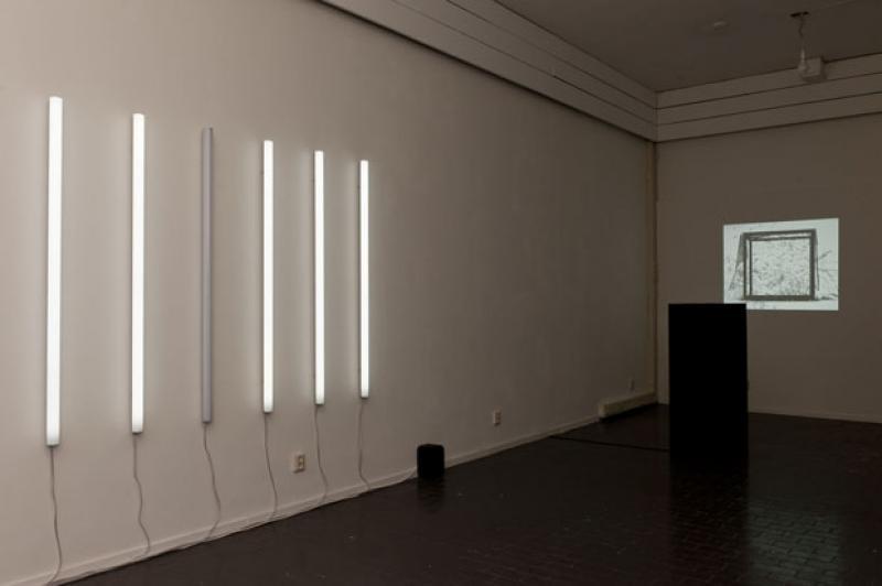
Feb2010 |
Cavity |
Exhibitions, publication, text |
CuRATOR, editor, WRITER and PRODUCER |
Art and technology |
a sound Architecture for a future technocracy? |
poetic and speculative |
Gert-Jan Prins |
English |
7 |
9 |
8 |
Taking technological culture’s micro to a global macro level: architecture for electromagnetic sociability.
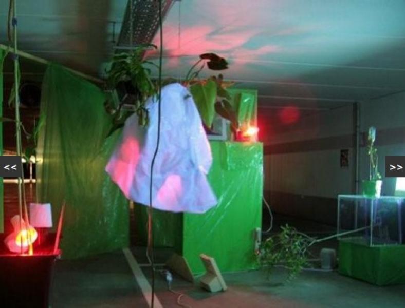
Sound artist Gert-Jan Prins (1961) deals with the frequencies of our electronic age. Between feedback and composition, between the free will of human improvisation and the determinism of electronic laws (and digital algorithms), Prins operates as a sculptor and an experimenting scientist.
Cavity: the Capacitive version is a new work in his study to bring forth the dynamics of this interplay within an architectural (atmo)sphere. The visitors, man, are brought about into this sphere as an electromagnetic wave. Do our bodies and minds indeed integrate into the mechanical and (digital) electro-technical order of our cultivation?
If indeed so, what would this mean to our sociability? Will we indeed experience a growing presence of the Asperger syndrome, as registered in areas as Silicon Valley and the Eindhoven Brainport region? Will this become a new standard for a post-mechanical, post-digital era? How can we discern this new order and precede this domain so as to anticipate it?
The technical meaning of a cavity is a small device with input and output. Within its hollow body, electromagnetic waves reflect, resonate, are clarified or amplified. Tuning is provided by a mounted capacitor.
Prins will build a cavity on human scale; the capacitive element, the filter, is represented in an interior system of sonically wrapped walls made from huge copper clad circuit boards.
Visitors are temped to enter this cavity as an electromagnetic wave. How do we socialise as such?
‘A liberation of the machine’, the pathos often caused by sound and video experiments. While working on his self built sound tools, Prins became visually intrigued by these hidden inner-machine worlds, consisting of elements from electronic measuring equipment. Reduced Objects are studies on the interior architecture of electronic machines in a relation to his sound systems.
Every machine beholds an interior landscape, normally invisible and disregarded as such, as we solely tend to take its functional exterior into account. Many artists, driven by both a romantic and a technological fascination, related to the machine and its era: from Leonardo Da Vinci in the 15th century to 20th century Futurists to present day geeks.
To voice the inner world of electronic hardware like radios, video recorders, computer games etc., the machine should, according to the machine liberators, take its true matter into account: both on behalf of its inner, private sounds as its visual existence. As all of these are the side effects of a functional destiny, they are both part of our universal full sum and independent entities, sometimes even ignored.
In a role that could be pronounced as ’electronic archeologist’, Prins stripped hardware, separating the electronic components, until bare frameworks, with a specific body to voice, remained. This particle configuration and (de)assembling of industrial nature’s elementary presents us the series of Reduced Objects.
Curator:Freek Lomme
Managing director:Freek Lomme
Assistant:Irena Boric
Graphic design:Remco van Bladel
Photography exhibition:Ingmar Swalue
Texts publication:Freek Lomme, Daniela Cascella, Willem van Weelden
Supported by:Fund BKVB, Mondriaan foundation, Municipality of Eindhoven
PUBLICATION
CAVITY
OMP39
10 inch transparant vinyl in a beautifully designed (maybe best design Remco van Bladel made so far according to Freek) booklet (30 pages or so)/cover/sculpture of seemingly pure bronze. The booklet’s (2) feature either photo’s of the work or text on the work and it’s realm.
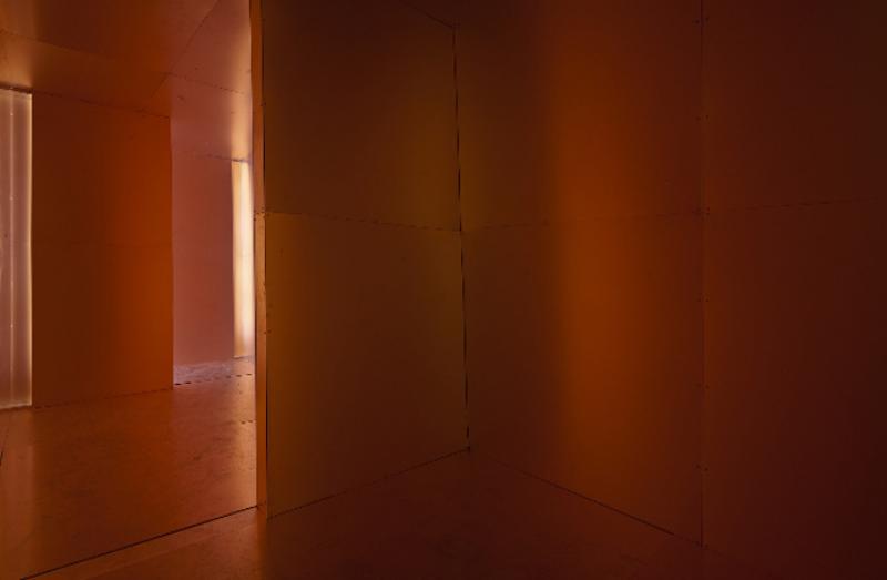
Photography by ingmar Swalue

Photography by ingmar Swalue

Photography by ingmar Swalue

May2013 |
Living Matter: What’s Been Before, Remains to be Seen |
Exhibition, book and text |
CURATOR, editor and PRODUCER |
art and visual poetics |
setting timeframes of language and communication, bridging the analogue and digital sphere. |
poetic and analytical |
Self-commissioned |
English |
8 |
8 |
9 |
A new installation by David Osbaldeston
In a world where alternative constructions of meaning are seen to evolve through an increasingly pluralised, digitised and mediated present, a new installation by David Osbaldeston (UK) takes established modes of artistic practice as its point of departure. With subtle humour, the legacies of conceptualism, word games, repetition and image recognition are toyed with in a bid to highlight ways in which inherited forms of communication become re-authored.
At first glance, the exhibition consists of a large-scale configuration of several items of locally sourced G-Plan and modern European furniture, arranged as anassemblage on a series of adapted, self-assembly IKEA table units that act as a plinth. Here, this arrangement is primarily intended as a ventriloquistic act or as an evocation of an unseen ghost – the ghost of a pre-existing, yet undefined, avant-garde.
Through a production process that runs counter to efficient modes of image production, five stop-motion animations have been produced from wood-cut prints made from old table tops, projected as integrated objects within and between elements of the assemblage itself. Each animation depicts black and white abstract geometrical shapes in constant spatial movement; each undertakes an exploration of perceptual and actual space. As these wood-derived animations are projected onto the furniture’s surface, the latter becomes a sculptural token of ‘reality’. Allied to the world of things this serves as a re-iteration of the perceived ‘shorthand’ for modernism, bringing inert material to life.
In the same way a sentence is brought to life from a sequence of words to create effective communication. A similar logic could be applied to the process of animation, where each labour intensive frame takes its rightful place in the unfolding of time to produce a narrative. This is especially relevant as each animation contains a text that awkwardly, yet relentlessly, punctuates and disrupts. The text is cryptic and directly addresses the relationship between reading, seeing, and doing, embodying a darkly humorous form of invocation that appears almost hypnotic by the removal of words from the grammar of everyday use.
In light of mercurial advances within communication technology, the combined temporal displacement of recognisable images, objects, things and words appear to take on greater significance; the stability of assumed pre-existing relationships are questioned, and their language begins to fall apart. Yet paradoxically, in acknowledgment of their continued residual power reproduced here – the languages of modernism, abstraction, and conceptualism – their successes or failures, afford a space to take a speculative glance into the folding of past into present, art into life and vice versa.
The exhibition will subsequently be accompanied by a publication designed by Will Holder including a new chapter of his ongoing series The Middle of Nowhere.
David Osbaldeston is represented by Matt’s Gallery, London. He has recently taken part in exhibitions at venues in the UK and internationally, including The Modern Institute, Glasgow; CCA, Glasgow; Focal Point Gallery, Southend-On-Sea; Rijksakademie Van Beeldende Kunsten Open Ateliers, Amsterdam; ICA, London; International Project Space, Birmingham, and EAST International, Norwich.
Parallel Production: SPACES IN BETWEEN: making the invisible visible
Inspired by David Osbaldeston, students from the St. Joost art academy in ‘s-Hertogenbosch (NL) will work on a project called SPACES IN BETWEEN: making the invisible visible. They will interrogate the relationships between language, text and image, and their removal from grammatical contexts, enabling a re-representation of new unseen relationships. Students will initially develop their works towards a self-organised exhibition at the academy, which will also include works by Osbaldeston. Thereafter, these works will move to Onomatopee for further development to produce a publication launched for the openings on May 25th, 15:00.
Project partner:Art Academy AKV | St.Joost ’s-Hertogenbosch
Curator: Freek Lomme
Graphic design publication: Will Holder
Made possible thanks to: Municipality of ’s-Hertogenbosch, Arts Council England and Wysing Arts Centre, Cambridge.
Thanks to: the tutors at AKV | St.Joost (Norman Trapman, Florette Dijkstra) and coordinator Leen Bedaux.

photography by Studio Clack


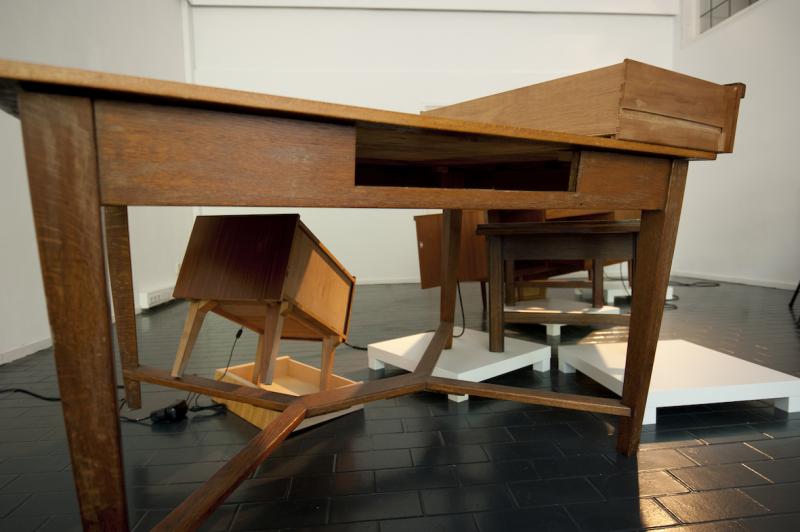
Aug2013 |
WHO TOLD YOU SO?! |
publication |
editor |
art in culture |
cultural ambivalence and visual ambiguity |
exploring pokes! |
self-commissioned |
English |
8 |
8 |
9 |
The collective story vs. the individual narrative
If uncertainty is the greatest common denominator, ambiguity is a means to unite the parts....
Only accountable to ourselves, Who told you so?! - The collective story vs. the individual narrative - challenges states of social ambivalence within various levels of cohesion: government, organization, scene and family. Abstractly informing our collective subjectivity and practically nurturing our personal, existential momentum, here we may inform our experiences along the lines of the poetical and critical postures presented. The postures included here inform on our whereabouts. Having the opportunity to feed our individual narrations, we may enable ourselves to challenge the collective stories written to us. Come and play upon ambivalence in cohesion’s truths and face up to what we might consider ambiguous!
The various concentrated gestures and scenarios in this project offer surprising and revealing perspectives of the conditionality of individual freedom within the social configurations in which we find cohesion. Fascinating, relevant and intriguing, now that collective freedom is at odds with individual liberties and individual liberties are at odds with the collective associations by which they should be represented. Belonging to any group makes you an accessory and if you don’t belong, you are not allowed to assume that responsibility. Whatever happens if you belong to a group without wanting to, we usually do not know... We live in times of great social ambiguity.
Trying to find new challenges and widening perspectives, often double-tongued as well as hiding a secret agenda, this project looks for deeper relations. Forty artists, ten writers and four poets use their astute authors’ skills to offer a thought-provoking ambiguity. This bundle will offer conformists an insight into the restrictions of freedom they are responsible for, will inspire freethinkers who feel they lack something and try to find a position, and it will provide recognition to those who feel oppressed.
Artists:
Aleksandra Domanovic, Foundland, Gokce Suvari, Group R.E.P. (revolutionary experimental space), Lieven De Boeck, Mauro Vallejo, Monika Löve, Slavs and Tartars, Azra Aksamija, Elena Bajo, Hank Willis Thomas, Heath Bunting, Jacqueline Schoemaker, Job Janssen, Tracy Mackenna & Edwin Janssen, Paul Segers, Anikó Loránt and Kaszás Tamás, Boudewijn Bollmann, Daan Samson, Exactitudes: Ari Versluis & Ellie Uyttenbroek, Gillian Wearing, Julian D’Angiolill, Katrin korfmann, Ken Lum, Marjolijn Dijkman, Matthijs Bosman, Mireia c. Saladrigues, Serge Onnen, Šejla Kamerić, Erwin van Doorn & Inge Nabuurs, Erika Rothenberg,Gunes Terkol, Jans Muskee, Keren Cytter, Melanie Bonajo, Nadine Byrne,Ronald Ophuis, Sebastian Friedman.
Writers:
Dr. Jonathan Short, Matteo Lucchetti, Markus Miessen, Alfredo Cramerotti, Wim Langenhoff, René Gabriëls, Leon Heuts and Tanja Baudoin
Poets:
Joost Baars, Serge van Duijnhoven, Krijn Peter Hesselink, Anne van Amstel
Curator/editor:Freek Lomme
Exhibition design: Dave Keune
Graphic design: In Edition
Made possible thanks to the Municipality of Eindhoven and Mondriaan Fund
PUBLICATION
isbn: 978-94-91677-04-5
softcover with inserts and extra’s!
Size: 6,49 x 9,05 inches / 165 x 230 mm
Book has 332 pages, the reader with Patricia reed’s text has 64 pages, the one of Daniel Miller has 54 pages.
Over 600 images in color and over 200 in B/W
The publication used to be available through Onomatopee, but after splitting with Onomatopee, Onomatopee did not want them anymore and whatever is left is rather lost unfortunate. But you can get the publication through me if you want.


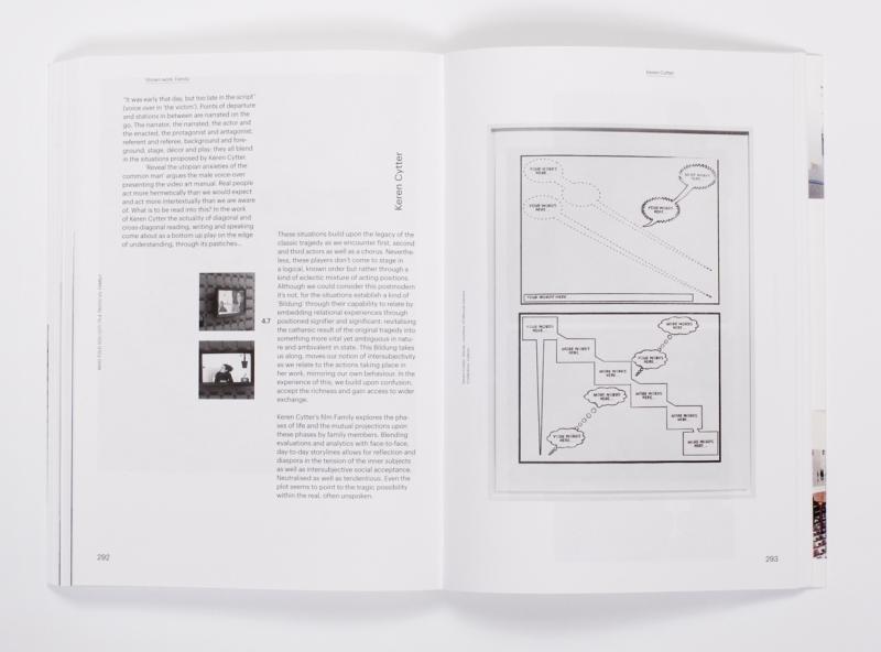


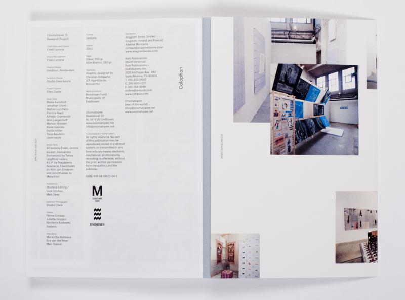

Mar2013 |
Distillations - Notes on Kathrin Schlegel’s insertions in public space |
Publication and exhibition |
Curator, editor, writer and producer. |
Art in public space |
Ephemeral interventions |
contextual |
Katrin Schlegel |
English |
8 |
8 |
8 |
Exhibition inspired by the publication, expanding the horizon of Katrhin Schlegel’s work.
Schlegel´s work investigates the potentiality and interactivity of human experience through the medium of art in particular local environments and their everyday spectacles. Her temporary interventions challenge the common perspectives on these locations and events while attempting to produce new sets of (ambiguous) meaning in direct communication with the particular audiences that are being addressed. The investigation of group identities is thus being transformed into an open invitation for social and cultural participation at the stage for production of collective memory, visualisation of social values, and re-articulation of everyday life.
The publication discusses how we can and want to relate to our environment. It poses the question of the possibility of social interaction through symbolic gestures and through the meanings manifesting themselves in and via a work of art in its context. In particular, it elaborates on the context of the presentation, the relation between the author, the work and the public, and the way the meanings concerned move in time.
The book also contains descriptions and an extensive review of Schlegel’s most recent work, as an illustration of her art practice and as ashowcase in which these gestures take root. The sum of this book discusses the posture and potential of meaningful experiences and the process of signification through art in the (public) context. As Kathrin Schlegel motivates: “It has to work.”
Texts Freek in this book:
Download editorial introduction here
Download article Who Points out? here
Curator: Freek Lomme
Editors book: Freek Lomme and Katrhin Schlegel
Graphic design book: Niels Schrader / Mind Design
Contributing writers: Alexandra Landre, Alena Alexandrova, Freek Lomme, Marcus Lutkemeyer, Maria Rus Bojan, Nils van Beek.
Made possible thanks to the support of:
Cusanuswerk, Bonn, Germany in the framework of the ‘Georg Meistermann-Stipendium’, Bank für Kirche und Caritas, Paderborn; Bank im Bistum Essen; Darlehnskasse Münster; Liga Bank, Regensburg; Pax Banke G, Köln; WGZ Bank, Düsseldorf.
photography by Studio Clack


Aug2007 |
Monument voor het moment |
Review |
critic |
art, art books, poetry |
Kasper Andreassen’s book Moment’s Notice |
personal quest |
De Kantlijn |
Dutch |
6,5 |
6,5 |
7 |
Review / mapping of Kasper Andreassen’s book Moment’s Notice
DOWNLOAD
text in Dutch, as published in De Kantlijn
Sep2005 |
Home at TENT. |
daily diary exhibition |
writer |
art, community |
the art and the community |
on the go |
Gil and Moti / TENT. |
English |
6 |
7,5 |
I worte a daily diary / report in the exhibit HOME @ TENT. at TENT. Rotterdam with varius artists, curated, hosted and warmed together by Gil & Moti
download the catalogue!
Jun2009 |
Projecteren en portretteren |
text |
writer, reviewer |
art, community |
Toos Nijssen |
mapping |
De Kantlijn |
Dutch |
7 |
6,5 |
6,5 |
Oct2011 |
This is Reality, Fundamentally shared |
Text |
writer, critic |
art, design |
The work of mentalKLINIK |
UNVEILING |
DAMn magazine |
English |
7 |
8 |
7,5 |
Photography by mentalKLINIK
Oct2009 |
Is this art? |
Text |
writer |
art, design |
Design’s lure and authenticity |
quest |
The Daily Whatever |
Dutch |
7 |
7 |
7 |
Another Article for the first Daily Whatever, Dutch Design Week daily, designed and edited by Eric de Haas.
DOWNLOAD
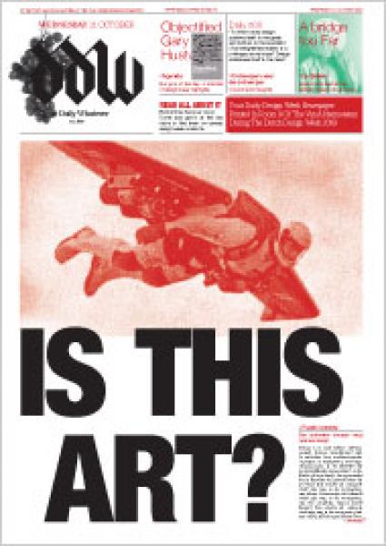
Oct2010 |
Tricksters Tricked |
Exhibition |
Curator |
art, design and politics |
identity politics |
polemic, participatory |
Van Abbemuseum |
English and Dutch |
8 |
8 |
8 |
(un)covering identity
Artists and designers:BAVO, Bureau d’etudes, Maartje Dros, Kim de Groot, Pierre Huyghe, Philippe Parreno, Marjetica Potrč, Jacqueline Schoemaker, Jonas Staal, Xijing Men en Jozua Zaagman.
Curators: Freek Lomme and Hadas Zemer Ben-Ari
Tricksters Tricked is an investigation of design and its dual role in shaping our contemporary reality. It concentrates on the craft of identity construction, a task that has become compulsory for most organisations and individuals today. What do we gain and what do we lose in the constant game of identity negotiation? What is being highlighted and what is being concealed? Which is more favoured at the end of the process – the authentic or the communicated entity? Is it even possible to talk about authenticity in the face of a multitude of added layers?
In October 2010 the Van Abbemuseum will launch the exhibition Tricksters Tricked – (un)covering identity. Tricksters Tricked will examine four levels of identity representation: the self, the city, the nation and the museum, with the aim of illustrating the dualities in each of them. During Dutch Design Week 2010, from 23 to 31 October, Tricksters Tricked will be reinforced with a special, live layer: daily interventions request visitors to get their hands dirty by participating in diverse design processes. A rich program of lectures, workshops and movie screenings complement the subjects at hand.
Tricksters Tricked
(un)covering identity
Kunstenaars en vormgevers: BAVO, Bureau d’etudes, Maartje Dros, Kim de Groot, Pierre Huyghe, Philippe Parreno, Marjetica Potrč, Jacqueline Schoemaker, Jonas Staal, Xijing Men en Jozua Zaagman.
Curatoren: Freek Lomme en Hadas Zemer Ben-Ari
Tricksters Tricked is een onderzoek naar design en de duale rol die het speelt in het vormgeven van onze werkelijkheid. Het richt zich op de ambacht van identiteitsconstructie, het verplichte laagje ‘makeup’ dat de meeste organisaties en individuen tegenwoordig aanbrengen.Wat winnen we en wat verliezen we in het constante spel van onderhandelen over identiteit? Wat wordt uitgelicht en wat wordt weggelaten? Wat is het meest geliefd aan het eind van het proces: het authentieke of het gecommuniceerde wezen? Is het eigenlijk wel mogelijk om over authenticiteit te spreken met al deze toegevoegde lagen?
In oktober 2010 gaat in het Van Abbemuseum de tentoonstelling Tricksters Tricked – (un)covering identity van start. Dit expositieproject verkent vier niveaus van identiteitsrepresentatie: het zelf, de stad, de natie en het museum, met als doel de dualiteit in elk van deze niveaus te illustreren. Tijdens de Dutch Design Week 2010, van 23 tot en met 31 oktober, wordt de tentoonstelling extra tot leven gewekt: bezoekers worden uitgedaagd om hun handen vuil te maken in verschillende designprocessen. Kunstenaars en ontwerpers bieden een gevarieerd programma van lezingen, workshops en een filmvertoning over de thema’s van de tentoonstelling.
Downloads:
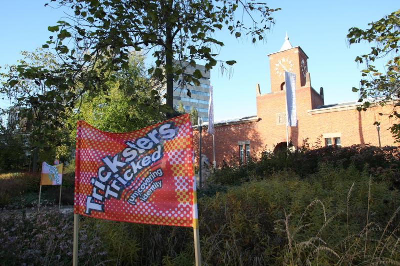

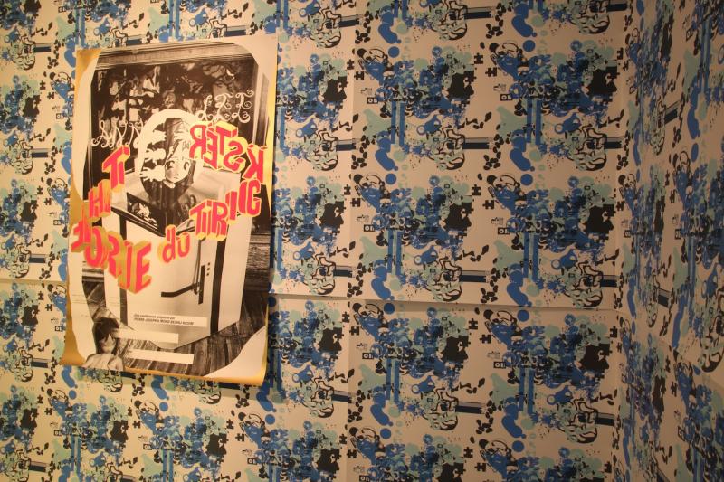


Oct2009 |
TAKE ON ME (TAKE ME ON) |
exhibition, events |
curator |
art, design, community |
an alternative production factory |
co-creation |
Van Abbemuseum |
English / Dutch |
7 |
9 |
8,5 |
An alternative production factory
During the Dutch Design Week 2009, from 17 to 25 October, the Van Abbemuseum presents TAKE ON ME (TAKE ME ON), a live-exhibition project curated by Freek Lomme and Hadas Zemer. It features four groups of ’artistic designers’, individuals or agencies whose ways of working fall outside the usual, conservative definitions of ’art’ and ’design’. Each group will create their own production line in one of the four corners of the original part of the museum and gradually extend their working process throughout the building.
Together with visitors, they will each work on the development of a product that seeks to respond to certain urgent questions today: ‘What kind of wealth would we like to acquire? What is it that we see when we look deep into our own personal value system? What are our authentic desires and how much do consumer products satisfy us?’ The live exhibition will also accommodate various other activities during the week that will mix with these production centres. These include public discussions, lectures, film screenings, debates, and the production of a daily newspaper. The aftermath of the project, together with all relevant documentation in word and image, will remain on display until 8 November 2009.
Curators: Freek Lomme and Hadas Zemer Ben-Ari
TAKE ON ME (TAKE ME ON)
Een alternatieve productiefabriek
Tijdens de Dutch Design Week 2009 van 17 tot en met 25 oktober presenteert het Van Abbemuseum TAKE ON ME (TAKE ME ON), een live tentoonstellingsproject samengesteld door Freek Lomme en Hadas Zemer. In dit project komen vier groepen ’artistiek vormgevers’ aan bod, dit zijn individuen of bureaus wiens manier van werken buiten de normale, conservatieve definities van ’kunst’ of ’design’ valt. Iedere groep realiseert een eigen productielijn in een van de vier hoeken van de Oudbouw van het Van Abbemuseum welke zich geleidelijk uitbreidt door de rest van het gebouw.
Hierin geven zij, samen met de bezoekers, vorm aan een product dat antwoord moet geven op vragen als:“Wat voor soort rijkdom willen wij verwerven? Wat willen wij eigenlijk, wanneer we diep in onze persoonlijke waarden kijken? Wat zijn authentieke verlangens en in welke mate bevredigen consumentenproducten ons?” Tijdens de tentoonstelling vinden ook andere activiteiten plaats, zoals publieke gesprekken, lezingen, filmvertoningen, discussies en de uitgave van een dagelijkse krant. De presentatie van het project, inclusief documentatie in tekst en beeld, is daarna tot en met 8 november 2009 te zien in het museum.
Curatoren: Freek Lomme en Hadas Zemer Ben-Ari
Downloads:
press-release here and hier voor een Nederlandse versie
Participants:
Acclair
What does our brain tell us about our authentic self? To measure is to know, which is just what Acclair does: they define what art and culture means to you, in a professional, competent and impressively scientific way.
Conditional Design
The act of designing is based on rules. Conditional Design has created a manifesto of explicit rules for design processes. The project invites visitors to use the designers as a vehicle for wall paintings, in accordance with several specific rules.
Metahaven
Image is identity. Image is politics. Image is a choice.Metahaven presents a graphic jungle in which specific choices must be made in order to avoid getting lost.
Orgacom
A combination of organisation and communication, Orgacom focuses on the conception and realisation of new roles for art in trade, industry, and non-profit organisations. Together with local amateur groups, they will create an interdisciplinary production floor, bridging low and high culture.
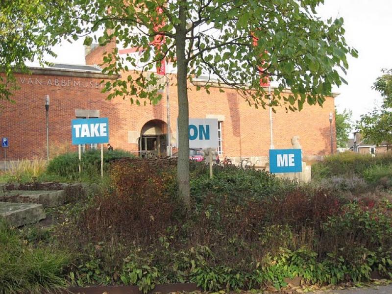
Photography by Ron Eijkman
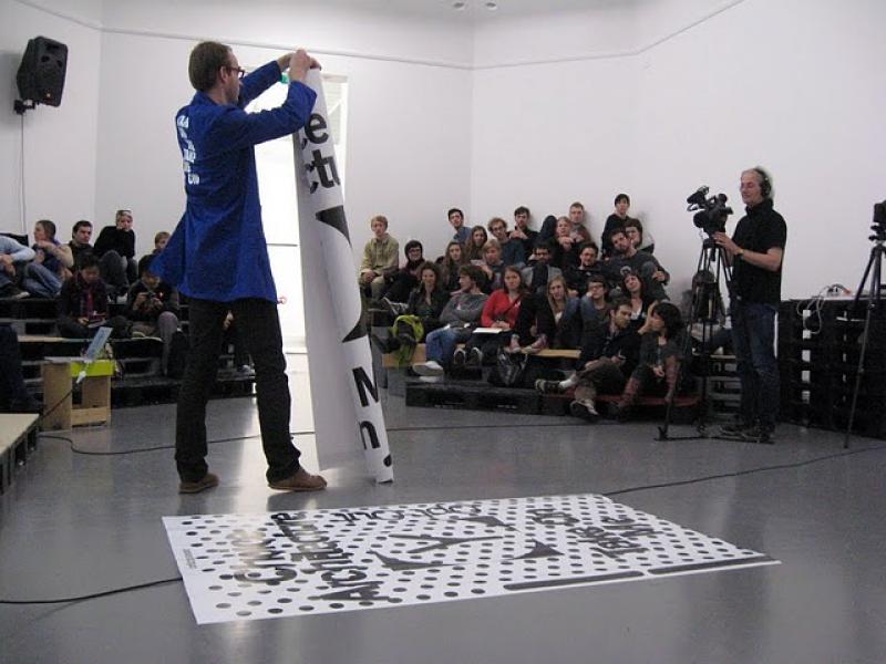
take a seat: the public arena. Photography by Ron Eijkman
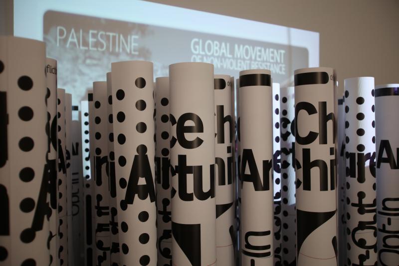
Fragment of work Metahaven. Photography by Ron Eijkman

Fragment of work Conditional Design. Photography by Ron Eijkman

Fragment of work Orgacom. Photography by Ron Eijkman
Sep2011 |
Dear Onomatopee, / Beste Onomatopee, |
Publication and exhibition |
curator, editor, writer, producer |
art, design, cultural policy |
Onomatopee: a historiography, a stance and a movement |
mapping and positioning |
self-comisssioned by Freek |
Dutch and English |
7 |
7 |
9 |
On five years Onomatopee and beyond
All you need to know to the first 5 years and, possibly, even the years after.
Feel free to download a less colored and less visual version here
Onomatopee gave insight into and an overview of 5 years of dynamic partnerships in designing culture. A variety of voices have united in this platform for progressive cultural production – they put our culturally designed mentality, its politics and possibilities, on the agenda.
Midway through 2006 writer / curator Freek Lomme and graphic designer Remco van Bladel initiated a platform for projects that consist of both the experience that an exhibition can offer and the depth of content of a publication. 5 years and over 70 projects later and operating from their 700m2 project space in Eindhoven, Onomatopee continues to organise a broad movement of and for a diverse group of involved persons and organisations.
What is the value of this initiative that became an establishment and could become an institution? Onomatopee strives for visual emancipation – to involve people in the visual culture in which they live. It wants to offer the public a critical insight into the motives and modes of expression with which politicians and commerce form our public space. Onomatopee wants to expand the public platform by mediating between visual professionals and specialists with regard to content – between the professionals who fear that their authority will be undermined by popular culture, and the general public who is sceptical of the power of that professional elite.
In short: Onomatopee at that time discussed our designed culture and offered a space for people who dare to doubt – a space where they can take and retake a critical position – Onomatopee is a platform for (self)critical citizenship.
Curator/editor: Freek Lomme
Texts:
Annelys de Vet
Jan Boelen
Bas Kwakman
Maaike Lauwaert
Hans Robertus
Lene ter Haar
Nils van Beek
Paul De Bruyne
Ranti Tjan
Steven ten Thije
Graphic design: Eric de Haas and Martijn Maas
Photography exhibition:Peter Cox
Partner organisation:Van Abbemuseum
Supported by:Mondriaan Stichting,BKKC/Province of North Brabant, SNS REAAL fund, Municipality of Eindhoven
Sponsor: Lecturis
PUBLICATION
DEAR ONOMATOPEE,
OMP60
ISBN 978-90-78454-70-0
Magazine 20 x 30 CM
poster cover
Full color, black/white and duotones
64 Pages
edition: 1500
Printed at: Lecturis
For sale including nice images and more touchable matter at Onomatopee
DOWNLOAD
Full black white booklet here

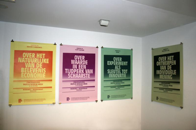

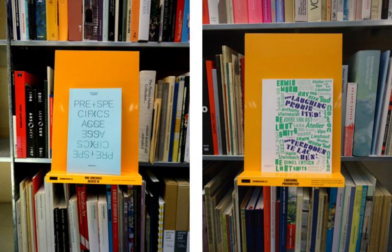
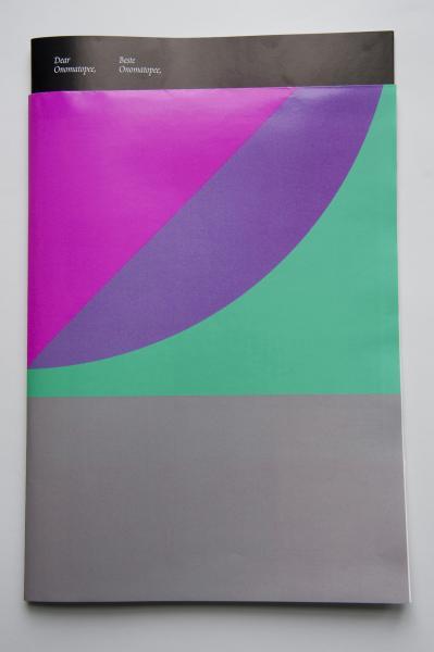
Mar2011 |
KRAK |
Exhibition and book |
curATOR, editor, WRITER and PRODUCER |
art, design, institutional policy |
alternative production |
mapping |
Self-commissioned and Sundaymorning@EKWC |
Dutch and English |
7,5 |
8 |
7,5 |
workmanship and mastership: passing the test.
Practising the innovative chain of cultural progressive production; from the workshop to a progressive platform!
With: Maaike Roozenburg, Tilmann Meyer-Faje, Irene Kopelman and Tim Breukers.
Innovation is the keyword that spans a bridge between now and the future. Innovation manipulates new materials, new techniques and new means of expression – inspired by cultural conscience. Innovation allows us to think outside the box, shakes up the status quo and shapes-up our culture’s future. ?
Krak shows the experiments in which progressive, cultural innovation is taking shape, step by step informing on this cutting edge chain of production. Never before has an experimental production process been so explicitly worked through and informatively presented.
Krak, workmanship and mastery: the putting to the test shows the extraordinary value of the experiment in production and presentation, not in terms of market value but through the production of progressive cultural expressions that expand and unlock new perspectives. It lays bare the contours within which cultural innovation in our material culture is able to exist. ?
Sundaymorning@ekwc is an internationally oriented workshop / centre of excellence / artist in residence for ceramics, it stimulates an international vanguard with support to experiment with both material and application. Onomatopee is a platform by Freek Lomme where topical designed culture is progressively exposed.Sundaymorning@ekwc is host to the test, Onomatopee is putting it on the cutting edge – a perfect collaboration!
Curators/editors: Freek Lomme and Ranti Tjan
Exhibition design: Lara de Greef
Graphic design: Remco van Bladel
Text: Freek Lomme, Ranti Tjan , Ilse van Rijn, Johanna Drucker, Michael Kroger
Photography exhibition: Fieke van Berkom
Photography process: Wim Voets
Partner organisation: Sundaymorning@EKWC
Supported by: SNS REAAL fund, Mondriaan Stichting, Municipality of Eindhoven
PUBLICATION
KRAK
ISBN 9789078454724
Softcover
80 pages
Black / white and full color
16 x 23 CM
Edition: 1000
Printed at:De Raddraaier
The publication used to be available through Onomatopee, but after splitting with Onomatopee, Onomatopee did not want them anymore and whatever is left is rather lost unfortunate. But you can get the publication through me if you want.


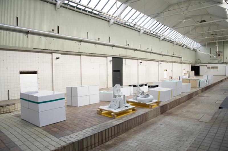
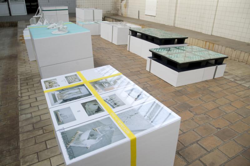

Sep2010 |
PRE-SPECIFICS: ACCESS X! |
Exhibitions and publications |
CuRATOR, editor, WRITER and PRODUCER |
art, design, poetics |
X factor in designed culture |
quest |
self-commissioned |
English |
7 |
7 |
7 |
Get access to the ’X’ imposed by designed culture.
Not only humankind might have an "X" Factor; an environment or a product may equally have one. If a person has an "X" Factor, his power increases. Similarly, as soon as an environment or a product has an "X" Factor, it gains control over us... Let’s make this production more accesible!
With: Platform for Pedagogy, Uglycute, Olaf Nicolai,Dexter Sinister, Joana Meroz / Andrea Bandoni, Unfold,Lust, Claire Fontaine, Société Réaliste, Ryan Gander /Abake, Dave Hullfish Bailey, Florian Conradi / Michelle Christensen.
PRE-SPECIFICS: ACCESS X! not only showcases luring products, spaces and concepts by contemporary artists, designers, architects and others, but actually also provides insight into their strategies. The exhibition thus features both sensory works and accountable strategies and motivations. The accompanying publication offers further notions into designed culture’s X: its productive conditions and modes of mediation.
Over recent years, ’Design’ has progressed into a collective term for various activities of research, conceptualisation, production and even criticality. As ’Design’ became synonymous to widespread professional authority, ’Design’ became the name for physically imposed control and personally imposed power at large: from the spatial design of McDonald’s to the branding of the new hybrid car, from the executive stance of the spin doctor to the services of the shrink and beyond. Li Edelkoort, design guru and former director of the Design Academy, even expressed a demand for the designer-politician…. The research project PRE-SPECIFICS: ACCESS X! offers you both a rich scope of forms of "X" as an instrumental toolbox to engage the "X" in our designed culture, offering ACCESS to X!
Freek Lomme and Michael Capio commissioned a variety of proposals, first of all to map out to what extent the addressed ’design’ practice touches upon conditions of such a type of production and, second, to situate X in practice by means of a newly produced work. The proposals have been exhibited at Röda Sten Kulturforening Göteborg. From these proposals, Freek and Michaelselected the majority to be actualised at Onomatopee Eindhoven during the Dutch Design Week.
Curators:Freek Lomme, Michael Capio
managing director: Freek Lomme
Exhibition design:Dave Keune
Graphic design publication:Eric de Haas
Made possible thanks to:Mondriaan foundation,Municipality of Eindhoven, SNSreaal fonds, VSB fonds, Konstfack University Stockholm, Swiss Federal Institute of Technology
PUBLICATION
PRE-SPECIFICS: ACCESS X!
ISBN 978-90-78454-49-6
Softcover
12,5 x 20 CM
160 pages
Duotone on blue paper
Edition:
1000
Printed at:
The publication used to be available through Onomatopee, but after splitting with Onomatopee, Onomatopee did not want them anymore and whatever is left is rather lost unfortunate. But you can get the publication through me if you want.

Exhibition design by Dave Keune Photography by Ingmar Swalue

Joana Meroz and Andrea Bandoni Photography by Ingmar Swalue

Dave Hullfish Bailey Photography by Ingmar Swalue

Societe Realiste Photography by Ingmar Swalue

book: design by Eric de Haas
Dec2007 |
Will someone stop you..? |
text |
writer, critic |
art, poetry and politics |
the political sublime / where politics is more poetic as art |
mapping and disturbing the status |
De Kantlijn |
Dutch |
7,5 |
8 |
7,5 |
A mapping of the tension in what Boris Goys came to describe as the Political Sublime; the tension between the poetics in a real, political act, possibly in strenght defeating the constructed one.
This is touched on the bases of the exhibit of Derek Tyman and Emma Rushton at Artis Den Bosch, a very much unfortunatley deceiced art space.
DOWNLOAD
Dutch text as published in De Kantlijn

Feb2009 |
A Task for Poetry |
research, 3 exhibitions, 3 publications |
curATOR, editor, WRITER and PRODUCER |
art, poetry, art field |
the poetic momentum and the autonomy of art |
on the go, mapping |
self-commissioned |
English and Dutch |
6,5 |
6,5 |
9 |
Unveiling the poetic momentum in arts
Three poets were invited by Freek Lomme, director and chief curator of Onomatopee, to invite an artist, curate the show, choose a graphic designer, take over PR and edit a book.
First of all to unveil the poetic momentum within an individual artistic practice, for we may suppose poets are better at revealing this as pr-employees or curators.
Second for we have to reise the hetronomy in the arts: the changing roles, expectations and blurring responsabilities in the arts.
Finaly, for the worth of ’autonomous visual capacities’ and ’inherent value of art’ is still spread by its literal words. Many put it forth bluntly, like the city of Eindhoven who targets their artistic policy as of ’inherent value’ or the province art’s policy claiming ’autonomous visual capacities of art’ to be essential in their judgement. They are, evidentlkey, cherishing the sentiments attached or the aura it provides.
#1:
Poet Jannah Loontjens, artist Aam Solleveld & graphic designer Katja van Stiphout
#2:
Poet Erik Spinoy, artist Tamara Van San & graphic designer Remco van Bladel
#3:
Poet Maria Barnas, artist Amalia Pica & graphic designer Felix Weigand
The publications used to be available through Onomatopee, but after splitting with Onomatopee, Onomatopee did not want them anymore and whatever is left is rather lost unfortunate. But you can get the publication through me if you want.
Meanwhile, the exact parameters of this notion, effectiveley the poetic momentum, has hardly been tested. Nor have these parameters’ politics been shared in-depth with the audience of art. Onomatopee believes that we need to reason with the voices of our visual culture, and considers creative practices to be design practices, since they revolve around motives and means.
I’ve always been fascinated by the rhetorical strength of ’The Poetic Momentum’: the moment one is supposed to undergo when confronted by an artwork, when overwhelmed by sentiments and sublime grasps. Still, this notion has never before been so obsolete.
We’re living in an information age; we know how information works. We cannot just think visual data is there for God’s sake. Still God’s sake is present when we start positioning ourselves within our visual surrounding. This moment is often described as poetic.
In order to maintain the richness of the cultural capital acquired over the last decades, we should at least define its parameters!
With this project Onomatopee objectifies to unveil the poetic domain in the presentation of visual art: what exactly is poetic in the art on display, how can this be envisioned and experienced and how can one bring this out to the public? These are the questions we put forth to the selected three poets, to be realised within their guest role as curator.
The project consisted of three separated projects wherein a poet operated as a curator, the artistic leader of an exhibition. The poet introduced an artist for a solo exhibition and represents this artist through the work usually done by the curator and the PR employee. Therefore the poet arranges textual layers like press releases, hall texts, catalogue texts and so forth. The poet also leads the installation within the exhibition space, edits the content and guides the design of the exhibition PR and catalogue.
Within the field of visual art presentation, museums, presentation spaces and galleries we encounter a growing tendency towards heteronomous roles: the PR employee, the curator and artists, to name a few key figures, tend to blur their roles. They all interfere in each other’s work, as everyone nowadays seems to be tolerated when interfering with another’s work. And this is justified on behalf of this project since, when art, as is often been said, really revolves around poetry than its pure logics to envision this poetical domain!
Therefore, A Task for Poetry questions both the parameters of the poetic and the institutional frame that represents it.
The first edition, guest curated by poet Jannah Loontjens, brought out the role of the subject, as actor engaging within this sphere. The core group of the poet, artist and graphic designer brought out their authorship alongside one another, as a variety of layers to be read parallel and related to one another. During the process of their production, they very much responded to each other’s processes, influencing and inspiring one another. Eventually, during the opening, Jannah brought in actress Nataliya Golofsastova. Nataliya and Jannah performed the poems of Jannah, specially written for this project, in a mix of personal style: acted and poetically read. This illustrates the roles of each person involved, from author’s to visitors, each person engaged does have his own stance, partly personal, partly taken along.
The second edition focussed on the physical. Erik Spinoy considers his poetry to be an almost material act: the meaning and the form of the words blend together in the ink on the paper. Therefore he invited artist Tamara Van San, since she’s very much dedicated to the voice of form, with all it’s in depth forces and overwhelming capacities. Graphic designer Remco van Bladel uses these visual qualities to highlight specific spheres and would therefore add up to this sum. Not to simply pass through the physical, Erik Spinoy wrote an incisive text on the topic, unveiling specific properties in Tamara’s and thereby generating a vibrant and strong narrative.
Poet Maria Barnas invited Amalia Pica. Tempted by her playful work, her loose approach of the relation between the signified and the signifier, of matter and the story attached to that matter, they engaged in a play of storytelling. Amalia spoke, via drawings with found materials, of Robinson Crusoe, copying old book covers. Gestures of empathy spoke via these remakes, giving birth to lively storylines. Accordingly, Felix Weigand started producing a bundle of booklets, putting forth the dialogue of this play.
All together, what seemed to become an ontological quest, ended up determining the poetic as a verb, a verb of acts, engagement, imagination and empathy. A verb that crosses boundaries of dispositions and formal voices. A Task for Poetry showcased the value of the poetic through the engagement of in depth experiences and reflections, on the fracture of the real and the fictional yet always focussed on the voices put forth. The project points out our capacity to debate our environment through imagination and states that we need to reason with those parameters in order to be able to engage in the first place. A collaboration of mixed disciplines is not just an exchange of the appeared external, but contains specified stances (#1), specified matter (#2) and specified acts (#3)!
Artistic and managing director: Freek Lomme
Assitants: Lachlan Bell and Soren Wibroe
Made possible thanks to: the Municipality of Eindhoven, NBKS/province of Brabant,LiBra fund, SNSreaal fund, Prins Bernhard Culture fund.

A Task for Poetry #1 Curator/editor: Jannah Loontjens Graphic design: Katja van Stiphout Art: Aam Solleveld Project concept and management: Freek Lomme

A Task for Poetry #2 Curator/editor: Erik Spinoy Graphic design: Remco van Bladel Art: Tamara Van San Project concept and management: Freek Lomme

A Task for Poetry #3 Curator/editor: Maria Barnas Graphic design: Felix Weigand Art: Amalia Pica Project concept and management: Freek Lomme

Book task #2, design by Remco van Bladel

Book task #3, design by felix Weigand
Mar2014 |
Civil provision! |
Project, exhibition |
curator, editor, producer |
Artistic interventions and cultural exchange |
civil exchange through wonder |
A quest after mapping |
A.C.T. DEMOC(K)RACY / European Union |
English |
9 |
8 |
8,5 |
Fostering the intrinsic capacity of informal demands and mobilising the application of the social opportune: exploring subjects predicating relational property.
The fourth exhibition of the A.C.T. DEMOC(K)RACY project, which focuses on a bottom-up awareness of European democracy through actual cultural exchange, fostering awareness and relations by a combination of international residencies and exchanges of students and tutors, by seminars that stimulate thinking and acting and by exhibitions which open up sensibilities.
Newspaper pdf (also available in risograph print)
featuring: all material we had of the process running up to the exhibition
FREE DOWNLOAD HERE
Where
Cultural Centre of Belgrade, Art gallery,
Knez Mihalova 6, Belgrade.
When
March 6th, 6 PM
Exhibition running until March 29th
With
Keynote text Dubravka Sekulić
informal mappers Jozua Zaagman and Francois Lombarts
graphic design Gabriela Baka
Artworks in public space Paul Segers, Matthijs Bosmanand Jeroen Doorenweerd
spatial designer Anthony Kleinepier
brought together by Freek Lomme
coordinated by Zorana Djakovic and Freek Lomme
Civil provision! stimulates the desire of people for exchange and production at Belgrade coldspots (rather than hotspots) through the heart-warming power of the artistic imagination. Rather than showing productions in a gallery space, the artistic services will give rise to provisions in the streets of Belgrade, providing transcending and poetic opportunities to the people’s public wishes.
The gallery space is used as a command centre during production and will become an information centre for the duration of the show. At the opening of the exhibition the artists will officially hand over the authority over their work to the people. On site, artists and users will cut the ribbon to express the transfer symbolically. A newspaper will be produced to spread the information, motivation and opportunities the project produces and distributes.
The project therefore necessarily focuses on informal demands and social opportunities that remain hidden and, through this, hopes to give rise to artistic materialisations which infect the bottom-up awareness and foster actual provisions opening up for exchange and usage. Here, a locally situated exchange becomes the material basis of small economics in a wider immaterial field.
Effectively: writers will describe the Belgrade urban subject in general and relate this to wider currents, field workers will walk the streets in a quest for offbeat demands at public coldspots, the mappings will be condensed to focus on demands and to focus on sites, and in response artists will give rise to settings and modes for exchange. This will be captured in a newspaper and an exploratory exhibition in the former command centre.
download press-release here
Made possible thanks to:
The European Cultural Foundation
The municipality of Eindhoven
All project partners!


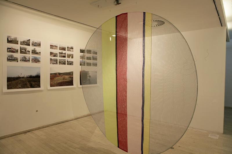
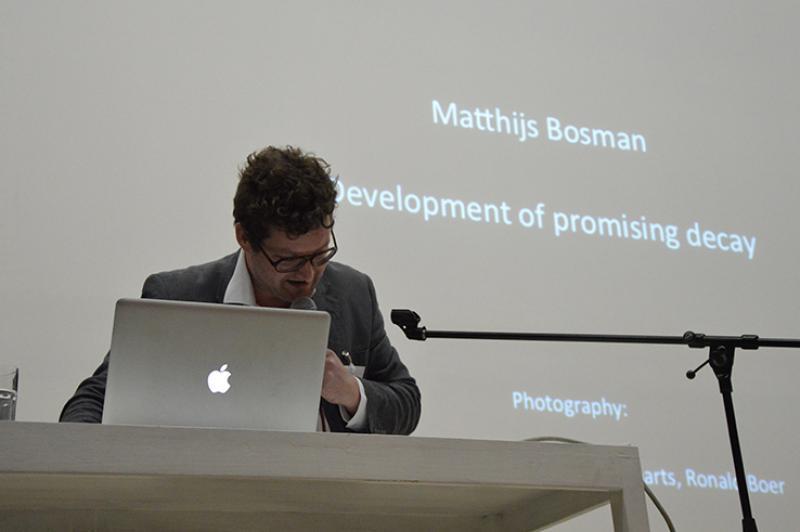
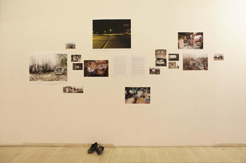
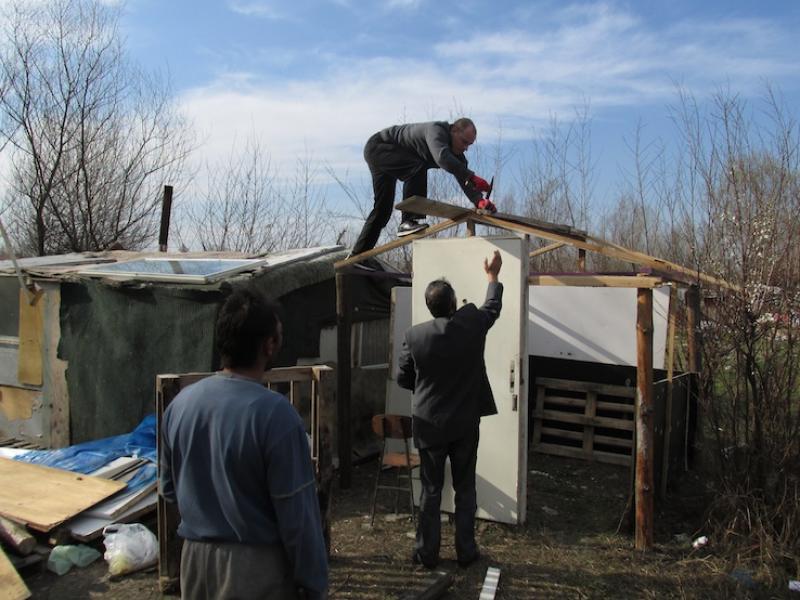


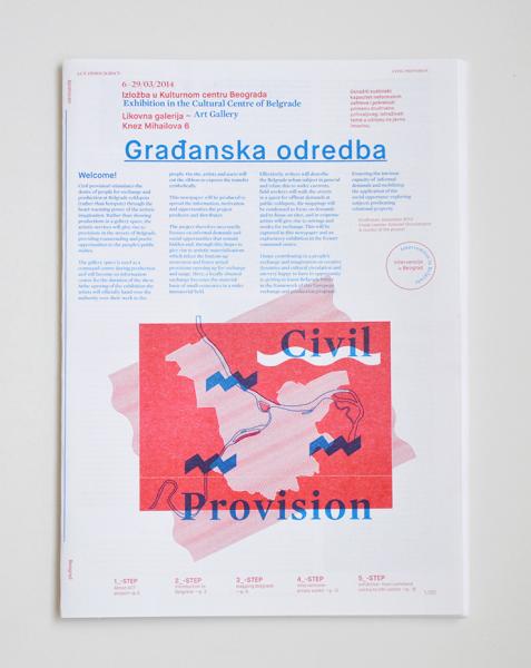
Sep2004 |
Achterland en Achterdocht / Hinterland and Suspicion |
Exhibitions |
curator |
autonomous art |
identity |
autonomous art |
Lokaal 01 |
English |
6 |
7 |
7,5 |
Antwerp:
Keiko Sato (NL)
Felix Schramm (DE)
Hatice Güleryüz (NL/TR)
Marit Shalem (NL)
Haleh Redjaian (NL/DE)
Ivo Provoost & Simona Dinicolaj (BE)
Breda:
Marijn van Kreij (NL)
Hatice Güleryüz (NL)
Marit Shalem (NL)
Haleh Redjaian (NL/DE)
Lokaal 01 -Breda (NL) and Antwerp (BE)- is a hybrid form in action radius. Our original backyard is most close, near are the others alble to receive a name, unnamed are those we do not reach. Status is fading. Statues are lowered. Suspicious notes fall behind the scene.
Procedures make what ritually happens. The illegal just is not present. Counter culture is cultured. Been there, stayed here: away. The other is what we are: neither Dutch nor Belgian. Still here.
We mutually mutate at 01. First, last ever past, remain to say what is not present. We live from distance: we live distant. The two faced thing faces from far. The cheek is always turned to a side. In between stages the white path under sky-high. Hinterland dislocates 01.
This exhibition responds to the year program, mapping the Lokaal 01 organisation anew.

Hatice Güleryüz (left) and Marit Shalem (right)

Marijn van Kreij exibition view
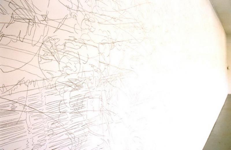
Marijn van Kreij (detail fully drawn wall)
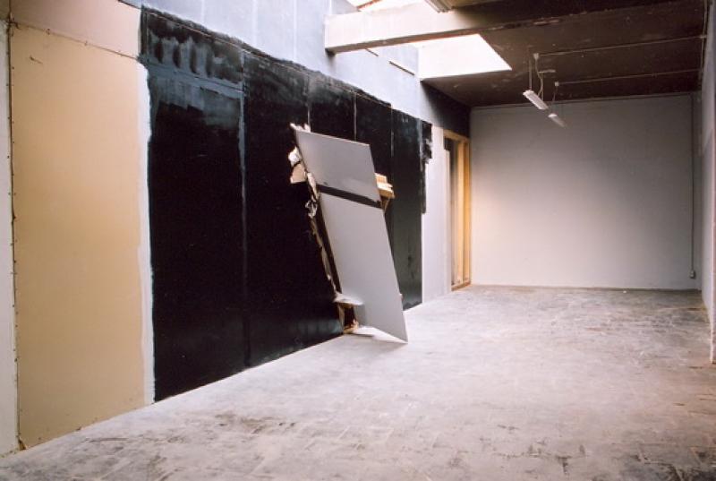
Felix Schramm
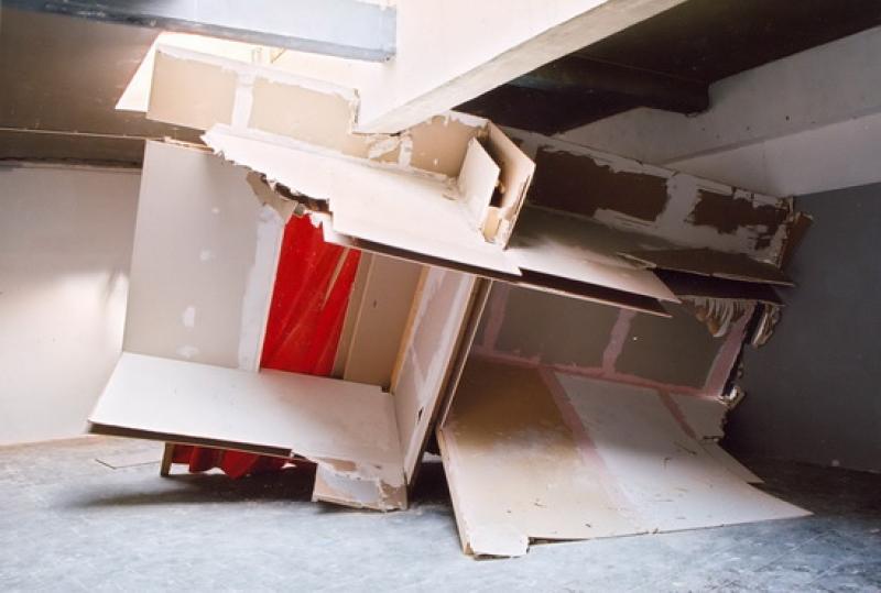
Felix Schramm
May2007 |
Het product en het ding in kwestie |
text |
writer, critic |
critical design |
on the dichotomy between design and art, aesthetics and criticism |
mapping wonderer |
De Kantlijn |
Dutch |
8 |
9 |
8,5 |
Review and mapping of Designing Critical Design; a groundbreaking exhibition at Z33 in Hasselt: a classic opening up to a new wave of design practices, new forms of curating and cultural production.
DOWNLOAD
Dutch text as published in De Kantlijn
Jul2020 |
Interview Metropolis M: Freek Lomme voorvechter voor de marge (championing the marginal) |
interview |
interviewed |
cultural politics |
mediating the marginal |
Metropolis M |
Dutch |
7 |
7 |
7 |
Aug2011 |
Freek profiled in Kunstbeeld |
profile |
profiled |
curator / director |
profile Freek as curator |
describing |
Kunstbeeld |
Dutch |
7 |
7 |
7 |
A profile of Freek Lomme by critic Machteld Leij for Dutch art magazine Kunstbeeld
Een profielschets van Freek Lomme als curator en kwartiermaker, door Machteld Leij in Kunstbeeld
See and read the pdf here (Dutch only)
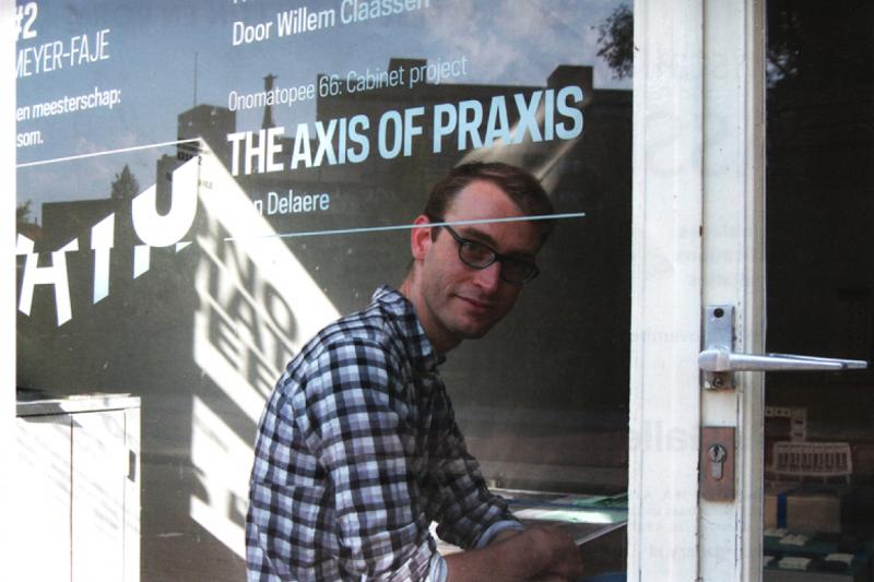
Photo by Machteld Leij
Oct2006 |
Drol vs. Drôle |
text |
writer |
Design |
Design and carnaval |
playfull |
The Daily Whatever |
Dutch |
7 |
8,5 |
7,8 |
Article for the first Daily Whatever, Dutch Design Week daily, designed and edited by Eric de Haas.
DOWNLOAD
Oct2011 |
Copy Nature: Elementary Sentiments |
Exhibition, book and text |
co-curator, co-editor and writer |
design and craft |
A cultivation of elementary value(s) |
calling out |
self-commisssioned and Beeldenstorm |
English |
7 |
7 |
7 |
A cultivation of elementary value(s) in an era of financial-economic scarcity: metal + sentiment.
We desire to live a life which is both aware and luxurious. The cultural and economic prosperity to which we have been accustomed is getting pressured; raw materials, constitutive to our culture’s economy, are becoming in short supply and thus more expensive. Through this dependence on the financial-economic value of raw materials we have become vulnerable. It is a challenge to disengage from this financial-economic traffic, and in doing so attain more independence – both cultural and economic.
Can cultural value give new shape to economic traffic? Can we, in the game of supply and demand, stimulate a new demand through offering a new supply? Elementary Sentiments presents 10 designers who lend to those raw materials, cultural added value. These unique, innovative products stimulate and chart the course of a new, cultural economy – an economy that is independent of financial-economic value.
This collaboration between artists’ workshop, Beeldenstorm, and Onomatopee presents 10 talented designers who add cultural extra value by developing the economic durability of raw materials, both personally and sincerely, through experimental production methods: metal + sentiment!
With: Alexander Pelikan, Mieke Meijer, Max Lipsey, Daphna Laurens, BCXSY, Rachel Griffin, Julien Carretero and Charlotte Dumoncel d’Argence.
Curators/editors: Ellen Zoete, Freek Lomme, Lex van Lith and Max Lipsey
Exhibition design: Daphna Laurens
Graphic design: Raw Color
Texts: Frederik Baas, Simone de Waard, Ellen Zoete andFreek Lomme
Photography exhibition: Fieke van Berkom
Partner organisation: Beeldenstorm
Supported by: Municipality of Eindhoven, BKKC/Province of North Brabant, Prins Bernhard Culture fund , SNS REAAL fund
DOWNLOAD:
Text Freek: Fashion victims and/or social fabrics
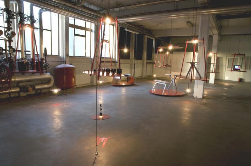
exhibition overview Photography by Lins

exhibition overview Photography by Lins

Julien Carretero Photography by Fieke van Berkom

Exhibition design Daphna Laurens, Photography by Lins

Mieke Meijer Photography by Fieke van Berkom
Oct2011 |
TAKE IT OR LEAVE IT - DESIGN ECONOMICS |
Exhibition and newspaper |
curator, editor |
Design and economy |
Design and economy |
mapping and disturbing |
Van Abbemuseum |
English and Dutch |
7 |
7 |
7 |
Take It or Leave It is a research project that will result in a collection of manifestations and actions throughout the various DDW venues and in the Van Abbemuseum during Dutch Design Week 2011.
The project explores the reciprocal relationship between economy and design, in the past and in light of recent developments. Take It or Leave It aims to involve designers, theoreticians and the public in a debate around value, utility and the struggle to make ends meet.
PAPER
The Take It or Leave It newspaper aims to actively engage Dutch Design Week visitors in thinking about and discussing the future of design.
Inside are articles by design critic of the Guardian, Justin McGuirk, researcher Giovanni Innella, designer Sam Hecht and others – all reviewing different aspects of the reciprocal relationship between design and economy. The publication is offered as a perception tool for the Design Week as a whole: a lens to sharpen one’s view on the surrounding design festivities. The newspaper will be delivered throughout the DDW venues by our paperboys and -girls who are prepared to offer not only a copy of the printed matter but a healthy conversation and some tough negotiation to go along with it. Make sure you get your share of each!
contributors: Eyal Burstein (Beta Tank), Gijs Frieling, Giovanni Innella, Justin McGuirk , Sam Hecht, Freek Lomme, Hadas Zemer Ben-Ari, Parfyme, Public Works, Helmut Smits, Lucas Maasen, Pascal Gielen, Ineke Hans, Alice Twemlow, Gijs Bakker, Alice Rawsthorne, Geert Lovink.
VISUAL SURVEY
In the Van Abbemuseum you are invited to witness a unique visual survey comprised of works by local Eindhoven designers – all accomplished thanks to various subsidies. Comprising together a 3D infographic scheme, the array of works reveal the story of the Eindhoven design scene and its dependency on economic support – freezing the present for a moment, before the reality of upcoming budget cuts sets in. The Take It or Leave It visual survey offers a tangible and matter-of-fact focal point for a public debate on the economic viability of design.
Participants: Maaike Bertens, Mieke Cuppen, Charlotte Dumoncel D’argence, Simone Farresin and Andrea Trimarchi, Tom Frencken, Lara de Greef, Bas Hesen, Jola Hesselberth, Ilona Huvenaars, Anthony Kleinepier, Yorit Kluitman, Maarten Kolk and Guus Kusters, Kathy Ludwig, Lucas Maassen, Rop van Mierlo, Jo Meesters, Anouk Parijs, Alexander Pelikan, Ralph Roelse, TTTVO, Florian de Visser, Doreen Wesphal, Jozua Zaagman.
Design: Lesley Moore
Editors and curators: Freek Lomme and Hadas Zemer Ben-Ari
NEDERLANDS:
TAKE IT OR LEAVE IT - DESIGN ECONOMICS
Take It or Leave It is een onderzoeksproject dat uitmondt in een verzameling van manifestaties en acties in de verschillende Dutch Design Week locaties en in het Van Abbemuseum gedurende de Dutch Deisgn Week 2011. Het project stelt vragen op het gebied van de wederzijdse relatie tussen vormgeving en economie in het verleden, en in het licht van recente ontwikkelingen.
Take It or Leave It heeft als doel om vormgevers, theoretici en het publiek te betrekken bij een debat rond waarde, nut en de worsteling om de eindjes aan elkaar te knopen.
KRANT
De Take it or Leave It krant probeert bezoekers van de Dutch Design Week actief te betrekken bij het denken en discussiëren over de toekomst van vormgeving.
De krant zal artikelen bevatten van Justin McGuirk, design recensent van de Guardian, onderzoeker Giovanni Innella, vormgever Sam Hecht en anderen. Ieder van hen belicht een ander aspect van de wisselwerking tussen design en economie. De publicatie wordt aangeboden als een hulpmiddel om inzicht te krijgen in de Dutch Design Week als geheel. Een lens om je blik op de je omringende design manifestaties te verscherpen. De krant zal in de verschillende DDW locaties verspreid worden door onze krantenjongens en -meiden. Zij zullen niet alleen een geprint exemplaar van de krant aanbieden, maar daarbij ook een gezond gesprek en een stevige onderhandeling. Zorg dat je overal een stukje van mee neemt!
Bijdragen van: Eyal Burstein (Beta Tank), Gijs Frieling, Giovanni Innella, Justin McGuirk , Sam Hecht, Freek Lomme, Hadas Zemer Ben-Ari, Parfyme, Public Works, Helmut Smits, Lucas Maasen, Pascal Gielen, Ineke Hans, Alice Twemlow, Gijs Bakker, Alice Rawsthorne, Geert Lovink
VISUEEL OVERZICHT
In het Van Abbemuseum ben je van harte welkom om een unieke onderzoekspresentatie te bekijken, bestaande uit werken van lokale Eindhovense vormgevers en allemaal tot stand gekomen dankzij verschillende subsidies.Samen vormen de werken een ‘3D infographic’ overzicht, de reeks van werken onthult het verhaal van de Eindhovense designscene en de afhankelijkheid ervan van economische steun; het heden wordt hiermee even bevroren, voordat de aanstaande bezuinigingen realisteit worden. De Take It or Leave It onderzoekspresentatie bieden een tastbaar gezichtspunt voor een publiek debat over de economische kansen van design.
Deelnemers: Maaike Bertens, Mieke Cuppen, Charlotte Dumoncel D’argence, Simone Farresin and Andrea Trimarchi, Tom Frencken, Lara de Greef, Bas Hesen, Jola Hesselberth, Ilona Huvenaars, Anthony Kleinepier, Yorit Kluitman, Maarten Kolk and Guus Kusters, Kathy Ludwig, Lucas Maassen, Rop van Mierlo, Jo Meesters, Anouk Parijs, Alexander Pelikan, Ralph Roelse, TTTVO, Florian de Visser, Doreen Wesphal, Jozua Zaagman.
Design: Lesley Moore
Redactie en curatoren: Freek Lomme and Hadas Zemer Ben-Ari

Photography by Ron Eijkman

Photography by Ron Eijkman

Photography by Ron Eijkman
Feb2013 |
Over-identifying products and production |
text |
writer, critic |
Design and economy |
A leap into a global future beyond local post-industrial specs along Eindhoven based design firm Lucas Maassen & Sons. |
mapping |
Unfold and The New City Reader |
English |
8 |
8 |
8 |
A text on the over-identified, new economy of Lucas Maassen (& Sons) in the framework of the Unfold edited New City Reader.
Download here
The 9th edition of the New City Reader is hung all over the streets of Istanbul! This issue on Economy/Ekonomi was guest edited by Unfold with contributions by Freek Lomme, Erdem Üngür & Işık Gürkaynak, Gwendolyn Floyd (SasaAfrica), Leander Bindewald (Nef) and Vincent Schipper (Monnik). These contributions all explore a ’different’ economy, business as unusual.
"The New City Reader is a newspaper on architecture, public space and the city first published as part of The Last Newspaper, an exhibition held at the New Museum for Contemporary Art (New York City) in 2011. Each issue of the New City Reader is guest-edited by a contributing network of architects, theorists, and research groups who will bring their particular expertise to bear on the individual sections. In emulation of a practice common in the nineteenth century and still popular in parts of the world today, the New City Reader is designed to be posted in public for collective reading."

Oct2009 |
Design Mass |
Exhibitions, talks, publication, text |
CuRATOR, editor, WRITER and PRODUCER |
Design and technology |
design and technological determinism |
mapping, playing |
Self-commissioned |
English |
7,5 |
7,5 |
7,5 |
Reviewing the promise of technological determinism.
What fulfils our world? Technology? Aesthetics? The industry rushes forth, developing new technologies that we are accordingly expected to acquire. Designers make these nice, as even iPod’s are gentle to our senses. Despite all of this: what do we really need? Beauty... technological extensions of our body... what do we need?
Freek Lomme invited three theoreticians to reconsider these questions. In the context of the Dutch Design Week, they will use the Onomatopee project space as their study. In here, they and the visitors brainstormed and developed ideas on these topics.
The technological deterministic prophesy of design is challenged. What could the technocratic system of the neo-liberal design industry offer after the crisis and how can they bring this forth?
Contributors:
Florian Schneider (DE) Koert van Mensvoort (NL) Koen Vermeir (BE)
Challenging the parameters of our (visual) culture. For the Dutch Design Week 2009, their gallery space will be overturned into a space of contemplation and reflection. Onomatopee invites theoreticians/writers known with the field of technological culture and design, to contemplate within the celebration, to reflect on its parameters and target groups from the perspective of the targeted themselves. Operating from within the event itself, located in a public accessible office at Onomatopee’s gallery space, the theoreticians will produce texts, directly in contact with the targeted and the events technocratic body: its creators and mediators. The Onomatopee project space will become a study hall; a writing room for the theoreticians, a reading room for the visitors. The resulting texts will be published.
Our welfare state implements humanist norms and values through a direct connection of the new, labour and salary. This system fulfilled itself within the commodity. Our shared religion remains neoliberal, based on the consumption of identity. We often indulge ourselves into these promises, promising ourselves a better future (beyond the credit crisis).
The current western consumption culture is in decay. The commodity-culture became obsolete, cannot cultivate anymore: cannot gain sales, cannot pay off its production. The resulting physical domain of produced commodities grows on and on like a cancer.
Even though in decay, this highly technocratic system remains to put forth new products with new promises. An ongoing outcome of technical progress enables the ongoing production of new products ’unlike ever experienced before’. An ongoing outcome of technical progress still lures us by means of marketing. Most of all, the religious sphere of the commodity became an obsolete fraud, since it cannot sell its religious promise of humanistic fulfilment anymore. Globalism, the final free-market, only showcased the decadence of the western world: we’re not needed! The western neo-liberal system needs to reposition their production and promises.
Big design events, like the Dutch Design Week, flourish as never before. These events celebrate an enlightened promise of progress while western progress might not be able to cope with the material progress that dominated since the start of the industrial revolution. How does our culture, how do you and me relate to this event? How can we comprehend and cope with it; what does it offer and what could it release? How does this technocratic state relate to the flexibility of our culture?
Curator, editor and production: Freek Lomme
Production assistance: Rob Ritzen
Graphic design: Rob van den Nieuwenhuizen and Jeremy Jansen
Exhibition design: Remco van Bladel
Made possible thanks to: The municipality of Eindhoven
PUBLICATION
DESIGN MASS
Softcover
11 x 18 CM
110 pages
Red text
Edition: 550
Printed at: New Goff
The publication used to be available through Onomatopee, but after splitting with Onomatopee, Onomatopee did not want them anymore and whatever is left is rather lost unfortunate. But you can get the publication through me if you want.
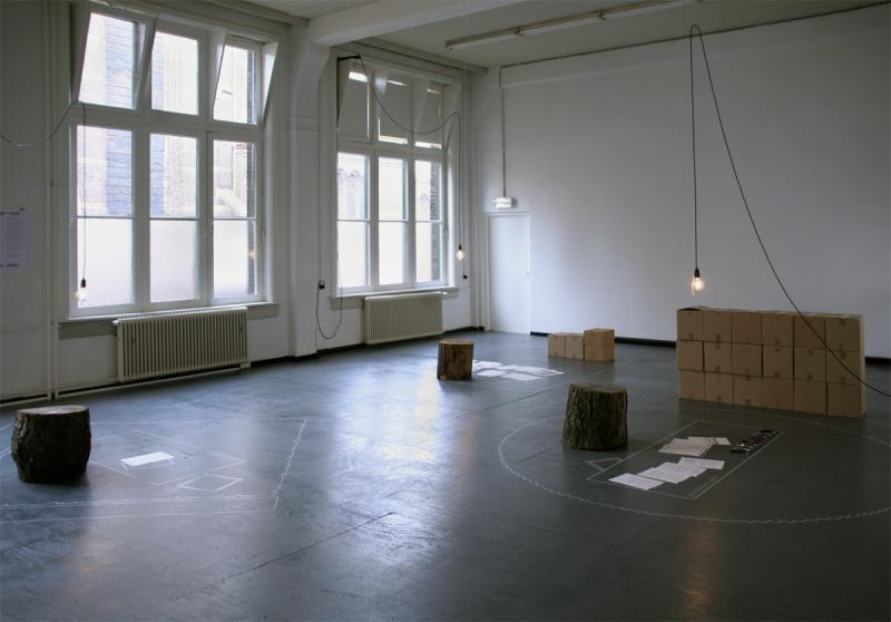


Oct2008 |
The Truth of Basics |
Exhibition, PUBLICATION and text |
CuraTOR, editor, WRITER and PRODUCER |
Design, art, architecture |
a tabula rasa approach to a casco space |
poetic |
Freek Lomme and Dave Keune |
English |
6 |
8 |
7,5 |
Resetting the history of living between four walls
The truth of basics advances that our interior is mainly influenced by our cultural tradition, closely related to our technical tradition. These two conceptions continue to live on rather firmly, not only because of commercial interest, but also because of insecurity of the unknown.Departing from architecture, keeping in mind the four walls as a base, we propose to enhance a new notion of our interior. From an artistic point of view, we want to consider the consequences of the sphere of the installation, the totality of the scene, when creating an interior.
With: Gabriel Lester, Raw Color, Esther Stocker, Krijn Christiaansen & Cathelijne Montens, IJm studio, Thomas Bakker, Tejo Remy & Rene Veenhuizen, Sander Mulder,TTTVO, Maurer United Architects and Bob Copray
Lift Off 2008: The Truth of Basics, Resetting the History of Living between Four Walls. The project included an exhibition at a prime location in the city centre: the offices of Philip van den Hurk financial consultants, as well as a publication, distributed at no charge, with texts that aim to stimulate the senses and the sense of the exhibition.
The Lift-Off project took place during the 2008 Dutch Design Week. In unique fashion, it approached the subject ofthe truth of basics, resetting the history of living between four walls. We took architecture as the basis for everything. We did so by constructing four walls, both concrete and abstract, as a basic frame. For the former, the decor provided by the offices of Philip van den Hurk gave us a fantastic starting point. In the abstract sense, we are concerned with the way that four walls offer diverse creative entrepreneurs a blank framework in which to express their visions about the use and the purpose of a space. They did by thinking through the space.
Departing from the frame, the four walls, we arrive in a context referred to in the fine arts as the ‘installation setting’: the atmospheric setting of a space and the meaning that can be derived from it. The approaches are by way of different disciplines and the media associated with them, such as those of the stylist (decoration as meaning), the artist (the medium lends the meaning), the designer (the product giving meaning) and the architect (the purpose of a space). What is also unique here is that this is not just a dry presentation of products, as is customary in the presentation of design. We have opted for site-specific works, productions designed for a specific location and the circumstances determined by the exhibition, a specific resolution of the problem that we have put to the participants.
For each of these disciplines, we have found outstanding participants who have established their reputations and/or demonstrated distinct talent. In addition, the photography for this newspaper publication, by Ingmar Swalue, and the text by Louise Schouwenberg, each have their own autonomous, discursive function. They are autonomous in the sense that, instead of shooting numerous product photographs, the photographer expresses his own interpretation of the work, while Louise Schouwenberg has also been challenged not so much to provide a hermetic, decisive interpretation, but to freely speculate, to provide a stimulating context for further interpretation. She has done this on the basis of the project proposals provided her, which included statements of intent, architectural drawings, sketches and so on. The objective of these texts is to put the stimuli offered by the various works into a context that challenges us to further discourse, thought or production.
With The Truth of Basics, we initiated an investigation into the frontiers between a space as a whole, made up of architecture and interior, by using the empty shell – the four walls – as a radical starting point, in order to chart the pure potential of a space by way of the differing disciplines and with different, strong perspectives.
Artistic and managing directors:Freek Lomme for Onomatopee and Dave Keune for Lift Off.
Graphic design:Novak
Photography:Ingmar Swalue
Text: Freek Lomme and Louise Schouwenberg
Made possible thanks to:
Buro Philip van den Hurk
Prins Bernhard Cultuurfonds
SNS Reaalfonds
Stokroos
Gemeente Eindhoven
PUBLICATION
THE TRUTH OF BASICS
newspaper (black/white) with gloss poster cover (pull color)
26 pages
30 x 42 CM
Printed at:
The publication used to be available through Onomatopee, but after splitting with Onomatopee, Onomatopee did not want them anymore and whatever is left is rather lost unfortunate. But you can get the publication through me if you want.

Maurer United Architects

Studio Ijm

Esther Stocker (thanks to Mari Tosmin)

Gabriel Lester (thanks to Remco van Bladel)
Design publication by Novak
Feb2008 |
Desarting |
Exhibitions and publication |
CURATOR, editor, WRITER and PRODUCER |
Design, art, criticism |
where do applied and abstract arts meet? |
mapping |
Freek Lomme |
English |
7 |
7,5 |
8 |
Desarting
Where visual and industrial design mutually attract and distract
A mapping of art and design practices that focuses on the similarities and differences, the tensions and the bridges. Desarting is a case study of the act of visualising communication: it reveals the possibilities and its applications with respect to various autonomous qualities and engaging opportunities.
Evidentley Eindhoven is Design Capital #1. Still, what does it effectiveley mean to use the term ’designer’ and ’artist’? What does the practice actually behold and what can the public and commssioners expect from what proffession and from which practitioner...?
This mapping of art and design practices - the first exhibitions at the Onomatopee space in Kanaalstraat Eindhoven, focuses on the similarities and differences, the tensions and the bridges within the practice of a singe ’trained’ artist and designer. A critical writer will follow them and together they will mutually and publicly endeavour to describe their practices, starting with an honest personal approach.
Desarting is a case study of the act of visualising communication: it reveals the possibilities and its applications with respect to various autonomous qualities and engaging opportunities.
Each opening featured a public discussion between the artist, the designer and the writer. The forum will take place within the setting of the presentation.
Desarting #1
CHARLES VAN OTTERDIJK, FLORIS HOVERS AND IRIS PETERS
Desarting #2
TOM VERBRUGGEN, GIJS GIESKES AND SANDRIJN VAN DEN OEVER
Desarting #3
DANIELLE SMITS, RUTH LODDER AND RENSKE BRINKMAN
Desarting #4
JEROEN DOORENWEERD, WOUTER SCHEUBLIN AND LENE TER HAAR
Curator/project manager/editor:Freek Lomme
Graphic Design: Vera Bekema, Koos Siep, Isolde Venrooy
Made possible thanks to: Municipality of Eindhoven, NBKS / Province of Brabant
PUBLICATION
DESARTING
OMP19
ISBN: 978-90-78454-17-5
72 pages
17 x 24 cm
Full color
Printing:
The publication used to be available through Onomatopee, but after splitting with Onomatopee, Onomatopee did not want them anymore and whatever is left is rather lost unfortunate. But you can get the publication through me if you want.

Wouter Scheublin and Jeroen Doorenweerd

Ruth Lodder and Danielle Smits

The book!
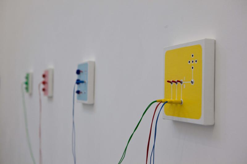
Dec2009 |
What are they good for? (Design Real) |
review |
critic |
design, craft, technology |
On visual presence and technological presence |
mapping |
none |
English and Dutch |
7 |
7 |
7,5 |
Review of the Design Real exhibition in Serpentine Gallery, curated by Konstantin Grcic. I took on the matter.
DOWNLOAD
text in English
text in Dutch

Design Real Curated by Konstantin Grcic Exhibition designed in collaboration with Alex Rich and Jürg Lehni Installation view: Serpentine Gallery, London
Feb2011 |
Comfort Zone and Disillusion |
exhibitions and publications |
CURATOR, editor, WRITER and PRODUCER |
design, criticism |
Where comfortable experiences usher our lives beyond comfort zones! |
playfull |
self-commissioned |
English |
7,5 |
9 |
8 |
Where comfortable experiences usher our lives beyond comfort zones!
Group Exhibition of Nest 2011, talk and launch of Onomatopee’s NEST 2011 box-set!
Presented by Onomatopee in collaboration with The Royal College of Arts Critical Writing in Arts and Design programme, hosted by So Far the Future
Where comfortable experiences usher our lives beyond comfort zones!
Comfort zone & Disillusion spotlights trends and currents via the combined strengths of “unsolicited advisers”, both powerful and young, who apply various strategies in order to pragmatically subvert the experience-economy’s political sphere by expanding and/or improving its qualities – with DIY event stylists heyheyhey, surreal architect Willem Claassen, hedonistic ecologist Nacho Cabonell and bottom-up urban cartographer Jozua Zaagman.
The NEST 2011 series exhibits the work of young and talented regional practitioners in four solo shows, based on their motives and actual accomplishments. Each of these solo exhibitions is paired with a publication on their work designed by Raw Color.
Visual variables by:
heyheyhey
Willem Claassen
Nacho Carbonell
Jozua Zaagman
Textual reflections by:
Arie Altena
Andreas Müller
David Morris
Ellen Zoete
Freek Lomme
Gerben Willers
John Dummett
Julie Taraska
Marco Tobasso
Michiel Huijben
Peter Maxwell
Curator/editor:
Freek Lomme
Graphic design:
Raw Color
Our age is characterised by the cumulative establishment of “comfort zones” in which we feel at home. We surround ourselves with objects like furniture and various accessories, with social events such as festivals, high teas, or visits to cinema that suits our disposition: that enable us to “get away from it all” and offer “a necessary time to relax”, to be with each other or “to live the family domestics”. This comfort zone is the cultural denominator for a very narrow understanding of what is private, both in a mental as a spatial perspective.
In recent decades the idea of the “wellbeing” has become strongly embedded in our cultural expectation: we now simply expect increasingly good health- care, spare time, holidays and trips, domestic luxury and so on. This expecta- tion used to commensurate with increased purchasing power. Meanwhile, the Wall collapsed and the free market became free for the world at large, making the rich West’s competitive position, an illusion. Despite the warning of the credit crisis, a culture of greed has remained submerged within the ashes. There is increasing support for a policy that the leftist desire for mercy and the right’s desire to reduce taxes unifies: a policy that effectively feeds off all of its own excesses...
Cultural and economic innovation stems precisely from progressive attitudes: from progressive qualities of “innovative thinking”. Effectively this means
that we, you and I, should overcome our primal urge to “the comfortable”. We need to dare to acknowledge our assumed reality as an illusion and dare to experience this illusion. The disposition of disillusion, the ability to rethink and reposition your desires and character, are pious positions in a spoiled culture.
The theme of Comfort zone & Disillusion takes on these qualities by spotlighting strong “unsolicited advisers” who apply these strate- gies. By focusing on outspoken voices from the region using the framework of the exhibition to outline the issues of concern, together with a publication, this programme presents a broad range of other experiences: of comfort zones and disillusions!
Curator / managing director / chief editor: Freek Lomme
Project manager/ final editor: Ellen Zoete
Assistance: Maartje van der Schoot
Graphic design: Raw Color
Made possible thanks to: BKKC/province of Noord-Brabant and Municipality of Eindhoven
PUBLICATION
COMFORT ZONE AND DISILLUSION
cassette box with four books of each of the Comfort Zone and Disillusion series, plus an extra reader with overall essay’s on the subject.
The publication used to be available through Onomatopee, but after splitting with Onomatopee, Onomatopee did not want them anymore and whatever is left is rather lost unfortunate. But you can get the publication through me if you want.
DOWNLOADS:
Intro Freek to reader Comfort Zones Box
Freek’s gamerules on HEYHEYHEY in ENG
Freek’s gamerules on HEYHEYHEY in NL
Freek’s gamerules on HEYHEYHEY in DE
Freek’s gamerules on HEYHEYHEY in IT
Freek on Willem Claassen
Freek on Nacho Carbonell
Freek on Jozua Zaagman
Grouposhow "Comfort Zone and Disillusion" London
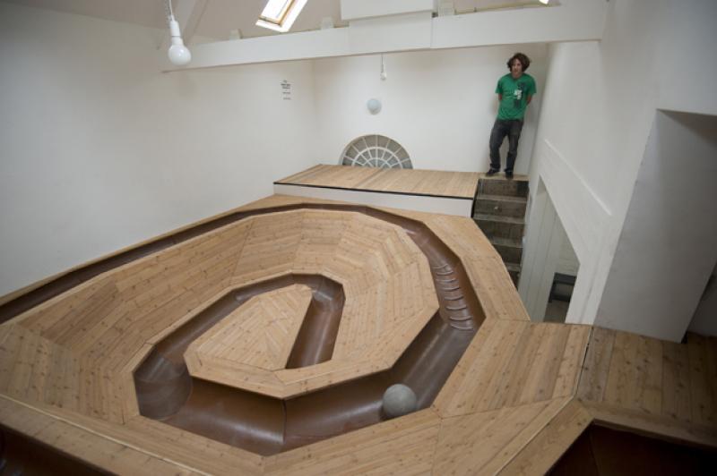
Fragment solo Willem Claassen - photography Fieke van Berkom
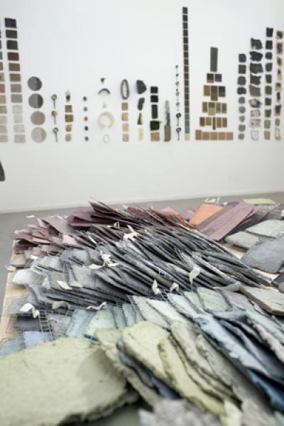
Fragment solo Nacho Carbonell - photography Fieke van Berkom

Fragment solo Jozua Zaagman - photography Fieke van Berkom

Cassette with four books and small reader. Design and photography by Raw Color
May2008 |
TRANSITIONERS: LE PRODUCTEUR |
Exhibition and conference |
curator |
design, criticism |
ideology and design |
mapping |
your-space / Van Abbemuseum |
English |
8 |
7 |
7,5 |
A module and conference about ideology and design.
Conference:
Sunday, May 18th, starting at 14:00
Produced in collaboration with Société Réaliste and Marko Stamenkovic, independent curator and writer, proposed to present the TRANSITIONERS’ 2008 Political Trend Collection module in your-space from May 8th to May 25th, 2008, in Eindhoven. Simultaneous, they proposed a conference on ideology and design. your-space curator Freek Lomme gladly accepted to debate design and ideology, in regard of the design sphere within Eindhoven. There’s a need to put design practices in a critical and international perspective, therefore we asked some designers and theoreticians whom work with ideology to step in the arena.
We will discuss present day ideology, social practices and design practices.
With:
- Cindy van den Bremen (designer, Eindhoven),
- Daniel van der Velden (Graphic designer, writer, Amsterdam),
- Annelys de Vet (graphic designer, Amsterdam, head of the man and communication department at the Design Academy),
- Marko Stamenkovic (writer and freelance curator, Belgrade / Amsterdam),
- BAVO (critics/researchers)
- Société Réaliste (cooperative, Paris),
- Marije van der Park (social designer, Eindhoven).
Moderated by Freek Lomme, curator/coordinator your-space.
Objective Module
TRANSITIONERS is a trend design agency, specialized in political transitions. Transposing the principles of prospective design, generally used by professionals in the field of fashion, to the field of politics, Société Réaliste questions the revolution (transition?) as a central category for contemporary Western society. How can a "democratic transition" be produced? What is the role of design in the permanent conversion of political flux into mythology? How can the effect of an event on citizens be transformed into a controlled affect?
Depending on present atmosphere, TRANSITIONERS defines the general climate, in which future social transformation movements will take place, in order to maximize their efficiency. By examining the evolution of revolution as a form, the project offers visual and semantic tools ready to be used by whoever wishes to: logotypes, color charts, lexical fields, etc.
Background
For each new step in the project, Société Réaliste conceives a new trend collection, originated by a precise historical event. In 2007, the inspiration for « Bastille Days » was the French Revolution. The 2008 collection, entitled « Le Producteur » , is based on the utopias developed during the first three decades of the 19th century, by thinkers such as Fourier, Enfantin, Rodrigues, Cabet, Owen, or Saint-Simon. A wide double-side panorama, pictorial and theatrical device inherited from that time, is inscribed in the architecture of Your-Space, allowing the visitors to discover the latest research of
TRANSITIONERS
The central question of the 2008 collection is related to the progressive separation of liberalism and socialism. While they have a common origin and were not differentiated by major utopian thinkers, the events of 1830 and 1848 progressively opposed them. This binary confrontation between liberalism and socialism still constitutes the basis of our common representations. For TRANSITIONERS, the interrogation of this ideological chasm, of its accuracy and its contradictions, is central. The stake of the collection « Le Producteur » consists in knowing how these movements share a common ideological base, and how the later can nourish the design of future transitions.
In 2006-07, the « Bastille Days » collection was presented at Trafo Galéria (Budapest), at the Kunstpavillon (Innsbruck), on the occasion of the 2nd Biennale of Moscow, at Mains d’Oeuvres (Saint-Ouen), at Ze dos Bois (Lisbon) and at the Martine Aboucaya gallery (Paris). In 2007-08, Société Réaliste has presented « Le Producteur » at La Synagogue de Delme (France), within the frame of Transmediale 08: Conspire... at the Haus der Kulturen de Welt (Berlin), and within the frame of Utopia Transfer at Kiscelli Museum in Budapest.
SOCIÉTÉ RÉALISTE
Société Réaliste is a Paris-based cooperative created by Ferenc Gróf and Jean-Baptiste Naudy in June 2004. The cooperative manages the development of research and production structures in fields such as territorial ergonomy, experimental economy, political design or counter-strategy. Société Réaliste’s practice is resolutely polytechnic, developed through exhibitions, collaborative research projects, cultural events organization, lectures, critical writings or educational interventions. Since January 2008, Société Réaliste is researcher in Design at Jan van Eyck Academie (Maastricht).
links:
www.societerealiste.net
www.cvdbremen.nl
www.marijevanderpark.nl
www.annelysdevet.nl
www.metahaven.net
www.bavo.biz
Apr2015 |
Movements and centres hard cores in hard-hearted chords |
"Poetry" booklet |
Author ("poet") |
experimental writing |
movement and centres |
mapping on the go |
myself |
Dutch and English |
7 |
7 |
7 |
Movements and centres
hard cores in hard-hearted chords
Poems by Freek Lomme with images by Joan van Barneveld
Graphic design by Eric de Haas / HEYHEYdeHAAS
ISBN 978-94-91677-32-8
Pocket
Bronze + some black
90 x 150 mm / 3,5 x 6 inch
176 pages
26 images by Joan van Barneveld
The publication used to be available through Onomatopee, but after splitting with Onomatopee, Onomatopee did not want them anymore and whatever is left is rather lost unfortunate. But you can get the publication through me if you want.
When we want to articulate in-depth positions and get a ducking while we’re at it, the dynamic integrity of solitary isolation comes in conflict with the levelling status at the surface.
Curator, art critic and poet Freek Lomme and artist Joan van Barneveld feel the urge to leap. At the same time they are afraid of the deep. They want to leave but they also hope to return home safely.
Sketching as linguistic and visual creatures, they fathom the depth at the horizon of experience. With his poems – ‘short pieces of text’ – Lomme seeks to balance the humanistic challenge inherent of the modern armamentarium of language with an urge for intense ‘doings and dealings’. Van Barneveld’s artworks present places where we could get a dip: representations of our desire for profundity; imaginable locations where we can project handles for profound retreats.
This book is a report of their leap in the deep end. A shared tribute to the need to find a place amidst transition and to get lost while seeking the way. Lomme’s poems evolved between 2008 and 2014, often on the road, in a period when his radius of action shifted from that of a local dreamer to that of a global cultural worker. Likewise, the sketches by Van Barneveld can be understood as a localised report of a coming-of-age. They are silkscreens of photos made in Los Angeles and raw images serving as sources for new works: they localise and release profundity, specifically in the finalised works. During an exhibition of Joan van Barneveld at art space Onomatopee, run by Freek Lomme, they recognised each other in their respective movements and centres, and decided to combine this raw source material with the unpublished poems.
What this illustrated collection of poems brings to the surface is the palpable energy of their leap, their search for a profound, honest position in an expanding world. What connects them is their dedication to that depth, where they both take inspiration from Punk’s rough edges and the free arts’ applicable potential to articulate indeterminate spaces: ‘hard cores in hard-hearted chords’.
‘Rock on’


Sep2014 |
THE BEST AMERICAN BOOK OF THE 20TH CENTURY |
Publication and exhibition |
Editor, curator and producer. |
fiction, conceptual art |
The best American literature of the 20th century |
Conceptually valid |
self-commisssioned |
English |
7 |
10 |
8.5 |
THE BEST AMERICAN BOOK OF THE 20TH CENTURY
Consists of
the first sentence of the first best-selling book of 1900, as listed*;
the second sentence of the second best-selling book of 1900, as listed;
the third sentence of the third best-selling book of 1900, as listed;
the fourth sentence of the fourth best-selling book of 1900, as listed;
the fifth sentence of the fifth best-selling book of 1900, as listed;
the sixth sentence of the sixth best-selling book of 1900, as listed;
the seventh sentence of the seventh best-selling book of 1900, as
listed;
the eight sentence of the eight best-selling book of 1900, as listed;
the ninth sentence of the ninth best-selling book of 1900, as listed;
the tenth sentence of the tenth best-selling book of 1900, as listed;
the eleventh sentence of the first best-selling book of 1901, as listed;
and so on up to the end of the century, to the thousandth sentence of the tenth best-selling book of 1999.
Each sentence is footnoted with its reference.
Ten sentences form one paragraph, representing one year.
Ten paragraphs form one chapter, representing one decade.
The book represents a century: the American Century.
In constructing ‘The Best American Book of the 20th Century’, artist cooperative Société Réaliste replaces the proper nouns by pronouns. This slightly enhances the original text and enables a selected overview of the history of Best American Fiction in one condensed, ambitious novel.
SUBJECT IN CONTEXT
As ‘The Best American Book of the 20th Century’ travels through the textual materiality of an entire century of mass-produced literature, it suggests intertextual relationships between the narratives of American fiction. Since a multitude of changes in time and culture converse in the book, the project transverses the usual, formal standards of language, questioning power dynamics between reader and writer. Are Pearl S. Buck, Sinclair Lewis, Ernest Hemingway, Margaret Mitchell, Ayn Rand, John Steinbeck, Daphne du Maurier, J. D. Salinger, Stephen King, and Toni Morrison basically telling a similar story? Do they, through this project, become the collective authors of one, all-encompassing- book? Is the project an opportunity to re-assess and reflect upon modernity’s spell on our collective imagination? And, ultimately, how does its composed text resonate in our present times?
OBJECT IN CONTEXT
Pockets brought literature to the masses by turning books into best sellers. Contrary to high-end prints the design of these pockets, cheap and mass-produced, was fit to serve the distribution system. Often effectively well–boxed, they were proportioned to maximize the box’s content and carrying-ability and were taggedto increase recognizability for the man handling the boxes rather than to make them look good.
The accompanying exhibition is conceived as a stock-sale of the book, in which the mass-produced and standardized presentation materials resonate with familiar formats of 20th century modes of book distribution and display. The standard cardboard boxes utilized as distribution and display devices represent functional carriers of the circulation of mass fiction throughout the previous century, and, for a significant part, up to this day. This project is brought to exhibition as a “stockroom-booksale”, resonating the symptoms of mass-distribution as visualized both on a sculptural and a graphic, formalized level. It presents a unique opportunity to display the boxes both as singular units on bookshop counters and as miniature sculptures in exhibition contexts, hinting at the standardized logistical and economic infrastructures behind each book purchase and art display.
Design agency Project Projects translated these ambitions in the publication’s graphics, in close collaboration with the editorial team. Curator Niels van Tomme served as scenographic advisor, Onomatopee director Freek lomme facilitated final editing and production: exhibition space and publisher Onomatopee provides an institutional framework for the presentation and distribution of this project, making ‘The Best American Book of the 20th Century’ its 100th project issue (OMP100).
* The 20th-Century American Bestsellers Database consists of work done by undergraduate and graduate students at the University of Virginia, the University of Illinois, Catholic University, and Brandeis University, from 1998 to the present, using the rankings from Bowker’s Annual/Publisher’s Weekly.
ISBN 978-94-91677-26-7
Pocket, 112 pages
Black/White
13 x 21 cm / 5 x 8 inches
Curatorial and editorial team: Niels van Tomme, Freek Lomme, Prem Krishnamurthy and Société Réaliste
Exhibition design: Niels Van Tomme (concept development and advice), Project Projects (graphic design) and Freek Lomme & Tineke Polak (production).
Graphic design publication: Project Projects
Production and producing: Freek Lomme for Onomatopee
Onomatopee assistent: Mitchell Onuorah
Made possible thanks to the Municipality of Eindhoven


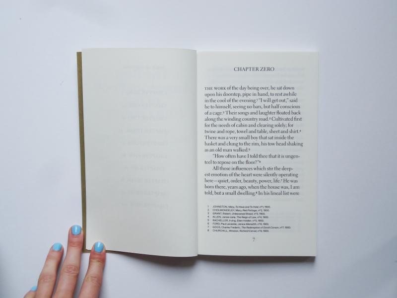
Dec2017 |
50 anniversaries / 50 jarigen |
book |
presenting the best of my collection |
folk art, street-art, graphic design |
posters of 50 year olds on the streets |
expanding |
myself |
Dutch and English book available |
7 |
9 |
7,5 |
ORDER book at Set Margins’
50-year-olds: they’re hung up in streets, stuck in dull, damp plastic sleeves; they are taped to lampposts, to electricity substations or traffic signs, or they’re attached to trees with drawing pins.
This publication and exhibition explore the typically Dutch tradition of publicly displaying home made photo collages throughout streets and neighborhoods in celebration of a person’s 50th birthday.
Almost reminiscent of missing pet posters, amateur portrait photographs are distributed and displayed by being taped onto lamp posts and stapled to trees by friends or relatives, at the mercy of public opinion. Exposed to judgment and ridicule by friends, family and strangers, due to the usually demeaning nature of the photographs through unflattering holiday photos and the likes, individuals are exposed, raised out of anonymity and placed in the public eye.
To an extent the street becomes an exhibition space for the non art-oriented person. It’s a document of the democratisation of the public domain, through a tradition which allows artistic expression and experimentation for anyone, under the gaze of a watchful even if disengaged audience.
The presented collection of posters, possibly a study of non-intentional art under the scrutiny of the public eye, constitutes an archive and an ode to amateur, home made graphic design, made possible through the democratisation of artistic means and software such as word art, paint and clip art. A non-hierarchical demonstration of taste and aesthetic is catapulted into the streets and now gathered in the exhibition space. Perhaps involuntarily, the posters bear a sense of humour and irony to the rest of the on-looking public.
read the article on VICE NL (in Dutch only)
Curators: Lucy Rose Nixon, Mook Attanath, Freek Lomme
Final editor: Freek Lomme
Graphic design book cover: Mook Attanath.
Made possible thanks to Freek’s savings.


Oct2006 |
VIS À VUE |
Exhibition, book, text |
curATOR, editor, WRITER and PRODUCER |
Graphic design |
Visual literacy: a visual manual for visual culture |
playfull quest |
Self-commissioned by Freek and Remco |
English |
6 |
9 |
7,5 |
A visual manual for visual culture
A project on visual literacy for which Onomatopee invited graphic designers/typographers to visualise their position in relation to visual literacy. These visions resulted in the publication of vis à vue, a visual manual for visual culture.
As people increasingly tend to read the world visually, it might be good to stimulate visual literacy. This book, conduced in the format of an exhibit, showcaes typographers who visualised their visually literate position in relation to the world, thus enabling users of the book to gain knew relations and increase their reach of perspectives.
When shown at the fairground of the Dutch Design Week 2006, many housewives who got interested in the diverse storys and perspectives, bought the book. We expect them to have returned home and getting into debates over the literacy involved with their families; very nice results!
Curator/project manager/editor:Freek Lomme
Graphic design book and exhibition: Remco van Bladel
Participating typographers / graphic designers:
Bart de Baets, Derk Reneman & Manuela Porceddu, Eric de Haas, Harmen Liemburg, Hans Gremmen, Jonathan Puckey, Karen Willey, Lesley Moore, Martijn Sandberg,Marjolein Delhaas, Meeuw, Modern, No-Office, Rob van Hoesel, Roger Willems, Severin Frank, Thomas Buxo, Tobias Schaub and Yvonne van Versendaal.
Made possible by: Municipality of Eindhoven
PUBLICATION
ISBN 90-78454-03-2.
96 pages
full color
Introduction: Freek Lomme
Graphic design: Remco van Bladel
Printing and lithography: Lecturis
The publication used to be available through Onomatopee, but after splitting with Onomatopee, Onomatopee did not want them anymore and whatever is left is rather lost unfortunate. But you can get the publication through me if you want.


Nov2010 |
Grafische Grafiek |
exhibition, reader and text |
curATOR, editor, WRITER and PRODUCER |
graphic design and craft |
graphic design and printing techniques |
field research |
GA s’Hertogenbosch |
Dutch |
7 |
7,5 |
7,5 |
Klassieke uitdrukkingswijzen in eigentijdse uitingen
Een expositie in het Grafisch Atelier s’Hertogenbosch
Grafiek is de verzamelnaam voor vele klassieke grafische technieken zoals diepdruk (o.a. gravure, ets of droge naald), hoogdruk (b.v. blinddruk, houtgravure, houtsnede, kartondruk of linosnede), vlakdruk (zoals lithografie, monoprint) of doordruk (zoals zeefdruk, sjabloondruk of stencildruk).
Door toename van digitale technieken zijn veel van de expressieve, technische mogelijkheden van deze druktechnieken voor nieuwe lichtingen kunstenaars in onbruik geraakt en vrij onbekend.
De grafische vormgeving heeft echter een boost gemaakt. Dit gebeurde onder invloed van toenemende vraag naar reclamemateriaal en de toenemende beschikbaarheid van goedkope massadruktechnieken. Tevens verschuift het toneel voor grafische uitingen meer en meer naar digitale media.
Vreemd genoeg bevatten de standaard grafische software veel filters en bewerkingsopties die voortkomen uit de specifieke expressieve uitingsvormen van de klassieker grafische technieken.
Recent is er bovendien een roep ontstaan naar een herbezinning met betrekking tot de huidige immateriële arbeid; de digitale productie die snel vorm kan krijgen en daarmee trager technieken en trager werkprocessen verdrukt.
Met o.a.: Attak - FoURPAcK ontwerpers - Hansje van Halem - Michiel Schuurman - Kaftwerk - almost Modern - Remco van Bladel - Studio Boot - Studio Daad - Poula Versantvoort - BOWfor / Waldo van Bokhoven
Curator: Freek Lomme
Grafisch vormgeving uitgave / projecthuisstijl: Theo Peters, Comma-S ontwerpers
Sponsor: Kampert drukwerk Oss
DOWNLOAD


achter: FoURPAcK ontwerpers, links Hansje van Halem
Remco van Bladel

links studio Daad, voor ATTAK, achter Almost Modern

Michiel Schuurman
Mar2010 |
the Form and the Frame / de Vorm en het Venster |
Research, exhibition, publication |
CURATOR, editor and PRODUCER |
Graphic design, communication, media, politics |
On opinion media as a window to reality: a case study in editorial design |
pushing and mapping |
Onomatopee |
Dutch and English |
8 |
9 |
9 |
On opinion media as a window to reality: a case study in editorial design
Each medium has its own group as the target of its communication. But which position is actually taken and in what sense is this position coloured? At this moment, there are many discussions about what our media landscape is offering. Public broadcasting would no longer disseminate rightist opinion, and every opinion magazine is set aside as leftist by populist commentators. A lack of clarity seems to have emerged concerning the identity of the media and our identification with the media. What is left, what is right, and what is pure reporting? What do we want to engage with?
Each medium has its own group as the target of its communication. In everyday use each medium both has its core readership and incidental consumers. These groups are addressed by an idiosyncratic use of language and image, of visual and textual rhetoric. An editorial board chooses a specific approach and in doing so applies a specific form. That is what editorial design is. Editorial design gives colour and takes positions. Editorial design is politics.
But which position is actually taken and in what sense is this position coloured? At this moment, there are many discussions about what our media landscape is offering. Public broadcasting would no longer disseminate rightist opinion, and every opinion magazine is set aside as leftist by populist commentators. A lack of clarity seems to have emerged concerning the identity of the media and our identification with the media. What is left, what is right, and what is pure reporting? What do we want to engage with?
‘the Form and the Frame’ engages in the construction of media. Onomatopee has assembled editorial boards to investigate the editorial design of specific opinion magazines; to approach their typical usage of text and image. The investigations will include formal aspects such as the relation between image and text, the normative content of the headlines and so on: hard facts. ‘the Form and the Frame’ ignores actual subjects as described in actual news, it does not touch upon actual issues. Through its formal approach it places the normative framework on the agenda.
Research and imagination
The editorial boards comprise visually and textually capable persons with a knowledge of editorial design. The editorial boards will design an article, both visually and textually, formally addressing the values concerned. The article will be widely made accessible. The current lack of clarity in the media landscape will be made tangible and provided with a better insight.
Presentation
Of course the resulting articles, brought about to the public, will also be featured in the Onomatopee project space. Additionally, Onomatopee shows the registrations of the editorial board meetings, thus revealing their considerations and choices to the audience. These meeting will be presented through film recordings and minutes of the meetings, among others. In order to provide this project and the current tension with a historical context - this problem is of all ages - there will be film screenings that consider these tensions in the past.
Through this project, Onomatopee intends to place the communication of our opinion on the agenda. ‘the Form and the Frame’ both triggers our opinion and engage the professional community, especially in the area of communication, politics, graphic design, and media.
The visitors will very much be encouraged to pick up the pen, to take the editorial opportunity to actively edit the framework of this formalist play.
Knowledge development and responsibility
At the end of the project, reflection and additional content will be collected at a public encounter with experts and condensed into a publication. As is common to all Onomatopee publications, this publication will make the render the additional layers of meaning transparent.
Editorial board #1: Eric de Haas, Bart Groenendaal,Merijn Oudenampsen
Editorial board #2: Annelys de Vet, Jeroen Boomgaard
Metadata intervention: Kim de Groot
Artistic and managing director and project coordinator:Freek Lomme
Graphic Design, PR, exhibition, and publication:Marjolein Delhaas
Camera:Ron Eijkman
Exhibition design advice:Hadas Zemer
PUBLICATION
THE FORM AND THE FRAME / DE VORM EN HET VENSTER
OMP41
Softcover
25 x 34,5 CM
full color
Two stabled booklets (95 & 47 pages) wrapped in one cover
Edition:
1000
Printed at:
The publication used to be available through Onomatopee, but after splitting with Onomatopee, Onomatopee did not want them anymore and whatever is left is rather lost unfortunate. But you can get the publication through me if you want.


Photography: Fieke van Berkom
Oct2008 |
KAPITAL K |
Exhibition, PUBLICATION and text |
CuraTOR, editor, WRITER and PRODUCER |
Graphic design, communication, media, politics |
visual politics of language in graphic design |
playful mapping |
Self-commissioned |
English |
6,5 |
7,5 |
8 |
A classless character
If language is indeed less fixed as is often thought, why would graphic designers apply this very symbolic signification so much? Can’t we consider linguistic signification differently?
Language is always altering since it’s subjected to many influences like technology, recognizable in MSN slang, multicultural influences, like the Moroccan rif slang that is entering our Dutch standard language and so forth. How can we connect the immaterial meaning to the material expression in a way suiting our communication?
‘Man does make his own history, but not under self-chosen measurements’ and ‘Fight for a classless society’ are well known slogans of Karl Marx. He revised our daily perception of labour within an economic system and focussed on an international system of equality by balancing economy and production. Eventually, what we need to consider is our work ethic. In the current globalising timeframe we still search for balance between economy and work.
When graphic designers and typographers use language without rethinking its limitations, they operate as alienated reproducers within a system of cultural (re) production.
Is it still possible to produce a character with universal acceptance or can you only prescribe one? Can different language systems exist in a plural manner or are we stuck in a fundamental unintelligibility?
A co-production with: Grafisch Atelier Daglicht, eindhoven
Curated by: Freek Lomme, Remco van Bladel, Linda Arts and Eric de Haas
Project manager:Freek Lomme
Texts: Freek Lomme and Peter Bil’ak
Gaphic design: Eric de Haas i.c.w. Hugo Naber
Made possible thanks to:Municipality of Eindhoven, Pokon Fund
PUBLICATION
ISBN: 978-90-78454-17-5 — Soft-cover — 13 x 21 CM — Black, red — Edition:250 — Printing: Greve Offset
PRICE: € 12,00 SOLD OUT!

Sep2011 |
The voice of... |
EXHIBITION and PUBLICATION |
Curator / editor |
Graphic design, painting, activism |
The position of the individual in public space and visual memory |
playfull |
self-comissioned |
English and Dutch |
7,5 |
8 |
7,5 |
Public opinion-forming as citizenship? The word is the individual’s! ?
THE VOICE OF... gives the individual an insight into the arena of public communications which forms our cultural understanding. Communication in public space, such as billboards with commercial sales pitches or so-called ‘public’ information produced by the government, these are the face of our culture – they form the understanding of culture which we, as individuals, morally and socially live up to. But can the citizen take part in the conversation? Where is the individual in relation to this one-sided communication?
In THE VOICE OF... citizens and alternative communicators join forces to give individual voices a role on the public stage!
With: Bayrol Jimenes (MEX), Candy Chang (VS), Cedric Geney (FR), Frank Peeters (NL), Freee (UK), Harmen de Hoop (NL), Julien Beneyton (FR), Rachid Ben-Ali (NL),Tsang Kin-Wah (HK)
and:
Teams of individual citizens and graphic designers:?
TEAM 1 Angelica Goyenechea Jaramillo & Foundland
TEAM 2 Jos Poortman & Cox & Gruysenmeyer
TEAM 3 Jane Hardjono & Drawswords (Rob van den Nieuwenhuizen)
THE VOICE OF... shows, on the one side, pamphleteering works by communicators who, using layered perspectives, extort an explicit cultural understanding by and for the citizen in the public domain, in word and image. On the other side, it challenges the citizens, supported by progressive graphic designers, to express their opinions on posters by which means they lay a claim to public space as the terrain of individual cultural production. Onomatopee hung the posters alongside arterial roads and in the city – irrespective of the content!
Curator /editor: Freek Lomme
Production: Freek Lomme and Ellen Zoete
Assistant: Maartje van der Schoot
Graphic design: Drawswords (Rob van den Nieuwenhuizen)
Architecture/spatial design: Open Architecture Office(Omayra Mingels, Floor Frings and Jan Schevers)?
Text: Angelika Burtscher, Patricia Reed, Freek Lomme
Photography exhibition: Fieke van Berkom
Supported by:SNS REAAL fund, Mondriaan Stichting, Municipality of Eindhoven, BKKC/Province of North Brabant,
Associated galleries: Maïa Muller gallery, Dukan & Hourdequin gallery and Oliver Robert gallery.
DOWNLOAD
text Freek in English
The publication used to be available through Onomatopee, but after splitting with Onomatopee, Onomatopee did not want them anymore and whatever is left is rather lost unfortunate. But you can get the publication through me if you want.

left: Freee, middle Cedric Geney, right Frank Peeters. Photography by Fieke van Berkom
Left to right: Rachid Ben Ali (fragment), Bayrol Jimenez, Julien Beneyton, Frank Peeters and another Julien Beneyton.

Kin Wah Tsang - Photography by Fieke van Berkom
Candy Chang - Before I Die. Photography by Fieke van Berkom
book design by Drawswords (Rob van den Nieuwenhuizen)
Dec2008 |
Sculpturale Blaadjes |
text |
Writer, reviewer |
Graphic Design, spatial design and craft |
Raw Color’s young practice |
mapping |
De Kantlijn |
Dutch |
6,5 |
6,5 |
6,5 |

Sep2008 |
PRINCE OF DARKNESS |
introduction, column |
WRITER |
GRAPHIC DESIGN, VISUAL COMMUNICATION |
Real time and communication |
playful mapping |
TYPERADIO |
English |
6 |
7.5 |
7 |
introducing Lust at Typeradio’s Dark Talk, drawing inspiration from the World of Warcraft commercial with Ozzy.
Listen to the stream here


Oct2007 |
By Method of Reasoning |
presentation, talks, books |
curator and producer |
graphic design, visual communication |
visual rhetoric |
pamphlet-tic |
Self-commissioned and partially paid by Freek |
English |
9 |
7 |
8 |
Visually Wrapping and Unwrapping
How can someone utilise visual rhetoric, the techniques and/or strategies used to visually ‘wrap’ a specific target group, and then turn around to ‘unwrap’ your audience and how can you get your audience morally involved in your presentation?
The Question is on visual communication, and visual rhetoric in particular, are predominantly results-oriented, in other words, using the image to convince the viewer that he or she is required to do something or find something. It’s a compelling tone that is more than the unsuspecting viewer suspects because, although he or she is being engaged in an honest way, there is really no room for a reply. Furthermore, the sender is solely and purely in total control of this communiqué. Add to this the fact that the sender is often a wealthy and thus a well-positioned, commercial enterprise.
How can visual rhetoric be applied to engage the public in an active and moral way through the use of the appearance and content of a visual presentation? And by extension, how can design contribute to a self-confident and critical cultural climate?
Three theoreticians contemplated this issue in a short manifesto, upon the invitation of the Onomatopee Foundation (www.onomatopee.net). Three graphic designers were invited to give some form to this issue, so that the resulting text can serve as both a case study and a formal statement.
The Answer
Art sociologist Rudi Laermans and graphic designer Karen van de Kraats went to work on this proposal, as well as design critic Max Bruinsma and graphic design studio Strange Attractors Design (Catelijne van Middelkoop and Ryan Pescatore Frisk) and finally, in a double role as both theoretician and designer, the design research bureau Metahaven (Daniel van der Velden, Gon Zifroni and Vinca Kruk).
Rudi Laermans wrote an incisive text, which basically states that design, despite wanting to be perceived as something thorough and critically eloquent, is not the sole domain of the image because texts are actually the essential conveyors of meaning. Laermans proposes that ‘Aestheticism is often just another word for not knowing, not being able to read an artefact and therefore devouring only its visual rhetoric viz. impact.’ And a bit further on: ‘Nowadays, the predominant forms of visual rhetoric, such as design and advertising, just want to mobilize a conscious attentiveness. They can not convince since they lack a surrounding discourse, a web of words in which they may resonate in such a way that they become persuasive.’ And ‘The primary message of every example of visual rhetoric is therefore an imperative: “look!”, followed by the next command “keep on looking!”.’
Today’s information society is absolutely screaming from every corner and hole for attention. It can be downright annoying having to be selective or having to ignore one of these loud screams for attention. At the end of his text, Laermans even has the gall to insist that even whoever has managed to make it through his text is actually guilty of visual consumerism, of bathing in the visual culture.
Karen van de Kraats has given the text an effective form by emphasising and accenting particular sections of the text. It’s interesting because in this way she places the text into the foreground as image. Slogans and pull quotes are emphasised and are placed apart on their own page. The publication itself can thus be approached from a number of angles. She has thus managed to successfully reach the postmodern and eclectic reader; the very type of reader that Rudi Laermans assumes we all are.
Max Bruinsma, in contrast to Rudi Laermans, has decided to emphasise aestheticism. The connotations of logos, especially those of large American multinationals, are for him the very raison d’être for the creation of his visual poetics, a poetry that finds a profound resonance in our western culture. The visual, typographical stature of logos such as those of IBM, LEGO, Google, et al., in its poetic connotation is liberated from the meanings of the word. When Bruinsma and the Strange Attractors replace IBM for the word GOD, set in the same typeface, Bruinsma believes the image suggests the phrase ‘The commander of life’.
Bruimsa gives the primacy of communication to the image. There is poetry to be found here, the representation of which escapes us. In this manner, Bruinsma and the Strange Attractors present us with visual evidence of god’s existence. For them, it’s not about denotation, the indisputable meaning of it, but more about connotation, the timbre. The god-like, that remains indescribable for us and suggests a certain imagination, is visual rhetoric, or rather visual poetry. Herewith Bruinsma presents not only visual evidence of god’s existence but a western-slanted proof of god’s existence. His burden of proof is simply cloaked in the clothes of a multinational. As we already know, these clothes are not always acceptable on every street.
The Strange Attractors have taken up Bruinsma’s argument by producing a pamphlet in the form of a poster with a visual side and a text side. On the visual side, we find the logos, along with some poetic captions. A nice detail is the inclusion of the names of the colours used, not in PMS language but names like Divine Red, Divine Green, etc. On the text side, we find a more detailed contextualisation of the pamphlet.
Meanwhile, Metahaven is not interested in text or image at all. Metahaven exist in a social and technological reality where the designer exists in an economic system in which he works during the day for someone else while in the evening he steps into a network where identity and visualisation are in a continuous state of flux. By increasing the frequency by which different cultures come into contact with one another, every standard handhold tends to lose its supremacy. The masses begin to appear to lead themselves as an entity of autonomous individuals. This results in a new visual language, one that is averse to conventions and social stature. Metahaven’s publication will premiere in Amsterdam in beginning of May. The other publications will also be presented again at this time.
Curator and managing director:Freek Lomme
Exhibition design: Freek Lomme and Remco van Bladel
Made possible thanks to:Municipality of Eindhoven and Freek Lomme
PUBLICATIONS
The publications used to be available through Onomatopee, but after splitting with Onomatopee, Onomatopee did not want them anymore and whatever is left is rather lost unfortunate. But you can get the publication through me if you want.
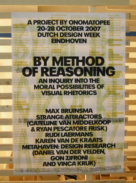
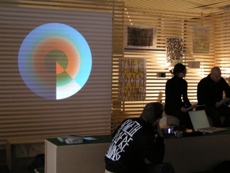

Jan2015 |
States in Capital / ATLAS OF AGENDAS by Bureau d’Etudes |
Exhibition and publication |
Curator, editor, writer, producer |
GrapHIC DESIGN, VISUAL COMMUNICATION |
mapping the power, mapping the commons |
informing |
self-commissioned |
English |
9 |
9 |
9 |
States in Capital consisted of a concentrated overview exhibition of Bureau d’Etudes at Onomatopee, allowing you study and create a context-based relation to our social and economic environment. The resulting show is a full-scale atlas spanning their work.
The publication, the ATLAS OF AGENDAS, is a political, social and economic atlas: informing the public about socio-political power structures and activating opportunities for the self and the commons. The atlas with infographics that really distributes access!
The French research and design group Bureau d´Études has been producing maps of contemporary political, social and economic systems that allow people to inform, reposition and empower themselves. Revealing what normally remains invisible, often in the shape of large-sized banners, and contextualizing apparently separate elements within new frameworks, these visualizations of interests and relations re-articulate the dominant symbolic order and actualize existing structures that otherwise remain concealed and unknown. This large-size hardcover book, panoramic in scope and theoretically both profound and accessible, is THE atlas for an emancipatory new citizenship that utilizes the opportunities of info-graphics from the local to the global and back again.
ISBN 978-94-91677-25-0
hardcover
230 mm x 300 mm / 9 x 11 ¾ inches
270 pages, of which 86 pages in full color. All other pages are in black + 1 PMS.
Extra: a fold out page integrated in the binding.
Curator and project manager: Freek Lomme
Editors publication: Bureau d’Études i.c.w. Freek Lomme and Brian Holmes
Graphic Design: Bureau d’Etudes
Project partner: Impakt Utrecht
With the support of: Municipality of Eindhoven and the Prins Bernhard Culturefund Noord-Brabant + a loan by Freek Lomme

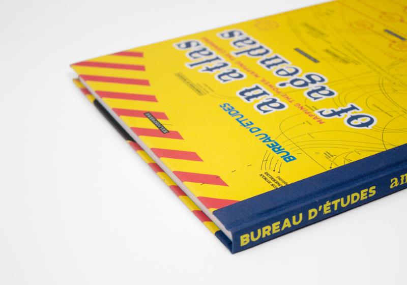


Oct2016 |
The Power of Imagination |
7 inch record |
art-director |
imagination |
imagination |
playfull |
Freek Lomme |
English and Dutch |
7 |
9 |
8 |
A Five Minute Self Help Workshop On Imagination
This interface for service design offers protagonist oracular language by Freek Lomme and antagonist digital couture by Pinar & Viola.
The publication used to be available through Onomatopee, but after splitting with Onomatopee, Onomatopee did not want them anymore and whatever is left is rather lost unfortunate. But you can get the publication through me if you want.

Jan2007 |
Eigen Terrein / Private Territory |
Exhibition and PUBLICATION |
CuraTOR, editor, WRITER and PRODUCER |
installation art, architecture, urban planning, critisism |
the possibility of a bottom up creative city |
invading and reviewing |
Self-commisssioned |
Dutch and English |
8 |
8 |
8 |
The creative city according to creatives: praxis and plans
Creative area’s are hot spots to-be. According to creative city spokesman Richard Florida, creative city’s gain value by the people at it’s streets. ‘Private Territory’ presents 10 installation artists, in diversity and through constructions. Architecture and citizenship are closely tied within this construction. Individual and creative citizenship will be displayed by the artists as pillars for the works to rise.
With: Antoine Stemerding, Daily Hero, Dinanda Luttikhedde, Laurent Malherbe, Martijn Rooker, Rob van de Werdt, Simon Kentgens, Susanna Ouwerkerk, Walter Van Broekhuizen, Wouter Huis. Writers: A.C.G. Vianen,Anja Novak, Charles Esche, Edwin van Onna, Eugene Franken, Gert Wijlage, Harrie van Helmond, Freek Lomme and Vivian van Saaze
Creative area’s are hot spots to-be. According to creative city spokesman Richard Florida, creative city’s gain value by the people at it’s streets. ‘Private Territory’ presents 10 installation artists, in diversity and through constructions. Architecture and citizenship are closely tied within this construction. Individual and creative citizenship will be displayed by the artists as pillars for the works to rise.
‘Private Territory’ will be displayed through the perspective of the autonomous, self realising attitude of the artists. This self realisation moves within the context of a urban area in development, more specific a creative urban area in development. The installation artworks will be constructed in direct and playful relation to the creative city in general, as concept, and in specific in relation to Strijp S, as creative city in development.
A question that rose parallel to the development of Strijp S asks for the motives and motion that individual, creative entrepreneurs undertake and prefer in relation to the developing creative city, since these people are the basis for the creative dynamics that should evolve out of the promise it proposes. These people will finally carry the city as a whole.
By there active and playful installations, the artists will posit themselves. These positions are open for public encounters and experiences and can, above all, be interpreted with the developing city in mind. Private Territory and collective interest will mingle within the creative domain.
Starting with an autonomous stance, ‘Private Territory’ displays how creative dynamics can manifest through a buttom-up perspective.
In a ‘Private Territory’ local paper several writers will display some further contexts of this topic.
Project manager:Freek Lomme
Curated by: Freek Lomme (Onomatopee), in collaboration with AIM Amsterdam
Graphic design:Remco van Bladel
Private Territory is possible thanks to:Municipality of Eindhoven, NBKS / Province of Brabant, City Dynamiek Eindhoven, Trudo
PUBLICATION
Newspaper, 64 pages
Black, blue & yellow
Edition: 5.000
Printed at:Dijkman offset
The publication used to be available through Onomatopee, but after splitting with Onomatopee, Onomatopee did not want them anymore and whatever is left is rather lost unfortunate. But you can get the publication through me if you want.
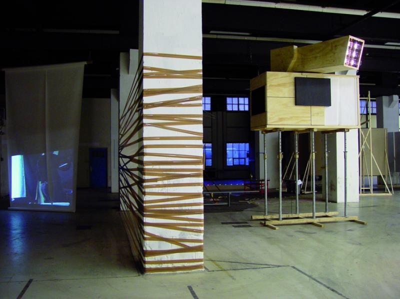


Sep2005 |
Chinese! It’s Chinese |
exhibition |
curator, producer |
Installation art, graphic design, visual communication |
Identity politics: notion of the ’Chinese’ |
experience |
TAC |
Dutch and Chinese |
6,5 |
9 |
8 |
Kin Wah Tsang made a site-specific instalation with texts on the notion of the ’Chinese’ in the Netherlands.
Travel expences funded by the Dutch Ambassy in Hong Kong

Photography by Kin Wah Tsang
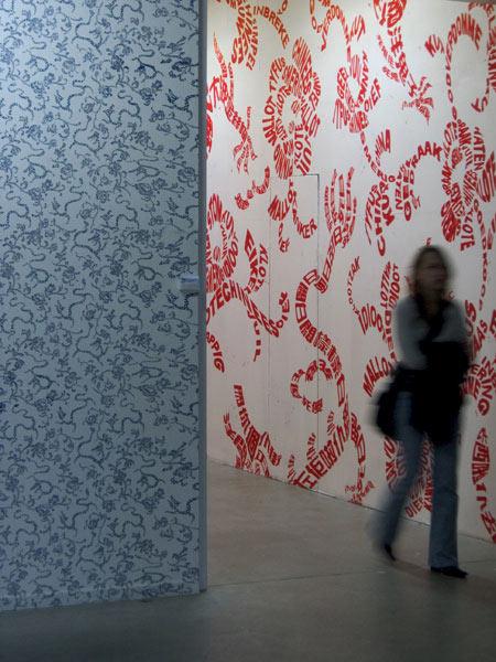
Photography by Kin Wah Tsang

Photography by Kin Wah Tsang

Photography by Kin Wah Tsang
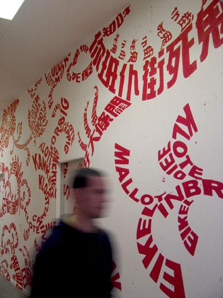
Photography by Kin Wah Tsang
Oct2006 |
ONOMATOPEE VAN HELMOND |
FILMS, FILM PREMIERES, STORIES AND BOOK |
PRODUCER, ARTISTIC DIRECTOR |
LITERATURE, FILM |
THE TRUE STORY OF HELMOND |
MAPPING ON THE GO |
Self-commissioned by Freek |
DUTCH and English |
6 |
7 |
8 |
Embedded prose from Helmond
Onomatopee sent out writers to reside at local households for one weekend; as embedded journalist. Inspired by Guy Debord’s situationisme and psycho-geography, they will write to transform situations into stories.
Onomatopee was offered a residency within the temporary project-space/exhibition space Hermitage Helmond. The Hermitage is located in a former ABN-AMRO bank in the centre of Helmond. Esther Didden, project leader, invited several organisations and artist to fill a vault at this unique spot.
Onomatopee used the Hermitage as a base for negotiation with the city. We’ve send artist and writers into the city, to generate text, sounds and visuals.
Our major project at the Hermitage is called ‘Onomatopee van Helmond’, for which Onomatopee sends writers to reside at local households for one weekend. Inspired by Guy Debord’s situationisme and psycho-geography, they will write to transform situations into stories.
The visits at the households will be followed by a cameraman and will be broadcasted on Stads-TV Helmond. Every month a new première will be screened in the Hermitage, with red carpets for writers and guest-households.
After the visit, Onomatopee will present the story told in audio by the artist at the Hermitage. The project will finish with the presentation of a book containing all the stories.
Curator/managing director/editor:Freek Lomme
Participating writers:
Jack Nouws
Rob Kappen
Beitske Bouwman
Jaap Robben
Tanja Bee
Nick J. Swarth
Frederieke Hijink
Camera and editting: Mooniq (first edition) and Kurt Augustyns (last 6 editions)
Graphic design:Remco van Bladel
‘Onomatopee van Helmond’ is possible thanks to VSB fonds
The publication used to be available through Onomatopee, but after splitting with Onomatopee, Onomatopee did not want them anymore and whatever is left is rather lost unfortunate. But you can get the publication through me if you want.


Aug2009 |
L’art pour l’art: zal wel! |
Review |
Critic |
painting |
Authenticity |
discovering |
De Kantlijn |
Dutch |
6,5 |
7,5 |
7 |
Een pleidooi voor een authentieke kunstbeleving. Naar aanleiding van de groepsexpositie Het gesnoeide Matisse boompje in museum Jan Cunen in Oss met werk van Carel Blotkamp, Gijs Frieling, Daan van Golden, Paul Klemann, Marijn van Kreij, Reinier Lucassen en Thomas Raat.
DOWNLOAD
Text in Dutch, as pubished in De Kantlijn

Jul2007 |
Man o man o mam: forget me not |
Review |
critic |
Painting |
Clare E. Rojas, being normal and gender |
fun and tempting |
De Kantlijn |
Dutch and English |
7,5 |
7,5 |
7 |
Review on Clare E. Rojas work, based on her exhibit in Museum Het Domein, Sittard, 2007
Download text
Dutch version, as published in De Kantlijn
English version, not published
Mar2008 |
De podiumstaat en daarboven |
Text |
Writer, reviewer |
painting |
Jowon van Barneveld |
mapping |
De Kantlijn |
Dutch |
6,5 |
6,5 |
6,5 |

Feb2011 |
New Scenes |
Exhibition, book, text |
CURATOR, editor, WRITER and PRODUCER |
Painting and touch of installation art |
Esther Tielemans’ scene |
mapping |
Self-commissiond and Museum van Bommel van Dam |
Dutch and English |
7 |
8 |
7,5 |
A comprehensive solo exhibition in Museum van Bommel van Dam, flanked by a documentary exhibition in Onomatopee, and an accompanying publication.
Solo show and publication by Esther Tielemans
As we communicate we produce our own identity and that of others, often without being aware of it. Each group and each person does this in their own way, although pop culture and commerce tend to dominate mainstream communication. These many flows and voices make up the dynamic theater of life; and in a sense, they provide the medium for painting the theatre scenery.
Tielemans presents painted panels as decor: full of colour, hanging on the wall, lying on the floor or hanging free in space. Together this decor forms an abstract landscape through which the viewer can walk. She draws attention to the visual quality of concentration, sensation, relations, attraction and repulsion – as if played out on the world as a stage in front of her. Where strength and sensation often compete for attention in our visual culture, Tielemans unifies their voices. Via painterly techniques, she stalls any aesthetic judgments within landscapes, which sensationally compete for the eye’s attention against bare horizons. And in her absolute reduction of the physical environment around us, the artist prohibits us from making any moral judgments either. Tielemans’s work takes over our mind and bodies, and realigns our attention.
The ancillary publication thoroughly maps the recent work of Tielemans and relates it to her previous projects. The tension between painting, interactivity and popular culture is outlined in a text by Saskia van de Wiel, curator at Museum van Bommel van Dam. Freek Lomme, director Onomatopee, places the visual signature of Tielemans in a current cultural context and designates the value of this expression.
Van Bommel Van Dam exhibition curator:Saskia van de Wiel
Onomatopee exhibition Curator:Freek Lomme
Editorial publication:Saskia van de Wiel,Freek Lomme, Esther Tielemans
Graphic design publication:Adriaan Mellegers
Photography exhibition Onomatopee:Fieke van Berkom
DOWNLOAD:
PUBLICATION
NEW SCENES
OMP57
ISBN 978-90-78454-61-8
Hardcover
22,5 x 28,5 CM
90 pages
Full color, extra fluor
Edition:1200
Printed at:Lecturis

Photography by peter Cox
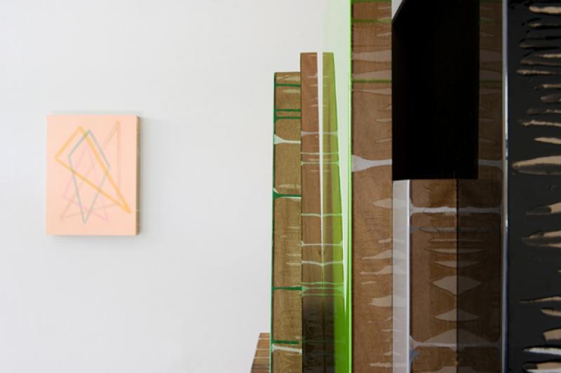
Photography by peter Cox
Jun2014 |
Ensembles assembled: in full color. |
Exhibition and publication |
curator, editor, writer, producer |
Photography |
A visual report between social realism and euphoric utopianism referencing the visual and material facilitation of socially unifying rituals. |
describing and mapping |
self-commissioned |
English |
7 |
8,5 |
8 |
Photographer Katrin Korfmann’s work is characterised by the bird’s-eye view perspective from which people are photographed moving in the scene below, capturing them in static images that present an abstract of human interaction: strongly aesthetic, its dynamic bound by the grid of everyday life.
Rather than showing a sum of independent persons moving, Korfmann’s new work records people merging into one being. In various places on earth collective rituals are photographed: events sustained by individual euphoria in which colour – or colourful garment – dissolves individuality. The highly aesthetic project reports of social realism and euphoric utopianism, acting in between the global event catalysing a visual surrender and the glocal play catalysing deeper contextual literacy.
The full series had its première at Onomatopee. Pictures of the human towers ‘Castells’ in Catalunya (Spain) for example, or the ‘Cascamorras’ festival (Spain) in which black paint plays a prominent role, or also the ‘Els Enfarinats’ in Ibi (Spain), a militaristic looking fight with flower, eggs and fire extinguishers that takes place onFools Day. Another new work came about on Korea during the ‘15th Mud Festival’ that sees teens and tweens throw healing dirt at each other and rubbing it in, thus allowing for physical contact of an intimacy Asians would otherwise consider inappropriate.
Curator:Freek Lomme
Graphic design: Adriaan Mellegers
Editors in chief: Freek Lomme and Katrin Korfmann
Texts by Gregory Volk and Freek Lomme
Made possible thanks to: Mondriaan Fund, Gallery Kopeikin, Galleri Andersson/Sandstrom, Art Affairs and the Municipality of Eindhoven


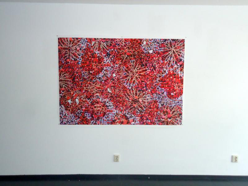


Jun2007 |
EHV - street poem |
poetry and street art |
poem |
poetry |
pinpointing the city |
playfull |
none |
Dutch |
6 |
8 |
7 |
Poem written by Freek to produce an intervention in public space and to relate with the city. Design and copying by Space3 while they hung it together.
DOWNLOAD

Sep2006 |
met gif |
poem |
poet |
poetry |
speach acts |
wonderer unveiling |
Eric Wie and Joost Baars |
Dutch |
6 |
7 |
7 |
Produced for the great project project Dicht aan het Ij, based on the theme poetry and composition, i wrote this poem, perfectely designed by Hans Gremmen. You can even hear my voice narrating the poem.
Apr2007 |
het streven naar lineariteit |
Poetry reading, book |
Poet |
Poetry |
the pursuit of the linear |
quest and mapping |
Voetnoot Publishers |
Dutch |
6 |
7 |
7 |
Het streven naar lineairiteit (The pursuit of lineairity)contains experimental texts or, if you will, poems by Freek Lomme available in Dutch only. It endeavours a place in and anticipates on the modern and situates a world to configure deriving from the practice of life. The texts postulate a groping being in between a progressive pursuit of linear development and a factual, actual existence that strays off the grid, accentuated in the book by the experimental typography. The reading pendulates between everyday wonder and great intentions... Signalling a grotesque pretty bourgeois being in modern life?
‘Lineairiteit’ reveals itselfa practice of life: levitating in between the popular understanding of the modern in its day-to-day enactment and the theoretical framework of modernity.Het streven naar lineairiteitis a practical, personal dialogue trying to grasp and understand the epistemology of existence: navigating from blasé and banal to pretentious and pompous without giving in to truthfulness.
This debut consists of two parts: the first part comprises a series of successive poems, the actual ’striving for linearity. The second part is formed as a numbered text with on first view, recurrent phrases. This text, titled ’indeductie’ bears a spontaneous mapping act into the essence of poetry, lead by linguistic forms and research approaches.
Publisher: Voetnoot Publishers
Graphic design: Henrik Barends
64 pages 14 x 21
ISBN 978 90 7806 8112
15 euros
Available in bookstores, through bol.com, Freek or via the publisher.
Het streven naar lineairiteit bevat experimentele teksten, zo u wil, gedichten van Freek Lomme. Het zoekt een plek in en anticipeert op een moderne staat van zijn en situeert een te bekennen wereld vanuit de praktijk van het leven. De teksten postuleren een tastend zijn tussen een progressief streven naar lineaire ontwikkeling en een feitelijke existentie die off the grid verdwaald. In het boek wordt dit geaccentueerd door de experimentele typografie. Zo laveert de bundel tussen alledaagse verwondering en grote intenties…een signaal van de groteske kleinburgerlijkheid van het moderne bestaan?
Lineairiteit toont zich hier als een levenspraktijk die zich beweegt tussen het populaire begrip van het moderne in haar alledaagse bewegen en het theoretische raamwerk van moderniteit. Het sterven naar lineairiteit is een praktische, persoonlijke dialoog die de epistemologie van ons zijn en bewegen probeert te grijpen en begrijpen en laveert van blase en banaal tot pretentieus en hoogdravend zonder aan waarachtigheid te verliezen.
Deze debuutbundel bestaat uit twee delen: het eerste deel omvat een serie opeenvolgende gedichten, het eigenlijke ‘streven naar lineairiteit’. Het tweede deel wordt gevormd door een genummerde tekst met op het oog steeds terugkerende zinnen. Deze tekst, die de titel ‘indeductie’ draagt, is een spontane mapping naar het wezen van poëzie, ingegeven door taalvormen en onderzoekbenaderingen.
Uitgever: Voetnoot Publishers
Vormgeving: Henrik Barends
64 pagina’s 14 x 21
ISBN 978 90 78068 112
15 euro
Verkrijgbaar in de boekhandel, via bol.com, via Freek of bij de uitgever.
Photography by CLACK


May2021 |
...Never Better... |
10 inch, white record with 24-page riso printed booklet |
poet, performer, editor |
poetry, spoken word |
generations |
self-commissioned |
English and Dutch |
8 |
7 |
8 |
A stewardship to rising sentiments / Een rentmeesterschap naar opkomende sentimenten
A rather fine record for people into spoken word, drone and psych music.
To order: email Freek
Text: Freek Lomme
Guitars / gitaristen: Glenn Peeters (Radar Men From The Moon) and Jak Peters (Every Other Me)
Graphic design / grafisch ontwerp: Studio Remco van Bladel
Recorded at/ opgenomen in Studio Bob de Wit
Vertaling / translation: Poezie/poetry advised by Josh Plough, other elements / de rest Mels Dees
A 10 inch, white record with 24-page Riso printed by Freek, poetry reading in a silkscreened cover (printed @ Made Eindhoven)
The future has been broken, while the dominant majority of past generations is guarding our cultural well-being. This project was inspired by Millennials (Generation Y) and Zoomers (Generation Z). Their sensitivity, while remaining under the radar, is very outspoken and worrying, while at the same time it is thoroughly modest, in its passive respect for the powerful generation that annihilated them even before they were born. It seems to possess a tragedy all of its own, that plays a unique role, particularly among themselves.
Every person is a child of its time. People spring from the spirit of the times they are born in, and then tentatively introduce their own sound and colours, thereby shaping the future. Youthful naiveté can only emancipate if it recognizes the power of its sentiment.
In this project we are searching for mental stewardship exercised by a representative of Generation X towards Generations Y and Z. It is an attempt to acknowledge the slumbering spirit of the youngest generations: their hopes and fears, the flow of their vital energy. How can we transmit this power, when the future has been broken so badly?
///NL VERSIE //
De toekomst is kapot terwijl de dominante meerderheid van de voorbije generaties het cultureel comfort bewaakt. Dit project is geïnspireerd op Millenials (generatie Y) en Zoomers (Generatie Z). Hun gevoeligheid, onder de radar maar zeer uitgesproken, zorgwekkend en tegelijkertijd vol van bescheidenheid in het lijdzame respect naar de machtige generatie die hen nog voor hun geboorte kapot heeft gemaakt, lijkt een geheel eigen tragiek te kennen die vooral onder henzelf een eigen leven lijkt te leiden.
Mensen zijn kinderen van hun tijd. Ze ontspringen in de tijdgeest die hun aangeboren is, en brengen bleu hun kleur en klank in, de toekomst kleurend. De naïviteit van de jeugd kan pas emanciperen als ze zich gaat bekennen in de kracht van hun sentiment.
In dit project zoeken we naar mentaal rentmeesterschap vanuit een representant van generatie X naar generatie Y en Z. Het is een poging erkentelijk te zijn aan de sluimerende geest van de jongste generaties: aan hun hoop en vrees, aan het vloeien van hun levensenergie. Hoe kunnen we kracht overdragen, waar de toekomst zo kapot lijkt?
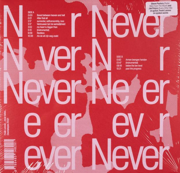


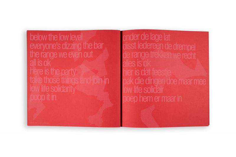
Dec2016 |
Songs about the business |
7’’ record |
spoken word, writing |
post-hardcore / spoken word |
organising principles in performing music |
dynamic |
by De Player and ourselves |
English |
8 |
8 |
8 |
a 7 inch record
spoken word by Freek Lomme
guitar by Joan van Barneveld
drums by Gert-Jan Prins
released by De Player but also available by paypalling 10 euro (eu) or 12 euro (beyond) to info(@)freeklomme.com
we played together improvising while Freek was performing his poetry. The sound is a mixture of post-hardcore, blues, noise...something like that. If you like stuff like Shellac you might like this.
The text on this record is made for the band. Freek likes the empowering quality of music to his guts but dislikes gigs nowadays as the gospels make fascists out of crowds. He wanted to address the issue of making and engaging in music through individuality, which of course is kind of an improvisation thing. In the end ’Songs about the business’ consists of three parts. It starts with ’a song about anarchy’ followed by ’a song about co-creation’ which is folowed by ’a song about self-organisation’. It is read/sung/whatever in a loop, so you can say it is a mantra or say it is a closed system or say whatever you want.
Graphic design is done by our friend Koos Siep: really basic and streightforth as the stuff eventually is. we love it. finally we included a photo of us with our signatures on it, to satisfy all the fans.
It was a pleasure making it.

live looks

Apr2011 |
STRAIGHTFORWARD AND TOUCHING: TAKING THE ROAM OF THE ROOM. |
text |
writer, reviewer |
Product design |
The language of Dave Keune’s product design |
mapping |
Dave Keune |
English |
7 |
7 |
7 |
On the work of product and spatial designer Dave Keune
download booklet, including texts, here


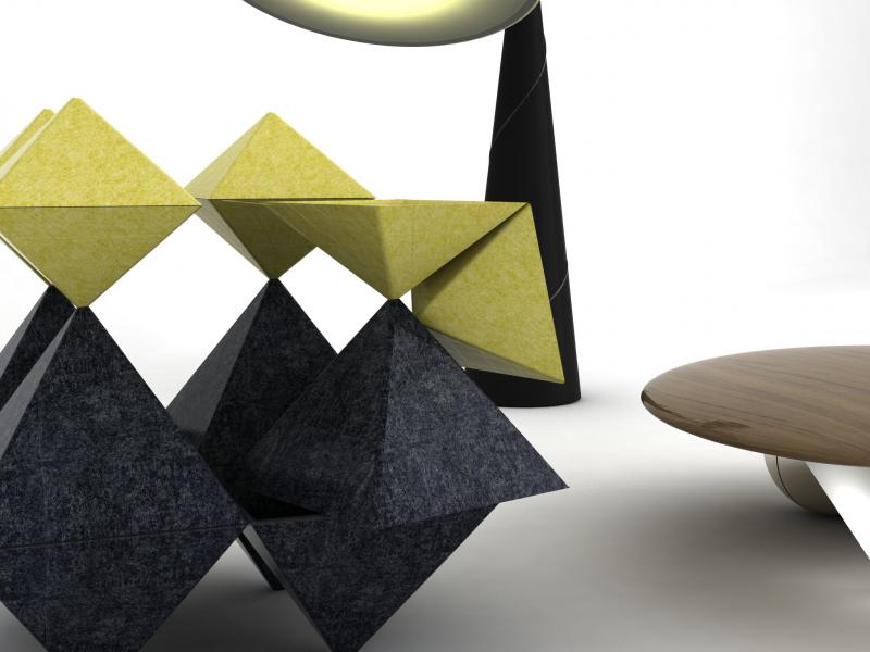
Apr2014 |
Trick or trait |
exhibition and publication |
curator, editor, writer, producer |
sculpture |
Gestures on social status |
positioning |
self-commisssioned |
English |
7,5 |
8 |
8 |
Maartje Folkeringa’s work plays the non-verbal forms of communication in our social interaction, our behaviour and the symbols we use to express our worth. It plays with power relationships and discusses the status wherein we postulate our social hierarchy, often unconcious. The work entices us with familiar images of this interaction and with the totems people use to furnish their value.
This sculptural reality, however, does not identify or point a finger at anyone in particular but quietly strips away all decoration, thus exposing and neutralising the facade of human interaction. It reveals how our private allurements can transform us into wannabes, jerks or cowards, or how others fall prey to temptation: man in his trivial megalomania. By articulating and acting upon these symbols, she touches upon the whole unconscious kit and caboodle of social interaction. Her poking around allows us to laugh at ourselves.
Maartje: ‘During the making process, I never try to bend the work to my original intentions but rather enter into ‘negotiation’ with it. In this contra-intuitive game I gradually act more associatively; one turn in a certain direction leads to another. I strive for “air” in my work: playfulness and humour; a balance between sketchiness and accuracy, dark and light, and figuration and abstraction.’
In her games with non-verbal communication as manifested in our behaviour and in the objects we dress and surround ourselves with, we can sense what is going on without words. These are the unwritten rules that colour the spectacle of life itself. We use them to accentuate our power relationships. They provide colour because they form a grey area within our social interaction. Exactly because they are being applied unconsciously, they reveal more than we like them to.
As we familiarise ourselves with our demeanour, social relationships are ingrained only deeper. Non-verbal communication disciplines our interaction and covers our social fabric with a fine hue of repression. Civilisation is rooted in traditions, and conditions our behaviour: it can be understood as the forms and codes of conduct pertaining to a conservative Cultural Capital; a status that is historic and sticks to our unconscious behaviour for a long time. Decency here is moving between the facade that evolved from following tradition and the dynamics of our heart as it tries to adapt to social changes. Enough reason to put this on the map of our cultural horizon.
Curator: Freek Lomme
Editors: Freek Lomme and Maartje Folkeringa
Graphic design: Raw Color
Made possible thanks to the generous support of theMunicipality of Eindhoven, the Prins Bernhard Cultuurfonds / Josine de Bruyn Kops Fonds, theMondriaan Fund and Stokroos Foundation.

Photography by Nolwenn Salaun
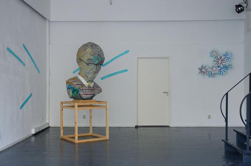


Oct2008 |
Plakboek |
exhibition, PUBLICATION and text |
CURATOR, PRODUCER and WRITER |
streetart |
Eindhoven streetart: a survey |
open |
your-space / Van Abbemuseum |
Dutch and English |
7 |
8 |
7,5 |
PLAKBOEK Eindhoven
Een initiatief van space3, Erosie en Crackrock, op uitnodiging van
Freek Lomme, curator van yourspace, oorspronkelijk voor de Dutch Design Week Eindhoven 2008.
Uniek aan de Eindhovense streetart-scene is de combinatie van
lokalisme en globalisme. De scene is breed, in die zin dat ze
verschillende stromingen kent in leeftijd en stijl, en tegelijkertijd
hecht, door onderlinge verbondenheid. Deze scene heeft zich
internationaal weten te profileren, juist door haar unieke lokale
bestaan. Van Lissabon tot Berlijn, in het Palais de Tokyo te Parijs
tot in Tokyo zelf.
De scene heeft zich altijd relatief afzijdig van de gevestigde
kunstwereld bewogen en is inmiddels verbrokkeld door de
intensieve stadsreiniging van de afgelopen jaren.
Tijd dus voor your-space om hen te eren met een publicatie die
werd gepresenteerd tijdens de Dutch Design Weeks 2008 te
Eindhoven.
Het boek telt 144 pagina’s in full-colour, introductie door Freek Lomme
hier moet je zijn voor info en bestellen
----------------------------------------------------------------------------------
SCRAPBOOK Eindhoven
An initiative of Erosie, Crackrock, and Space3 on invitation by
Freek Lomme, curator of yourspace, originally for the Dutch Design Week Eindhoven 2008.
Unique to the Eindhoven street art scene is the combination of
localism and globalism. The scene is broad, in the sense that it
encompasses various age and style streams, but at the same time
it is closely-knit because of long-standing bonds of solidarity.
Unlike in other cities, the Eindhoven street scene is characterised by
a typically Brabant, easy-going, artistic/creative-oriented cohesion.
This scene has succeeded in creating an international profile for itself,
precisely because of its unique local existence.
Large numbers of works from Eindhoven can be admired from Lisbon
to Berlin, in Palais de Tokyo ,Paris and even Tokyo itself.
The scene has always moved relatively apart from the established
art world and has sadly collapsed due to intense city cleaning
of the past years.
Time for your-space to honour this scene with a publication that was
presented during the Dutch Design Week 2008 in Eindhoven.
The book has 144 pages, full-colour, introduction by Freek Lomme
to see more and order, go here


Aug2021 |
Balancing ethics and economies: a push for a new perspective on art publishing. |
Essay |
author |
theory |
art publishing businesss |
field review |
Sternberg / Brad Haylock and Megan Patty |
English |
8 |
8 |
8 |
In this text, I describe changes to publishing infrastructure and discuss some of the most urgent challenges we need to face to foster this economy, which I call ’progressive cultural publishing’. I also consider how publishers can balance ethics and integrity with the competing demands on book production. I hope this honest text enables independent writers, publishers, or designers interested in bookmaking to see their ambitions more clearly, and for those currently engaged in the field to consider their responsibilities in responding to these challenges.
Or,
in in the words of the editors of the book,
Brad Haylock and Megan Patty:
’Against a backdrop of art markets and the ecosystem of art book fairs, Freek Lomme unpacks the perils of distribution for independent publishers.

Sep2018 |
The truth is "out there": stakes and responsibilities of rhetoric’s within contemporary culture’s design realm |
Essay |
critic |
theory |
Political and design rhetoric |
mapping |
Routledge |
English |
8 |
9 |
8 |
A contributed essay within the book ’Culture, innovation and the economy’ edited by Biljana Mickov and James E. Doyle. Published by Routledge.
short (do not think I am allowed to share):
We are living a bipolar international arena wherein two regimes are in friction to one another, each on its own held together by indoctrination. If the consumer within capitalist society does not capitulate first, then the citizen within a political society will. Under the semblance of being locally anchored and globally positioned, excluded from an open truth, people should take charge over systems again. This ignites by informing ourselves on the literacy of its rhetoric, expands by distributing the information on rhetoric more widely and, finally, by reconstructing the order by takeover of its rhetoric. There are still opportunities for humanist dissent and independent production.
In this essay I want to discuss the way truths are sourced and how this sourcing reflects the foundation of our contemporaneity, consider its vitality and, accordingly, consider how to approach this.
First of all, I will do so by proposing two forms of truth, the ‘innovative truth’ and the ‘open truth’ as a think model to think through and re-experience the motivation wherein we are inclined to portray and engage our reality. As such, it anticipates to the gut of our lower belly, in an attempt to inform and inspire.

Jun2010 |
Beelden uit de informatiemaatschappij en een woord na |
review |
critic |
visual communication, graphic design |
the quest for ’informationdesign’ |
polemic |
De Kantlijn |
Dutch |
7 |
6 |
6,5 |
Sep2014 |
Spoed vergt focus (de bevrijding van het beeld) |
text |
writer, critic |
Visual culture |
The current power in visual culture and the dynamics as they should be |
opinionated |
MOTI museum |
Dutch |
9 |
7 |
8 |
Tekst voor de Beeldcultuurkrant 2014-2015 van het MOTI museum (Museum Of The Image) Breda
Stelling van de krant: ’Logo is over!’
Mijn pleidooi bespreekt de macht over de beeldcultuur zoals die is en zoals die zou moeten bewegen.
DOWNLOAD TEXT HIER
